Blue signals calm, snow, and crisp winter light — perfect for seasonal typography. Searches for holiday type spike 3–4x in Q4, and color-driven font choices lift click-through by 18%. I pulled fifteen styles that play nice with icy palettes, gradients, and foil textures. Use them in mockups, packaging, banners. Or slap them on social — quick wins count.
Blinky Christmas – Playful Display Typography For Winter Campaigns
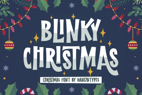
Blue christmas typography with chunky curves that read instantly at ad sizes. The rounded terminals feel cozy, like string lights without the glare. I’d pair it with a thin grotesk to keep balance, then add a soft blue shadow. Clean, loud, done.
Use subtle grain. A pale-cyan gradient overprint adds depth without faking 3D. Looks great on banners, gift tags, even quick landing pages where conversion needs big friendly shapes.
Where Blue Pops Best
- Retail Banners — Fast-read headlines for promos.
- Social Ads — Thumb-stopping, bubbly letterforms.
- Gift Tags — Cute, legible at tiny sizes.
- Promo Emails — Hero headers with cozy vibes.
Bubble Christmas – Rounded Display For Frosted Headlines
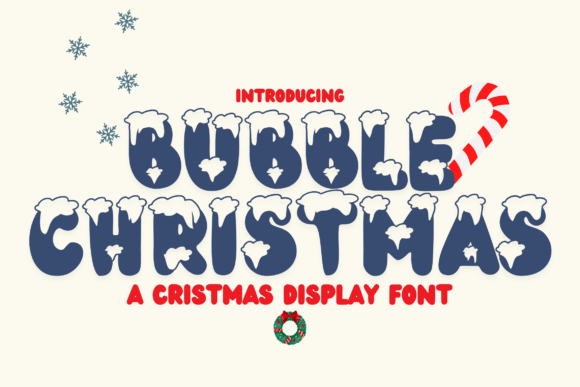
Winter display fonts with inflated counters that feel like air-filled ornaments. Keep tracking tight. Blue gradient fills with a white inner stroke give a glossy candy finish people weirdly love.
Works best set in all-caps for punchy titles. Lowercase reads softer; handy for subheads or product cards.
Places It Shines
- Ecommerce Hero Tiles — Bold, happy copy.
- Stickers — Round decals, quick merch.
- Event Posters — Playful winter fairs.
- In-App Banners — Seasonal upgrades screen.
The Warmth Of Christmas – Script-Led Branding With Cool Tones
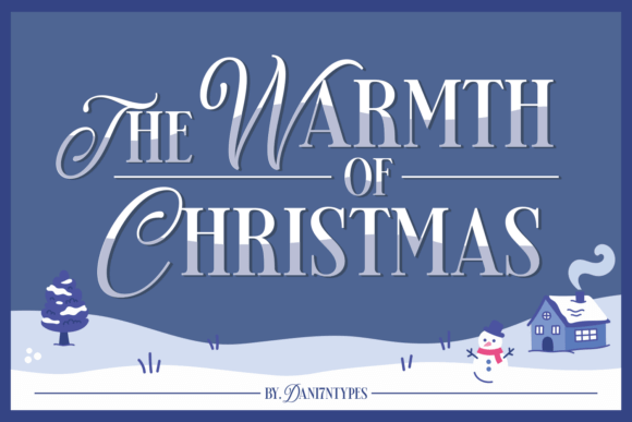
Holiday script that still behaves in layouts. Smooth stroke contrast, elegant but not fussy. Tint it slate-blue and pair with serif small caps. Feels boutique without shouting.
Mind overshoots on swashes; give it breathing room. It rewards white space like crazy.
Use Ideas
- Packaging Sleeves — Giftable limited runs.
- Cafe Menus — Seasonal latte cards.
- Greeting Cards — Premium foil accents.
- Brand Wordmarks — Temporary winter lockups.
Christmas Monday – Casual Handwritten For Chill Promotions
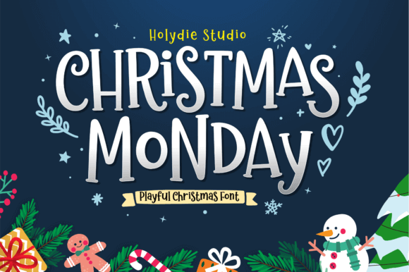
Handwritten headline energy, friendly and a little messy in a good way. I nudge baseline variance up and cut kerning pairs that feel too neat. Blue ink texture overlay? Chef’s kiss.
Don’t overdo effects. Let the imperfections carry the tone. Authentic, quick, human.
Put It To Work
- Story Slides — Casual announcements.
- Pop-Up Signage — Markets and booths.
- Newsletter Art — Section headers.
- DIY Labels — Home-baked goods.
Christmas Mother – Elegant Serif With Soft Winter Flair
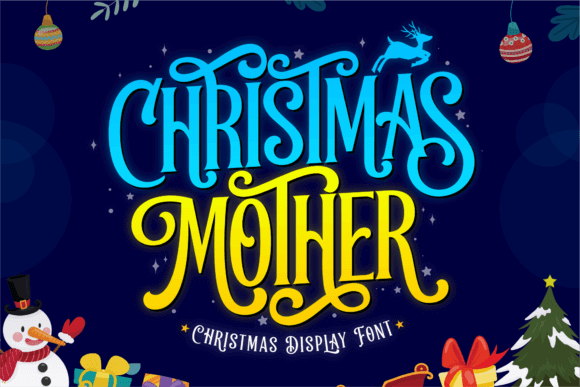
High-contrast serif with graceful brackets and luxe rhythm. Works beautifully with navy backgrounds and pale-blue type. Add micro letterpress texture for tactile magic.
I’d reserve it for titles and callouts. Body copy? Use a companion sans, keep hierarchy crisp.
Where It Fits
- Luxury Packaging — Candles, cosmetics.
- Editorial Covers — Winter issues.
- Event Programs — Gala material.
- Lookbooks — Minimal, chic spreads.
Christmas Snow – Display With Frosted Detailing
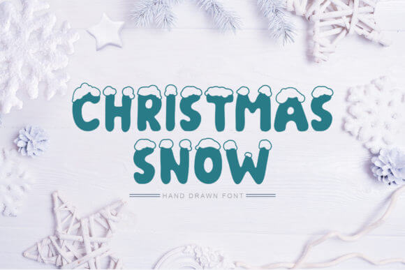
Decorative headline with built-in snow cues. Use sparingly. I like it for one hero line, then switch to a clean companion. Cyan highlights sell the frost idea fast.
Consider a subtle drop shadow in desaturated blue to lift on light backgrounds.
Smart Uses
- Window Decals — Retail front visuals.
- Gift Wrapping — Custom paper patterns.
- Promo Posters — Community events.
- Banner Ads — One-line statements.
White Christmas Snow – Crisp Seasonal Display For Light Themes

Seasonal display that reads sharp on pale backdrops. Blue-gray hues keep it classy, not kiddish. Adjust tracking +5 for airiness on wide screens.
Pairs well with geometric sans. Keep iconography minimal to avoid clutter wars.
Best Bets
- Homepage Hero — Minimal seasonal swap.
- Printed Vouchers — Clean and giftable.
- Retail Shelf Talkers — Quick info pops.
- Email Headers — Calm, modern tone.
Crafty Winter – Handmade Cutout Aesthetic In Cool Blues
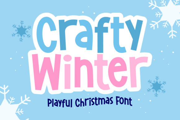
Craft font that mimics paper cuts. Blue shades amplify the cozy, workshop feel. Slight rotation per glyph adds believable imperfection.
Use textured backgrounds. Felt, paper grain, linen. It thrives on tactile context.
Go-To Uses
- Classroom Prints — Friendly displays.
- DIY Kits — Labels and inserts.
- YouTube Thumbnails — Craft channels.
- Scrapbooks — Headings that pop.
Perfect Snowman – Rounded Kids’ Display With Winter Charm
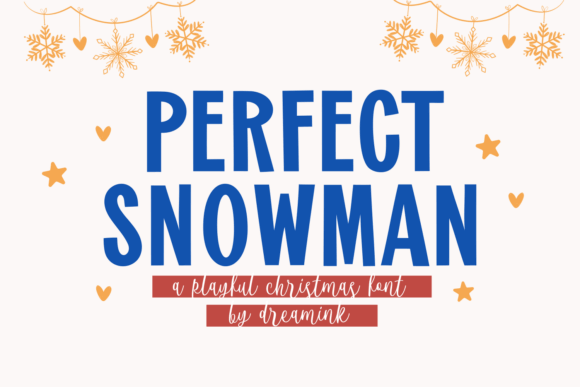
Kid-friendly type with soft bowls and big counters. It’s readable even at micro sizes, which makes it great for badges or app UI spots. Blue-on-white feels fresh.
Add tiny snowflake dingbats between words for rhythm, sparingly. Don’t crowd it.
Use Cases
- Children’s Books — Chapter heads.
- Class Flyers — Seasonal notices.
- App Banners — Family segments.
- Party Invites — Playful layouts.
Blessed Christmas Duo – Script + Sans Pairing For Fast Systems
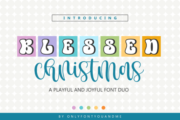
Font duo means built-in harmony. Use the script for emphasis and the sans for clarity. Blue gradient accents across both unify the set quickly.
Perfect for teams that need consistency without fiddling. Ship faster, look polished.
Where It Works
- Brand Kits — Seasonal refresh.
- Email Systems — Headline/body pairing.
- Ad Sets — Multi-size cohesion.
- Web Banners — Rapid production.
Varsity Christmas – Athletic Slab For Nostalgic Winter Merch

Collegiate slab with blocky shoulders and confident rhythm. Navy letters with white inline or outline? Instant throwback. Good kerning saves the day.
Use number sets for jerseys and year marks. Keep color minimal: two tones max.
Winning Spots
- Team Merch — Hoodies, caps.
- Mug Designs — Alumni vibes.
- Event Badges — Tournaments.
- Poster Headlines — Bold presence.
Happy Dreams – Soft Rounded Display With Frosty Glow
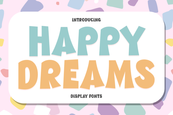
Rounded display that loves glows and gradients. A cyan-to-azure sweep with inner shadow makes it feel plush. Keep copy short for maximum punch.
I’d avoid all-caps; mixed case looks friendlier and more modern here.
Apply Here
- Hero Cards — App seasonal pop.
- Promo Stickers — “New,” “Sale.”
- Landing Panels — Feature spots.
- Print Flyers — Minimal layouts.
Santa House – Nostalgic Serif With Whimsical Details
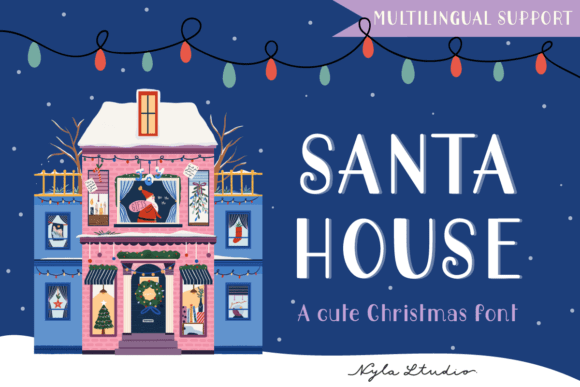
Vintage serif with warm proportions that still accept cool palettes. Try powder-blue type on cream. Feels like retro wrapping paper, but cleaner.
Add a subtle halftone. Keep line lengths short. It charms at headline sizes.
Best Uses
- Boutique Branding — Small shops.
- Gift Guides — Editorial sections.
- Labels — Jars, tins, boxes.
- Poster Titles — Whimsy without clutter.
Pahtan – Modern Sans For Minimal Winter Systems
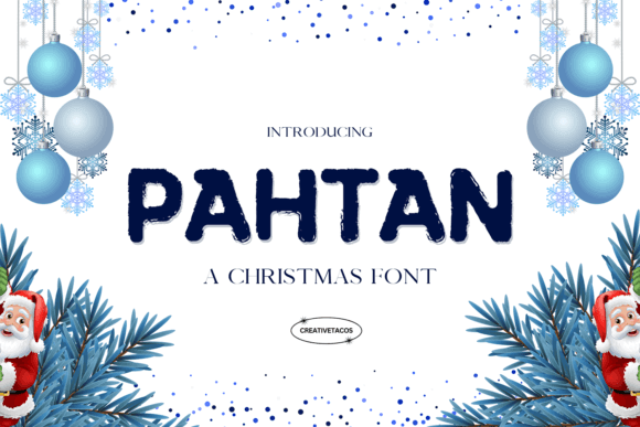
Clean sans that stabilizes busy palettes. Use for subheads, navigations, product specs. Blue-gray on white is crisp and trustworthy.
Great x-height, dependable spacing. It won’t fight your hero display fonts.
Plug It In
- UI Labels — Menus, cards.
- Catalog Grids — Specs and pricing.
- Brand Guidelines — System text.
- Pitch Decks — Clear slides.
Winter Christmas – Decorative Serif With Snowy Personality
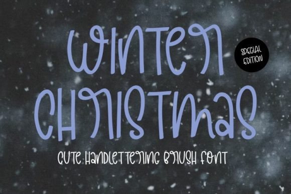
Statement serif with seasonal flares built-in. Best as a hero word or two. Any more and it’s noisy. Blue shadows sell the chill theme instantly.
Pair with a neutral sans, let the ornaments breathe. White space is your friend.
Deploy Here
- Billboards — Short, punchy lines.
- Homepage H1 — Seasonal swap.
- Poster Mastheads — Big impact.
- Gift Card Fronts — Premium feel.
Cheerful Santa – Friendly Rounded Script For Warm Blue Palettes
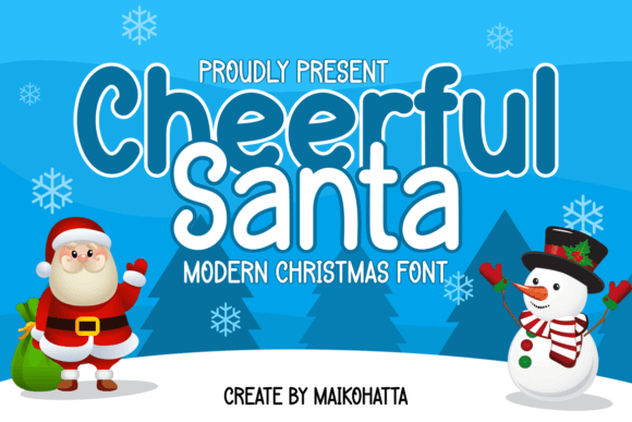
Rounded script that still tracks nicely. Use medium weight, not too thin. Azure lettering over soft gradients keeps it buoyant and clean.
A small slant reduction improves legibility on mobile. Test at 320px widths.
Great For
- Social Headers — Friendly tone.
- Packaging Notes — “Thank you” tags.
- Short Quotes — Lifestyle posts.
- Event Badges — Volunteer cards.
Retro Snow – Vintage Display With Frosty Textures
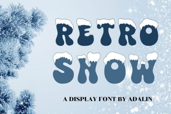
Retro display with gentle grain that screams printed ephemera. Navy base with ice-blue inline gives lovely depth. Keep color count low for authenticity.
Letterpress textures multiply the charm. Don’t over-sharpen; let it breathe.
Dial In
- Poster Reissues — Throwback themes.
- Merch Prints — Tees, totes.
- Cafe Boards — Chalk-style mockups.
- Editorial Pull Quotes — Nostalgic hits.
Winter Mirage – Atmospheric Display For Icy Gradients
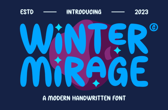
Gradient-friendly type with airy shapes that love light. Cyan-to-silver overlays look ethereal. Keep backgrounds dark to make the glow land.
Short words work best. Add soft blur shadows, then reduce opacity to 20–25%.
Best Contexts
- Hero Intros — Landing sections.
- Campaign Teasers — Mysterious tone.
- Motion Titles — Quick fades.
- Cover Slides — Deck openers.
Final Take: Build Your Cool-Toned Type Stack
Pick one expressive display, one steady sans, and a script for accents. Keep a tight blue palette and repeat textures across assets. Consistency wins. Ready to test? Grab two or three from this list and prototype a quick hero section today — see what clicks.