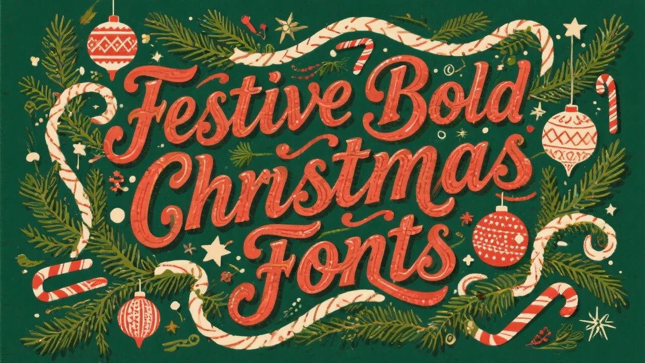
Holiday campaigns spike engagement by 30–50% when headlines feel big, bright, loud. So, I pulled 16+ Christmas bold fonts that nail readability, whimsy, and that jolly punch. Use them for tees, cards, stickers, storefronts. I tested legibility at small sizes, kerning at scale, and alternates for flair. Pick one, ship faster, look braver.
The Jingle – Display Sans With Playful Contrast
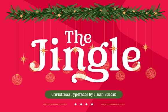
This chunky display sans hits that sweet spot: rounded edges, upbeat rhythm, zero fuss. Headlines pop on mugs, hoodies, banners. It tracks tight without clogging, and its caps feel cheerful, not childish.
Pair it with a slim grotesk for body copy. Print or SVG, it behaves. I’d bump letter-spacing +2 for foil prints. It just sings.
Where To Use It
- Holiday Merch – Tees, totes, mugs
- Retail Signage – In-store headers
- Social Posts – Bold reels covers
- Gift Tags – Short merry notes
Christmas Bitterfly – Script-Display Hybrid For Max Personality
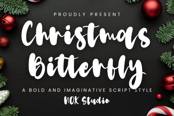
Curvy strokes, fat terminals, a little sparkle. It’s loud in a charming way, perfect for short phrases. Keep backgrounds clean so the forms breathe, especially on small stickers.
For decals, outline at 1–1.5 px. The vibe? Cozy bakery meets party invite. Works with muted palettes like pine and cranberry.
Ideal Uses
- Handmade Goods – Labels, wraps
- Greeting Cards – Front covers
- Photo Overlays – Seasonal quotes
- Pop-Up Menus – Headings only
Christmas – Bold Poster Serif With Holiday Charm
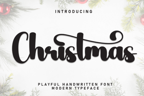
A chunky serif with slabby confidence. Great contrast for headlines against minimalist photography. It prints crisp on kraft paper and textured card, no muddy bowls.
Think big banners, window decals, event posters. Throw in subtle tracking for metallic ink. It looks premium without trying.
Use Cases
- Event Posters – Market promos
- Product Sleeves – Limited runs
- Website Hero – Seasonal splash
- Billboards – Short punchlines
Howdy Christmas – Western-Inflected Display For Festive Branding
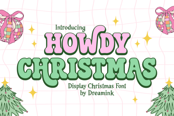
Ropey curves, squared counters, instant nostalgia. Use it for regional brands or rustic packs. It sits well on woodgrain textures and denim mockups.
Kerning is generous, so shrink tracking for tight logos. Looks ace in two-tone fills. It’s merry, but with spurs.
Best Fits
- BBQ & Deli – Holiday specials
- Country Boutiques – Gift signage
- Craft Markets – Booth headers
- Label Design – Small-batch jars
Candy Christmas – Rounded Bubble Display With Sweet Energy
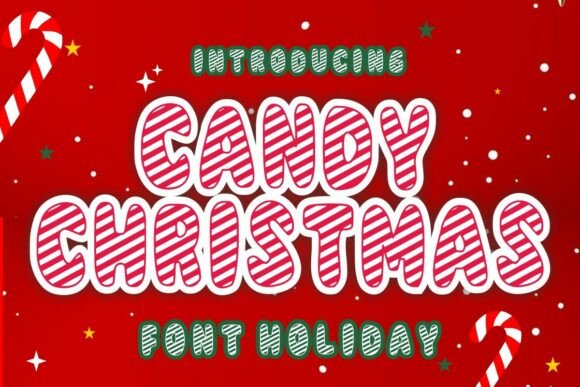
This one’s sugar-high adorable. Thick strokes, friendly bowls, super legible at tiny sizes. Kids tees love it. Stickers too.
Drop a soft shadow for instant pop. Keep colorways candy cane or gumdrop. It’s simple joy in letters.
Where It Shines
- Toy Shops – Window clings
- Cookie Boxes – Lid headlines
- YouTube Thumbnails – Family vlogs
- Classroom Prints – Bulletin boards
Super Santa – Blocky Comic Display With Hero Vibes
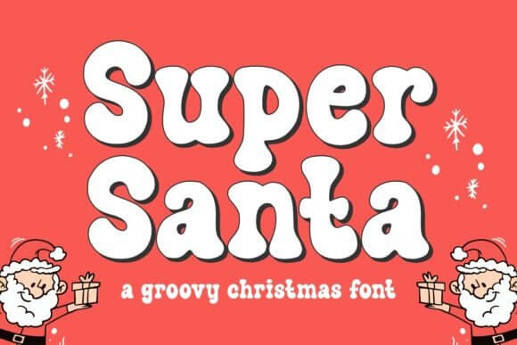
Squared shoulders, cartoony punch. Perfect for sales blasts and thumbnails where you need instant read. It holds outlines and strokes well at 3–5 px.
Use uppercase for consistency. Works with halftone textures and retro comics shading. Big energy, zero confusion.
Great For
- Promo Banners – Flash deals
- Gaming Overlays – Holiday streams
- Stickers – High-impact phrases
- Gift Guides – Section headers
Jolly Christmas – Friendly Rounded Sans For Cozy Headlines
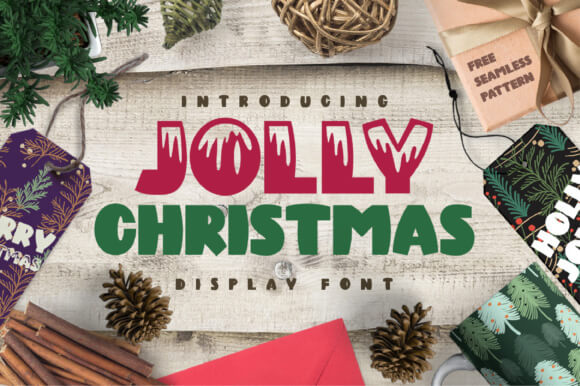
Soft corners, gentle weight, feels like a hug. Stellar for lifestyle brands and cozy emails. It pairs with thin line icons effortlessly.
Try cream on forest green. For embroidery patches, increase spacing just a touch. It’s approachable and tidy.
Applications
- Email Headers – Campaign titles
- Brand Boxes – Seasonal sleeves
- Blog Graphics – Feature images
- Gift Vouchers – Primary text
Fulood – Bold Quirky Sans With Handmade Charm
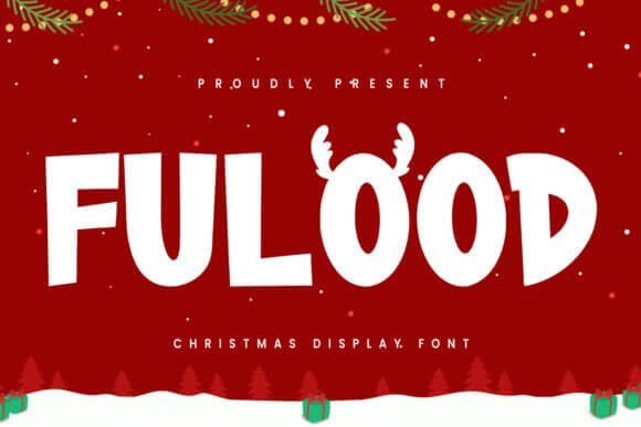
Wonky in the best way. Slightly uneven strokes bring warmth to flat layouts. Great for indie brands and craft markets. Legible, memorable.
Use muted reds, olive, oat. It loves textured paper. Keep lines short for punchier impact. No overthinking.
Perfect For
- Artisanal Packs – Candles, soaps
- Market Booths – Price boards
- Social Stories – Quick promos
- Gift Wrap – Pattern headlines
Christmas – Monoline Script Bold For Warm Headlines
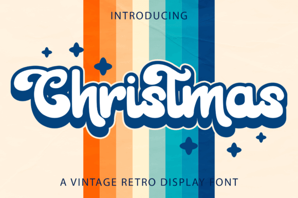
Thick monoline strokes, smooth joinery, big festive vibe. Use at 36pt+ for clarity. Looks awesome with glitter textures and foil stamping.
For SVG cut files, expand strokes to paths. Keep contrast minimal in backgrounds. It smiles, genuinely.
Best Uses
- Photo Cards – Family names
- Mugs – Single-word hits
- Door Signs – Script statements
- Sticker Sheets – Hero phrases
Graceful Christmas – Elegant Serif Display With Swash Options

High-contrast serifs with tasteful curls. Perfect for luxe packaging and editorial covers. Keep spacing open; it loves air.
Gold foil? Chef’s kiss. Pair with a neutral sans to balance the drama. It elevates instantly.
Strong Matches
- Luxury Gifts – Candle boxes
- Magazine Covers – Holiday issues
- Menus – Prix fixe headers
- Gift Certificates – Premium feel
Winter Glyph – Iconic Display With Seasonal Motifs
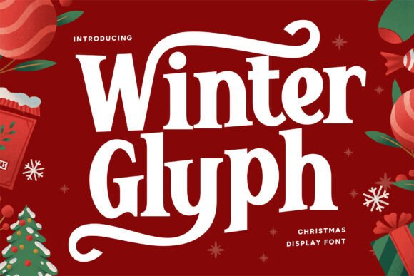
Bold letters sprinkled with built-in seasonal glyphs. Great for quick patterns and headers. Don’t overstuff layouts; let icons breathe.
Use as a hero word then switch to a clean sans. It’s visual confetti. Fun, fast, done.
Use It For
- Wrapping Paper – Repeat motifs
- Event Badges – Title lines
- Kids Books – Section heads
- DIY Crafts – Cricut projects
Merry Christmas – Festive Script With Bold Weight For Impact
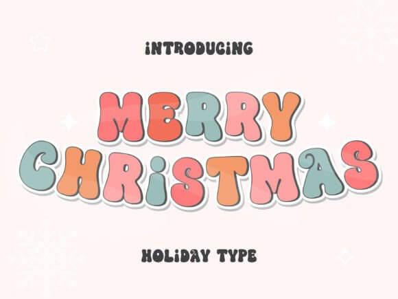
Swashy but readable. Perfect for short greetings and hero overlays. For dark photos, add thin white stroke and a soft drop shadow.
It pairs well with a geometric sans. Keep lines short to avoid messy joins. Sweet and confident.
Great Spots
- Photo Overlays – Greeting lines
- Gift Tags – Handwritten feel
- Posters – One-liners
- Store Banners – Warm tone
Jingle Grinch – Chunky Whimsical Display With Mischief
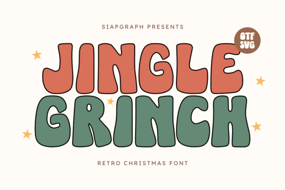
Playful wobble, thick forms, instant grin. Works best in loud color palettes and sticker packs. Keep spacing moderate; avoid collisions.
For tees, use 2-color print with offset shadow. It’s cheeky. People notice.
Try It In
- Sticker Packs – Quote sheets
- T-Shirt Prints – Bold phrases
- Party Decor – Banner letters
- Kids Apps – UI headings
Josilca – Modern Rounded Sans With Festive Weight
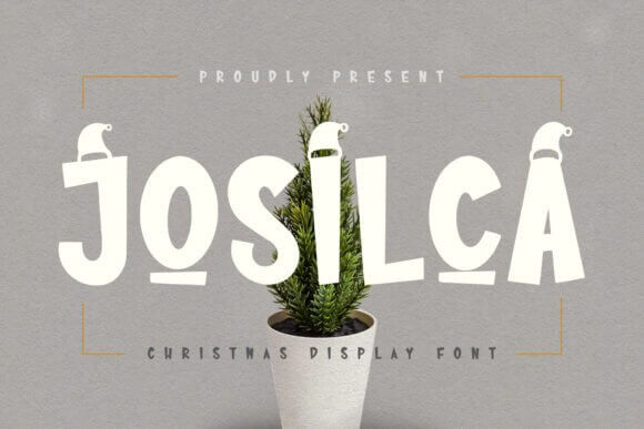
Clean curves, balanced metrics, very brandable. It’s the safe pick when you need broad appeal. Great on web hero sliders and app popups.
Use 700–800 weight with roomy line-height. It scales like a champ. Zero drama. Just clarity.
Deployment
- Ecommerce Banners – Clear promos
- App Modals – Holiday CTA
- Mailer Headers – Bold yet friendly
- Gift Cards – Clean layout
Christmas Grinch – Playful Bold Serif With Tilted Energy

Chunky serifs with a mischievous lean. Big personality. Use it for playful campaigns where straight-laced fonts feel boring.
Add slight rotation per word for handmade feel. It prints beautifully on textured stock. Memorable, a bit sassy.
Good For
- Pop Branding – Capsule drops
- Gift Wrap – Fun headers
- Cafe Boards – Seasonal treats
- Poster Art – Loud type
Christmas Stealing – Decorative Display With Naughty Flair
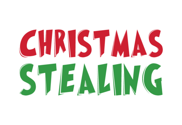
Irreverent shapes with a cartoony streak. Great for gag cards and meme-ready merch. Don’t overuse symbols; keep it clean-ish.
Outline at 2 px for dark tees. Use neon accents for extra bite. It’s mischief in type.
Best Placements
- Gag Gifts – Funny labels
- Meme Graphics – Quick posts
- Party Invites – Bold headers
- Sticker Shops – Sassy sets
Christmas To Bold – Ultra-Heavy Display For Max Contrast
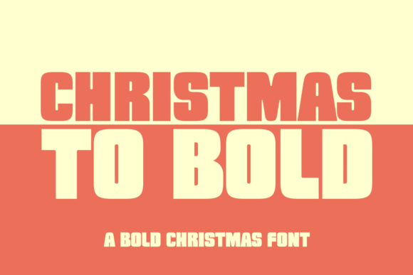
Absolute unit weight. Perfect for tiny mobile screens and drive-by reads. Keep words short; let the mass do the work.
Drop shadow at 120° works well. Contrast with thin subheads for hierarchy. Boom, readable.
Use Situations
- Flash Sales – Big timers
- Billboard Ads – Short hooks
- Button CTAs – High click intent
- Box Seals – Bold stamps
Single Grinch – Bold Cartoon Sans With Tilted Quirk
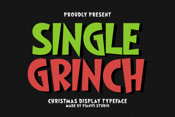
Slightly crooked, very readable, hilariously fun. Use it when you want joy without the sugar crash. It takes color gradients like a champ.
For die-cut stickers, exaggerate stroke. Keep kerning neutral. It just works everywhere.
Great Matches
- Sticker Shops – Die-cuts
- Kids Apparel – Loud phrases
- Stream Overlays – Holiday sets
- Event Signage – Directionals
Wrap It Up With Bold Cheer
You came for holiday typography that punches above its weight. These christmas bold fonts cover classy, cheeky, rustic, luxe. Pick two, build contrast, ship your campaign before the rush. If you test anything, test scale and spacing. Then get cozy, hit print, and let the season work its magic.