Bold holiday type converts. Big time. Headlines with strong contrast can boost recall by 23% in seasonal campaigns, and that’s not fluff – it’s usability 101. Below you’ll find a curated list of chunky, spirited styles that slap on packaging, merch, ads, and printable kits. Mix script with slab. Pair retro with modern. Then ship your project faster, cleaner, merrier.
Sleigh Belles – Display Script For Festive Headlines
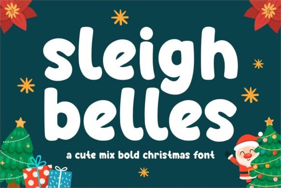
Playful curves. Thick strokes. Sleigh Belles reads loud without begging for attention, which is rare. I’d stack it for hero lines, then tighten tracking for labels or cozy mug wraps. Works best in short phrases – let it sing, don’t write a novel with it.
Pair with a clean grotesk for body copy, and push color contrast – cream on cranberry looks wicked good. Add tiny snow glyphs for micro flair, if you must.
Best Uses
- Holiday Banners
- Mug & Tumbler Wraps
- Gift Tags
- Etsy Thumbnails
- Event Flyers
Santa Claus — Rounded Display With Friendly Weight
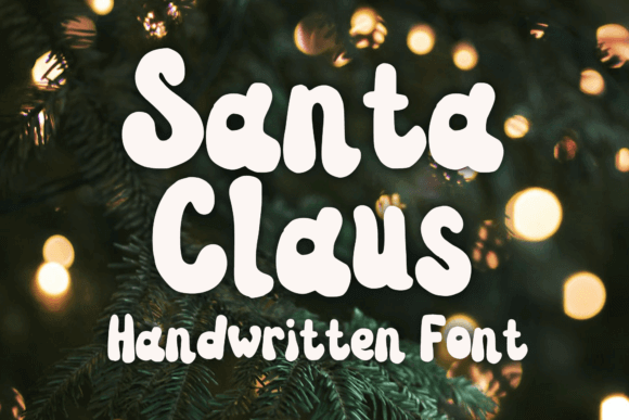
This one’s chunky and adorable. Think signage for markets, kids apparel, cookie tins. The bowls feel cuddly, so push bigger sizes and let whitespace breathe. Kerning’s forgiving, which makes quick mockups painless.
Try a candy-cane palette or soft shadow for instant depth. Keep copy short and sweet – it shines in punchy headlines.
Best Uses
- Storefront Signage
- Kids Apparel
- Advent Calendars
- Promo Posters
- Gift Boxes
Grinch – Bold Cartoon Serif With Naughty Flair
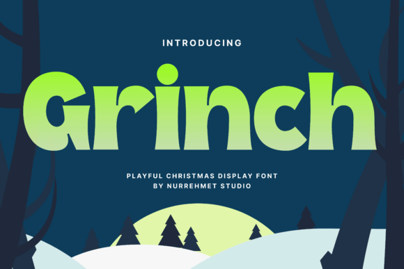
Spiky charm, thick stems, mischievous energy. Grinch is perfect for cheeky merch and teaser graphics. I’d outline it in white to pop on dark sweatshirts. Keep letterspacing tight so the rhythm feels punchy.
Mix with a neutral subhead to keep it readable when stacked vertically. It carries a joke. Let it.
Best Uses
- Funny T-Shirts
- Sticker Packs
- Party Invites
- Meme Graphics
- Poster Headlines
Holly Grace – Elegant Bold Script For Luxe Seasonal Branding
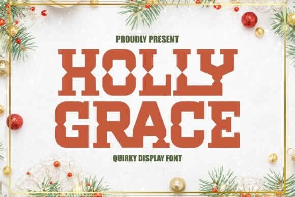
Swashy script with confident weight. Great for boutique packaging and artisan labels. Increase size, add high-contrast pairing, then toss in a gold foil texture if you’re feeling fancy.
Don’t over-swirl. Use alternates sparingly so it stays legible on smaller stickers and seals.
Best Uses
- Premium Packaging
- Wine Labels
- Gift Certificates
- Brand Marks
- Event Programs
Salty Claus – Rough-Edged Bold For Gritty Holiday Graphics
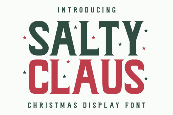
Textured, slightly grunge, still readable. It screams craft market and barnwood signs. Use it big, then throw subtle grain overlays to match the vibe across assets.
Keep color earthy – burgundy, pine, parchment. Contrast via shadows instead of neon hues.
Best Uses
- Farmhouse Signs
- Craft Labels
- Market Stalls
- Menu Boards
- Wood Prints
Merry Coldness – Blocky Sans With Frosty Personality
Square-ish forms, assertive rhythm, icy flavor. It lands beautifully in promo graphics and price badges. Tight grids help — align edges for that clean retail look.
Try frosted overlays or subtle gradients. Works in uppercase for punchy visibility on mobile.
Best Uses
- Sale Graphics
- Homepage Hero
- Pop-Up Banners
- Carousel Ads
- Lookbooks
Winter Color – Layered Display For Playful Headings
Layerable shapes, chunky counters, instant fun. Set the base in white, shadows in candy colors. It’s great for kits and printable packs where energy matters.
Don’t overlayer effects – one shadow, one texture, done. Keep legibility king.
Best Uses
- Kids Posters
- Classroom Prints
- Party Kits
- YouTube Thumbs
- Stickers
Big Santa Hat – Bold Mascot-Style Display
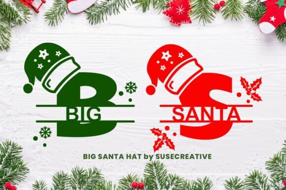
Big Santa Hat brings mascot energy without going off the rails. Perfect for merch drops and event headers. Use curved baselines for motion, then center-align to keep it tidy.
Try it on tote mockups and social headers. It grabs attention, fast.
Best Uses
- Merch Drops
- Booth Backdrops
- Event Tickets
- Gift Guides
- Header Graphics
Christmas Graffiti – Street-Styled Bold For Urban Cheer
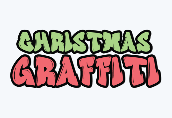
Urban edge meets tinsel chaos. This one slaps on youth apparel and bold flyer stacks. Add grainy textures, keep colorways limited for control.
Use heavy drop shadows to simulate wall depth. It photographs well on brick mockups.
Best Uses
- Streetwear
- Concert Flyers
- Sticker Walls
- Lookbook Covers
- Promo Teasers
Sugar Candy – Rounded Bold With Sweet Volume
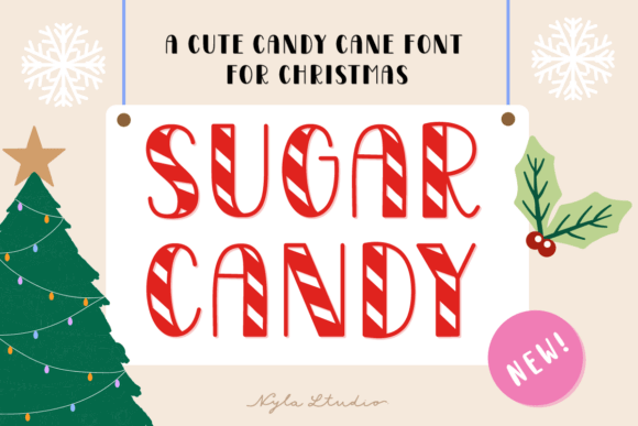
Soft rounds, glossy vibe. It’s dessert in type form. Use thick outlines and pastel fills for packaging that pops on shelves and feeds the sweet tooth.
Keep copy minimal and playful. Works well with icon stickers and badges.
Best Uses
- Bakery Boxes
- Cookie Labels
- Sweet Shop Signs
- Recipe Cards
- Gift Hampers
Christmas Signature – Bold Script For Classy Headlines
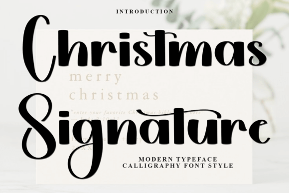
Signature vibe, still chunky enough to read at a glance. It elevates invites and premium cards. Balance it with a fine serif for hierarchy that feels editorial.
Use generous margins. Nothing says luxury like space to breathe.
Best Uses
- Invitations
- Luxury Cards
- Gift Certificates
- Boutique Logos
- Foil Prints
Christmas Tree – Iconic Bold Display With Festive Motifs
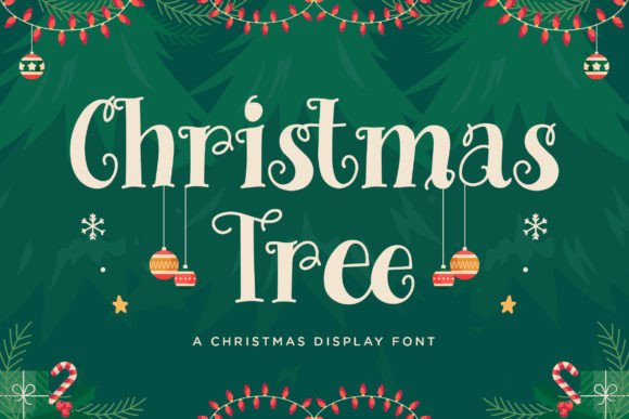
Decorative yet punchy. Use for hero words and keep subheads clean. The themed letterforms do the heavy lifting – no need for extra ornaments.
High contrast backgrounds help. Think deep green + cream for classic cool.
Best Uses
- Window Posters
- Directional Signs
- Event Maps
- Program Covers
- Photo Booth Backdrops
Baloon – Puffy Bold Display With Inflated Curves
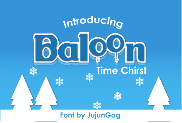
Chunky, bubbly, super friendly. It wins on party kits and banners where joy matters more than restraint. Outline + drop shadow = instant pop.
Keep lines short. Let the inflated counters breathe or it clogs fast.
Best Uses
- Party Banners
- Cake Toppers
- Goodie Bags
- Birthday Cards
- Printable Kits
Howdy Christmas – Western Bold With Seasonal Attitude
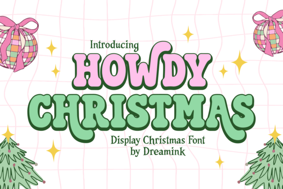
Western slabs, holiday trim. It’s a vibe for rustic markets and backyard gatherings. Use letterpress textures to sell the tactile story.
Go big on kerning to open those slabs. It breathes better and prints cleaner.
Best Uses
- Market Posters
- BBQ Menus
- Barn Events
- Band Flyers
- Sign Boards
Cozy Christmas Duo – Bold Serif + Script Pairing
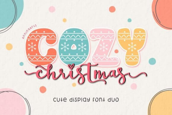
A match made easy: sturdy serif for headlines, warm script for accents. You get instant hierarchy out of the box. Lockup logos in minutes, honestly.
Use color to separate roles – serif in dark, script in light. Keeps it crisp.
Best Uses
- Brand Kits
- Label Systems
- Gift Sets
- Card Suites
- Website Banners
Groovy Xmas – Retro Bold With 70s Curves
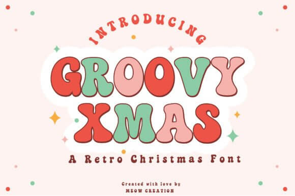
Wavy, warm, nostalgic. Pair with muted palettes and grain for that vinyl-sleeve feel. It’s killer on tees and poster drops.
Track it slightly loose. Those curves need room to dance, or it muddies up.
Best Uses
- Vintage Tees
- Gig Posters
- Album Art
- Retro Stickers
- Social Covers
Wrap-Up: Make Your Headlines Ring
You don’t need twenty fonts – you need the right bold voices. Pick two or three, lock your palette, and go build the thing. If it reads at arm’s length, you’re golden. Save your set, reuse across assets, keep the vibe consistent. Ready to make something that actually gets clicked?