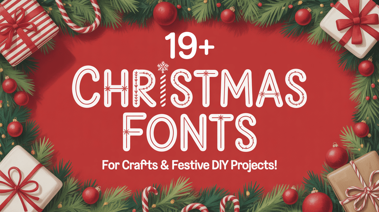
“Good typography is invisible,” sure. But holiday design goes extra — swirls, sparkle, that warm nostalgic pull. I curated 19 Christmas fonts that balance charm with readability. Think branding-safe weights, smooth kerning, clean SVGs. Use them for gift tags, reels overlays, menus, and product photos. I tested legibility at small sizes. You’ll feel the difference.
Hello Christmas — Hand-Lettered Script For Cozy Headlines
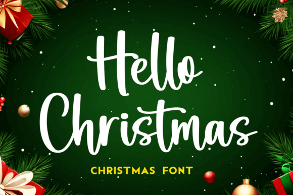
This one feels handwritten, like a note on a cookie tin. Smooth curves, light bounce, and tidy connections that don’t snag when you kern tight. Pair with a neutral serif for contrast and watch your holiday graphics glow with warmth.
I like it for product mockups and card headers. It stays readable on mobile, which matters when you’re posting stories or reels text overlays. Short words sing.
Smart Uses For This Style
- Logos and Submarks for seasonal shops
- Gift Tags and printable labels
- Social Post Headers with cozy vibes
- Card Front Titles with simple flourishes
Christmas Wonderland — Playful Script With Snowy Charm
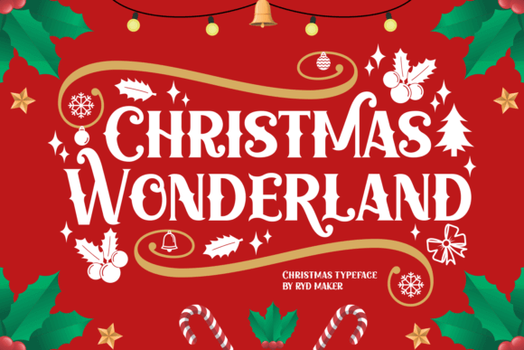
Curvy, cheeky, and a bit whimsical. The baseline bounce adds energy without wrecking alignment. Use bigger sizes for hero text, then anchor with a tidy sans. It screams festive without yelling. I’d use it for holiday invitations instantly.
Keep letterspacing tight. Color it candy-apple red or deep pine, then add subtle texture for that printed feel. Looks sweet on stickers.
Where It Works Best
- Event Flyers and seasonal promos
- Product Packaging for treats
- Instagram Stories covers
- Printable Postcards and notes
Jolly Christmas — Bold Script For Impactful Headlines
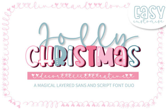
Chunky strokes, friendly curves, and that billboard energy. Perfect for banners, storefront posters, and punchy quotes. It pairs cleanly with monoline icons and minimal color palettes. Your seasonal marketing will look confident, not corny.
Try white on deep green, add a drop shadow at 20–30%, and let it float. Works on textured backgrounds too.
Drop It Into
- Window Signage for pop-ups
- Promo Banners and ads
- Gift Guides covers
- Homepage Hero sections
Chasing Christmas — Energetic Brush Script With Flair
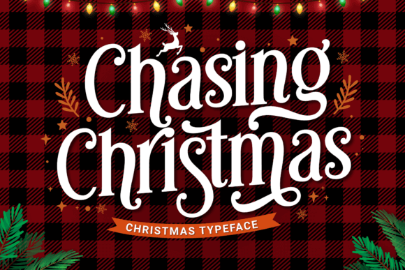
Looks like quick brush pen lettering — movement, texture, life. Great when you need a little chaos in a clean layout. It thrives on contrast. Pair with a geometric sans and oversized spacing. Use for holiday promotions that want to feel handmade.
Pro tip: keep lines short. The rhythm pops when words stack tight.
Where It Pops
- Limited-Time Offers graphics
- Mood Boards and mockups
- Gift Wrapping Kits branding
- Merch Drops tees and totes
Christmas Wishes — Sweet Script With Soft Terminals
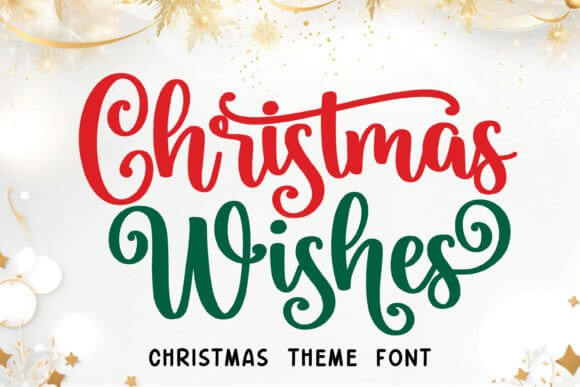
Gentle and tidy, almost calligraphic without the drama. It nails elegance for invites and menus. The spacing is forgiving, so long phrases still read nicely. Add gold foil texture and your holiday stationery looks boutique-level.
Try small caps for dates and a thin divider. Chef’s kiss.
Use It For
- Wedding Seasonals winter sets
- Menus And Place Cards
- Printable Invites and RSVP
- Gift Certificates layouts
Brighter Christmas — Clean Script With Modern Curves
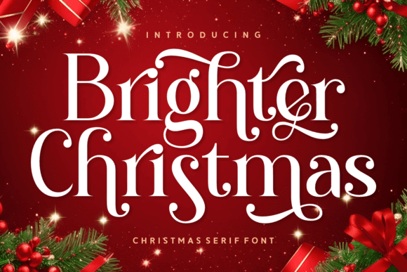
Sleek, modern, less flourishy. Feels premium without being stiff. Use it when you want festive but still brand-forward. Works beautifully with muted palettes and lots of white space. Your brand campaigns won’t lose their voice.
I’d pair it with a light grotesk for body text, keep hierarchy tight, and let color do the rest.
Great For
- Ad Creatives with clean layout
- Minimalist Packaging
- Website Banners seasonal
- Email Headers promos
Twinkle Christmas — Sparkly Script With Cute Details
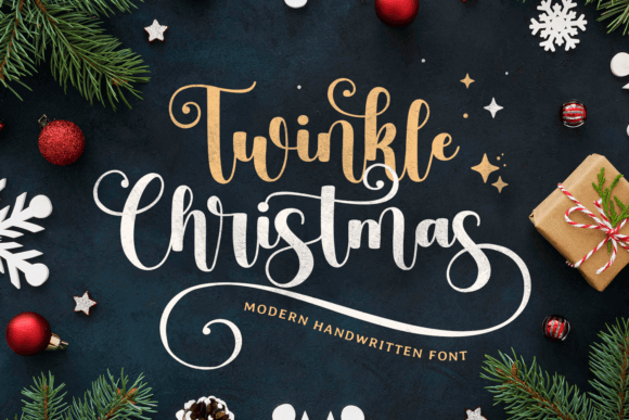
Playful loops and a touch of glitter energy. Great for kids projects, DIY labels, and cheerful posts. It’s friendly at small sizes and still cute at 120px. For craft templates, it’s an easy win.
Use pastel backgrounds, keep shadows soft, let it shine (literally, try a foil layer).
Plug It Into
- Kids Party Decor printables
- Mugs And Tumblers
- Stickers And Decals
- Reels Captions overlays
Magical Christmas — Elegant Calligraphy With Swashes
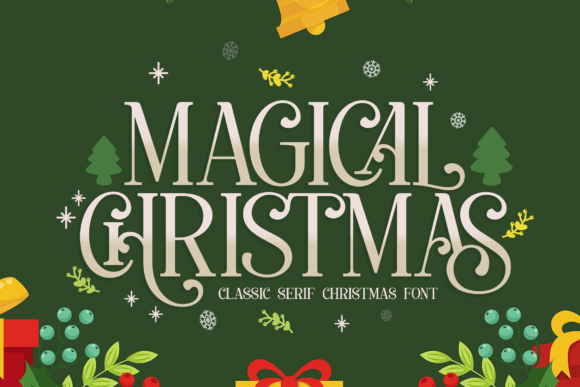
Classic calligraphy energy with graceful swashes that don’t overwhelm. Use alternates sparingly and it feels luxe, not loud. Perfect for elegant invitations and premium product labels. Think candle lines, artisan cookies, boutique boxes.
Try off-white stock, deep ink, tiny stars as separators. Timeless.
Best Fits
- Luxury Packaging sleeves
- Event Programs winter galas
- Gift Boxes limited sets
- Editorial Covers seasonal issues
Beauty Christmas — Refined Script With Balanced Weight
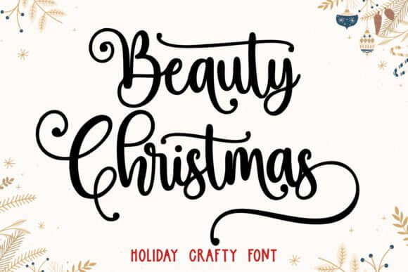
Subtle contrast, tidy loops, highly readable. It’s chic without trying hard. For gift guides, promos, and cosmetics packaging, this just works. I’d use it for winter catalog titles paired with a narrow sans.
Keep color palette muted — blush, forest, cream — and let spacing breathe.
Ideal Scenarios
- Beauty Branding holiday sets
- Lookbooks and guides
- Gift Cards and sleeves
- Newsletter Headers
Christmas Day — Friendly Script For Warm Greetings
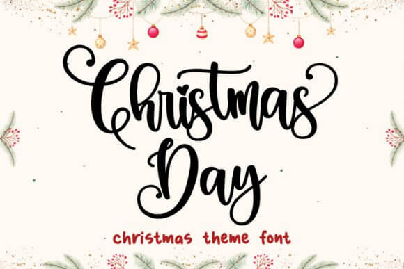
Gentle roundness, comfy rhythm, approachable vibe. Use for heartfelt messages on cards, banners, and reels covers. For greeting layouts, it nails that “from our family” tone without feeling cheesy.
Try cream paper textures with subtle grain. Warm, cozy, done.
Use Cases
- Family Cards templates
- Photo Overlays captions
- Blog Headers seasonal posts
- Printable Tags sets
Joyful Christmas — Spirited Script With Bounce Rhythm
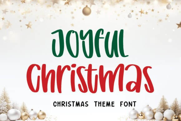
Alive and bouncy but still legible. Perfect for playful promos, countdown posts, and animated titles. I love it in bright red on dark backdrops. It lifts holiday campaigns with a happy pulse.
Short words, stacked lines, generous line-height. Looks great in motion.
Where It Shines
- Countdown Graphics
- Animated Stories
- Sticker Packs
- Promo Covers
Holy Christmas — Classic Script With Sacred Calm
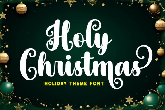
Softer contrast, restrained curves, calm presence. Has that reverent feel for faith-based events or formal stationery. Pair with a transitional serif. For program design, it reads dignified and clear.
Ivory backgrounds and small ornaments only. Let it breathe.
Perfect For
- Church Bulletins
- Formal Invitations
- Charity Events programs
- Song Sheets covers
Christmas Candy — Cute Display With Sugary Curves
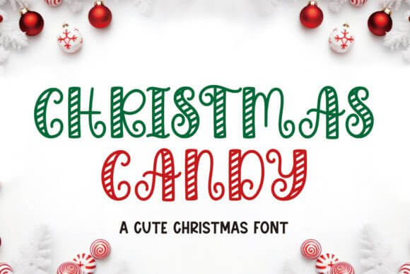
Rounded, sweet, a little retro. This isn’t script — it’s a playful display that pops on packaging and signs. Pair with a neat script to layer styles. Your treat labels will look delicious instantly.
Try alternating colors per letter for whimsy. Works on kraft paper too.
Plug And Play
- Bakery Boxes and sleeves
- Market Stalls signage
- Kids Crafts kits
- Advent Calendars prints
Cozy Christmas Duo — Script + Sans Pairing, Ready To Go
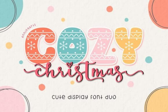
A matched pair — one script, one sans — so hierarchy is painless. Use script for headlines, sans for details, done. Consistency across brand kits gets easier and faster. Love it for templates, too.
Swap weights for variation. Keep a tight grid and it feels pro.
Great Pairing For
- Brand Systems seasonal
- Canva Templates sets
- Shop Graphics bundles
- Email Kits headings/body
Christmas Child — Whimsical Script With Youthful Touch
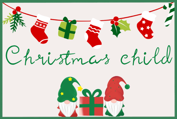
Light, bouncy, cheerful. Ideal for school concerts, crafts, and playful banners. It’s friendly with icons and doodles. For classroom printables, it reads happy and clear, which is hard to nail.
Use bright primaries or candy tones. Keep spacing loose.
Perfect Uses
- School Flyers winter events
- Craft Worksheets
- Party Banners
- Sticker Sheets
Christmas Wish — Soft Script With Gentle Flow

Understated and graceful. It feels handwritten but polished, like a careful signature. Use for soft branding, captions, and elegant cards. It won’t fight your photography, which I love for product shots.
Monochrome palette, thin rules, minimal icons. Quietly gorgeous.
Use It In
- Minimalist Cards
- Product Inserts
- Gift Notes
- Website Banners
Starlight Christmas — Shimmer-Inspired Script For Headlines
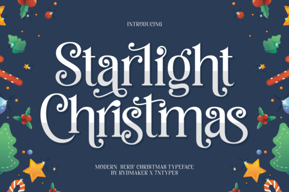
Lively strokes with a starry vibe. Looks amazing with gradients and light flares. Great for event headlines, countdowns, and animated intros. It has that modern sparkle that doesn’t feel tacky.
Go big, keep lines short, let effects do the subtle magic.
Best Uses
- Event Posters
- Countdown Timers visuals
- YouTube Thumbnails
- Digital Banners
Christmas Fortune — Retro Display With Festive Edge
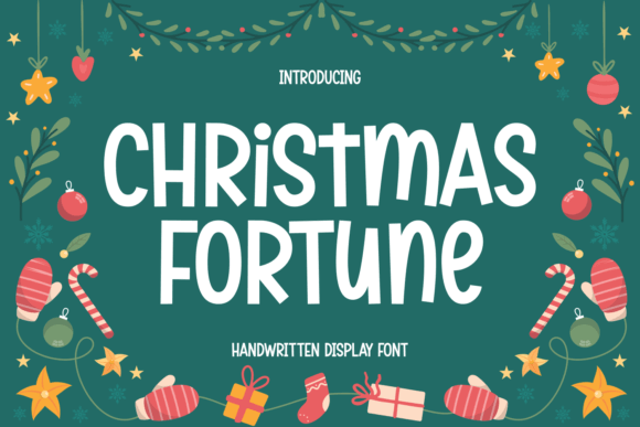
Retro flair with thick shapes and confident presence. Not a script — think vintage signage with holiday charm. I’d use it for retro posters, cocoa tins, and gift shop graphics. It loves texture.
Grain, halftone, and warm reds. Instant nostalgia.
Plug It Into
- Vintage Labels
- Poster Prints
- Merch Graphics
- Cafe Boards
Snowy Winter — Frosty Display With Soft Edges
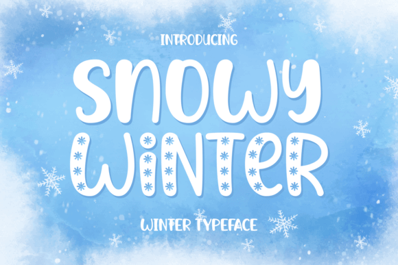
Rounded, chilly, a little storybook. Works for signs, mugs, and winter break promos. Pair with a gentle script for balance. For cozy posters, it delivers that snow-dusted feel in seconds.
Try pale blue gradients, tiny snowflake icons, and soft inner shadows. Cute, done.
Use For
- Mug Designs
- Shop Windows winter sales
- Class Flyers
- Printables decor
Wrap-Up: Pick One
I think the best workflow is simple – choose two Christmas font ideas, build a 3-style hierarchy, test at mobile sizes, and commit. Don’t overthink. Your audience notices clarity and charm more than perfection. Grab your favorites, mock a cover, post it today.