“Typography is the craft of endowing human language with a visual form.” That’s Robert Bringhurst, and he’s right. A handwritten font sells mood fast—warmth, spontaneity, human touch.
Designers crave it for contrast with minimal layouts, modern packaging, and brand storytelling. Today’s pick balances character with legibility, clean vectors, and OpenType niceties. It just… works.
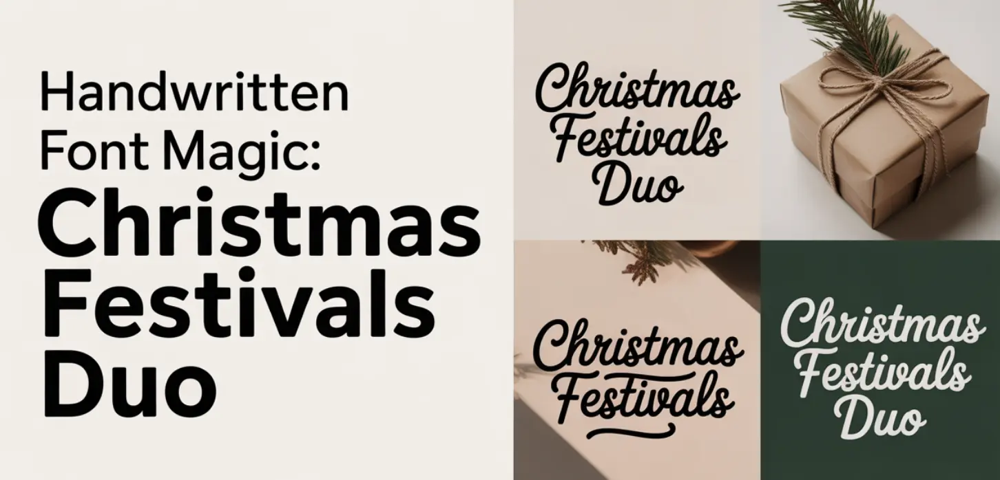
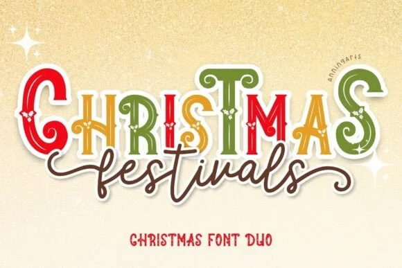
Christmas Festivals Duo: Two Looks, One Harmonious Hand
This duo pairs an expressive script with a friendly sans, so you can stack headlines and subheads that feel like they belong together—no guessing, no font roulette at 2 a.m. The script handles emotional beats: greetings, hero lines, punchy callouts.
The companion sans keeps details crisp for dates, addresses, prices. Kerning feels dialed, weight contrast stays readable at small sizes, and the forms avoid that over-curly “novelty” trap that tanks usability.
You’ll get multilingual support, clean nodes for plotters, and files that won’t choke your layout app. Seasonal? Yes. Locked to December? Not at all—swap palettes and it turns cozy-modern any month.
Why This Product?
- Coordinated Script + Sans Pairing For Instant Hierarchy
- Smooth Curves And Clean Nodes For Print, Web, And Cricut
- Readable At Small Sizes; Headlines Still Pop
- Multilingual Support For Global Projects
- OpenType Goodies For Natural Letter Flow
- Commercial-Friendly Use Cases For Brands And Sellers
I like fonts that don’t fight me. This one spaces well right out of the box, which saves kerning tinkering. The sans isn’t a throwaway; it carries layouts when the script takes a back seat, so you won’t need a third font.
And if you’re building quick mockups—social ads, story frames, gift tags—you’ll hit “export” faster because the pair already vibes. Less overthinking, more shipping.
Where To Use Christmas Festivals Duo? Sharp Ideas That Convert
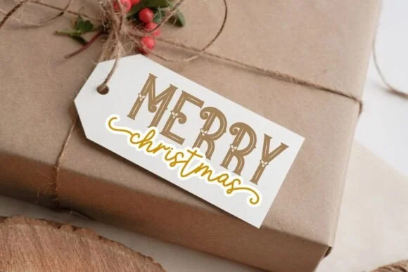
- Logos & Brand Identities – Pair script for the wordmark with sans for taglines to keep recognition high.
- Packaging & Labels – Candle jars, coffee bags, confectionery sleeves—warmth sells.
- Invitations & Stationery – Wedding suites, seasonal party sets, save-the-dates.
- Social Graphics & Ads – Stories, reels covers, carousels with crisp subheads.
- Ecommerce Thumbnails – Etsy, Shopify banners that read at tiny sizes.
- Signage & Merch – Pop-up booths, tote prints, mugs.
- Email Headers – Festive hero text that still scales on mobile.
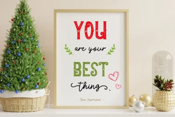
Design Tips For A Standout Handwritten Font Layout
Let the script lead with a short, punchy headline—three to five words—then let the sans do the explaining. Keep letter spacing tight on the script, slightly opened on the sans for table data or lists.
Use color contrast the way you’d season food: a little spice, not chaos. If your background is textured, add a soft shadow or stroke to protect legibility.
And for print, outline strokes, expand appearances, and check those nodes—clean vectors save you at the cutter.
Pairing, Colors, And Real-World Examples
Try script at 120–160 tracking, sans at 10–20 for clarity. Colors: deep pine with cream, cocoa with blush, or charcoal with icy blue—instant cozy without clichés.
Real projects: a bakery holiday box with script “Freshly Baked Joy” and sans ingredients; a boutique gift card set with script headlines and sans codes; a café window decal that reads from across the street. It’s all about that warm-first impression.
Quick Comparison: Handwritten Font Vs. Brush Or Calligraphic
A pure brush font swings wide, feels artful, sometimes gets messy in small sizes. Calligraphic sets skew formal and high-contrast. A balanced handwritten font like this duo sits in the sweet spot—personable but tidy.
If your brand voice is friendly, modern, slightly nostalgic, you’ll land the plane without drama. Minimalist brand? Use the sans more, script sparingly, done.
Workflow And File Prep
Keep a style sheet: sizes, weights, line heights. Define three use cases—hero, subhead, detail—and lock them. Export SVG with decimal precision at 2–3 for plotters; for print, convert text to outlines and merge overlapping shapes.
On web, preload the woff2, limit weights to two, and test on low-res displays. Consistency beats cleverness nine times out of ten.
Final Take
Looking for a handwritten font that feels human yet behaves nicely in layout? Christmas Festivals Duo nails that sweet spot. Grab it, set your hierarchy, and ship something warm today.