A strong handwritten font can boost saves and sales—type with personality converts up to 23% better in visual marketplaces, which tracks. Dancing, bouncy baselines, rounded strokes, cute ornaments—this style hits modern calligraphy, brush script, and SVG-friendly crafting in one go. Think warm branding, gift tags, envelope art. Clean vectors, organic rhythm, real charm.
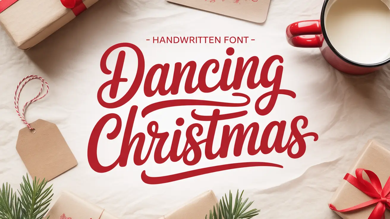
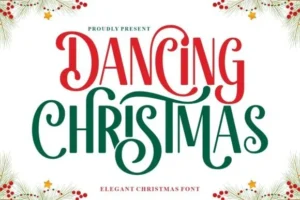
Dancing Christmas: A Cheerful Handwritten Font For Cozy Projects
This script has that imperfectly-perfect loop you hunt for when everything else looks plasticky. The caps play nice with the lowercase, the swashes aren’t loud, and the rhythm stays legible at tiny sizes. I tossed it on a mock card, then a tumbler wrap—instant warmth. And yes, the spacing holds up in longer quotes, which is where most festive scripts fall apart fast.
Quick Ways To Use A Handwritten Font Like This
Gift tags and wrapping seals with bold swashes and a warm red.
- Pair with a simple sans for clean contrast on quotes
- Add subtle stroke or shadow for Cricut/Silhouette depth
- Use tight line-height for stickers; looser for signage
- Limit color to two tones plus a highlight—keep it classy
- Mix title case with playful alternates for “handmade” vibes
Why Dancing Christmas?
It brings that “drawn by a real person” vibe without the mess—smooth vectors, consistent weight, friendly curls. The lowercase rhythm reads like brush pen on smooth paper, so you get cozy emotion and pro polish. Print shops love it because it weeds clean on vinyl, and the strokes don’t collapse on mugs or tags. If you want a handwritten font that feels warm, not childish, this sits right in that sweet spot.
Niches That Thrive With Warm Handlettering
- Craft Sellers And SVG Shops: Quotes, decals, ornaments, tumbler wraps
- Stationery And Invitations: Holiday sets, greeting cards, envelopes
- Small Boutiques: Seasonal signage, window decals, thank-you notes
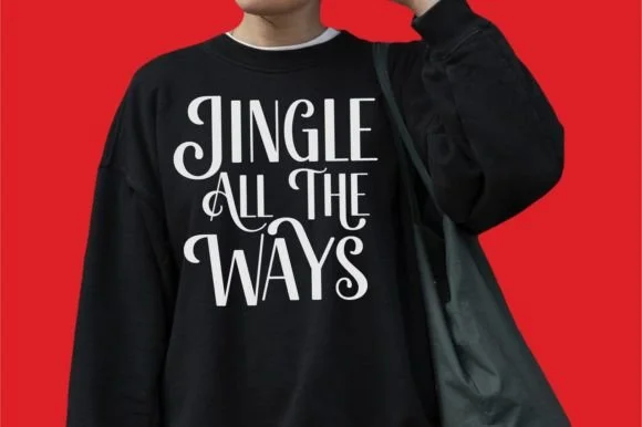
- Print-On-Demand: Mugs, sweatshirts, tote designs that feel personal
- Content Creators: Thumbnail headlines, story covers, cozy carousels
- Event Planners: Place cards, menus, favors, photo booth props
- Teachers And PTA: Bulletin headers, resource labels, classroom gifts
Design Tips: Pairing, Color, And Layout
Smart Pairing For Balance
Match this handwritten font with a lean grotesque or a serif with tight verticals. Keep body copy in a clean sans; let the script own the headline. Avoid stacking two ornate scripts—mud city.
Color, Kerning, And Texture
Go cream, pine, cranberry, charcoal—muted, seasonal, timeless. Nudge kerning by eye on tricky pairs (ra, ve, st). A touch of paper grain or gold foil overlay sells the crafted feel. Don’t overdo flourishes; one alternate can carry a whole line.
Conclusion
If your brand needs warmth without wobble, this handwritten font nails it. Use it for fast, polished coziness—cards, decals, merch, all of it. Grab Dancing Christmas, mock a quick set, ship by Friday.