Good halloween fonts do a weird little magic trick – they tell the whole mood before your illustration, color palette, or copy even gets a chance. At Increobox, we keep seeing the same thing in seasonal design work: swap the type, and the exact same pumpkin graphic suddenly feels cute, campy, vintage, or straight-up cursed. That matters if you’re building invites, shirt art, stickers, shop banners, classroom printables, or horror poster concepts and you want the headline to do real work.
This list pulls together 16 halloween fonts with very different energy – spooky script, pixel horror, skull-heavy display lettering, and softer handwritten styles for labels, Cricut files, invites, and social graphics. Some lean loud. Some stay subtle, then sneak up on you. If you need halloween fonts free to test, easier alphabet ideas, or cleaner halloween typography design for client work, start here.
The content on this website was created with the help of AI.
Witch Mystery For Moody Halloween Fonts
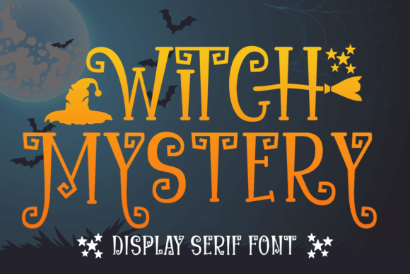
Witch Mystery feels like a spellbook note scrawled after midnight, messy in the best way. The strokes stay readable, which saves it from the fake-goth trap a lot of halloween fonts fall into, and the overall tone works for labels, invites, or shop graphics that want mystery without a wall of goo.
Best Places To Use It
- Spellbook Covers – Give faux magic journals a handmade, believable mood.
- Boutique Candle Labels – Add an occult edge to wax melts and seasonal scents.
- Tarot Workshop Flyers – Pull attention fast without looking cheap or noisy.
- Witch Market Signage – Make booth headers feel personal and on-theme.
Halloween For Sharp Party Poster Type
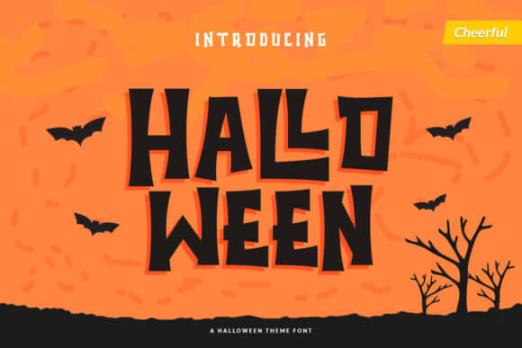
Halloween goes harder. It looks built for fast attention, the kind of chunky title you slap on a flyer or poster when nobody has time to squint. We’d skip it for long phrases, honestly, but for loud headers, promo art, and quick seasonal branding, it does the job with zero fuss.
Where This Font Hits Hard
- Haunted House Posters – Push event details with bold, easy-to-read impact.
- Event Ticket Headers – Make admission cards feel more dramatic right away.
- Flash Sale Graphics – Turn quick promos into proper October attention-grabbers.
- Snack Bar Boards – Help concession signs read from across the room.
Halloween Script For Spooky Handwriting
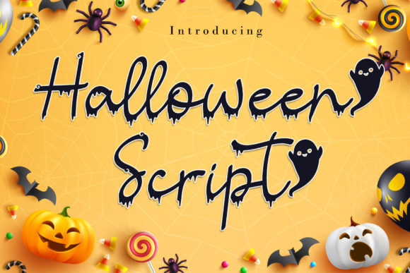
Halloween Script leans softer and more personal, like spooky handwriting instead of monster-movie yelling. That makes it handy when you want halloween fonts handwritten enough for names, invitations, decals, or small business packaging, but still polished enough to sit next to clean icons and tidy layouts.
Projects That Fit This Style
- Costume Party Invitations – Write names and dates with a more intimate vibe.
- Cupcake Topper Names – Keep dessert decor playful and custom-looking.
- Planner Sticker Kits – Add seasonal script without wrecking readability.
- Quote Card Sets – Dress short sayings in eerie, elegant strokes.
Halloween Font For Drippy Horror Headlines
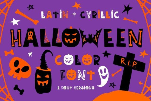
Halloween font looks drippy, rowdy, and a little feral. If you want polite typography, this is not it. We’d use it when the brief asks for blood, slime, scream energy, or over-the-top horror headlines, then balance it with plain body text so the design does not turn into a visual food fight.
Good Uses For The Look
- Slasher Movie Titles – Sell campy horror fast with messy, loud texture.
- Escape Room Branding – Turn a simple logo lockup into something tense.
- Horror Thumbnail Text – Grab clicks with big, theatrical headline energy.
- Fright Maze Banners – Push giant signage without losing the spooky joke.
Halloween – For Retro Seasonal Graphics
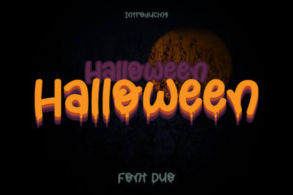
Halloween pulls the mood toward nostalgia instead of shock. It fits that retro October sweet spot, old candy ads, movie-night cards, handmade market signage, stuff like that. We like halloween fonts like this when a design needs charm first and darkness second, because not every project wants fake gore splashed across it.
Best Places To Drop It
- Vintage Candy Packaging – Echo old-store charm with less noise and more warmth.
- Fall Market Booth Cards – Help handmade goods feel seasonal, not generic.
- Retro Reel Flyers – Nail that old movie-night look in one move.
- Classroom Door Decor – Keep the theme festive without going grim.
Halloween Time For Cute October Crafts
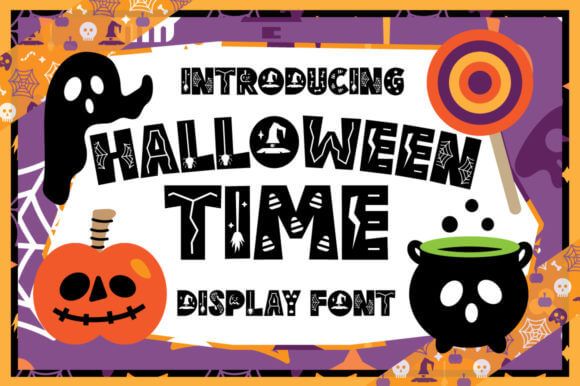
Halloween Time feels friendly right away. Rounded shapes and easy rhythm make it a smart pick for kid-safe crafts, family party pieces, and classroom work where spooky should stay fun, not nightmare fuel. IMO, this one earns its keep when you need quick readability on stickers, totes, or printable games.
Where It Feels Right
- Kids Party Invites – Keep the mood festive, bright, and easy to read.
- Teacher Activity Sheets – Dress up worksheets without distracting young readers.
- Family Photo Captions – Add charm to albums, cards, and memory boards.
- Trick-Or-Treat Tote Prints – Make simple bag art feel custom in minutes.
Halloween Secret For Witchy Display Text
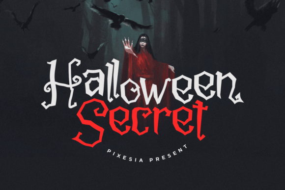
Halloween Secret brings the drama down and the mood up. It feels witchy, secretive, a bit luxe even, so it works well for feminine branding, mystical product labels, and short titles that need a soft occult vibe. We’d pair it with moon icons, muted oranges, dusty blacks, and lots of breathing room.
Projects That Need This Energy
- Moon Journal Covers – Give notebooks a polished mystical identity.
- Handmade Soap Sleeves – Add boutique magic to small product packaging.
- Dark Wedding Menus – Support elegant spooky themes without visual chaos.
- Crystal Shop Headers – Make store graphics feel curated and niche.
Gloomy Halloween For Dark Gothic Layouts
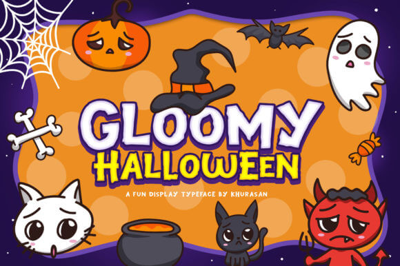
Gloomy Halloween does not flirt with cute. It pushes a darker gothic silhouette, and that makes it useful for poster work, bookish graphics, moody site headers, and cemetery-tour style visuals. When we want halloween fonts design that looks atmospheric instead of gimmicky, this sort of type usually wins.
Ideal Uses For Dark Layouts
- Gothic Blog Headers – Set the tone before the first sentence even lands.
- Cemetery Tour Posters – Make historical event promos feel richer and darker.
- Dark Book Covers – Support eerie fiction with a more literary finish.
- Moody Brand Ads – Add seasonal drama to fashion or beauty campaigns.
Scary Halloween For Loud Horror Branding
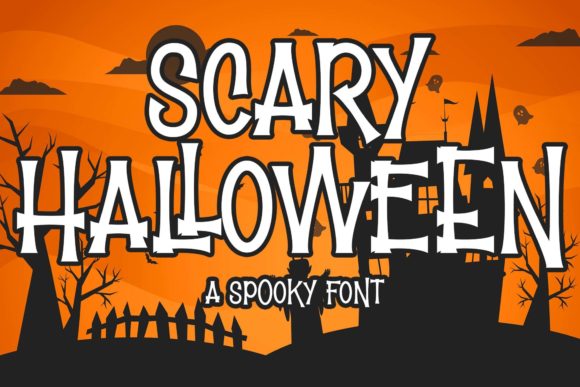
Scary Halloween lands exactly where the name says it will. The shapes shout, the energy bites, and the font reads best when you let it dominate the canvas for a second. Use it for bold horror branding, short teaser art, or merch where a calmer font would just feel asleep at the wheel.
Where This One Pops
- Fright Night Tees – Turn simple merch text into a stronger statement.
- Scream Room Tickets – Add urgency and rough energy to printed passes.
- Horror Trailer Cards – Push that trailer-title feel inside social promos.
- Game Stream Overlays – Build hype for spooky playthroughs and themed nights.
Halloween Cute For Playful Fall Designs
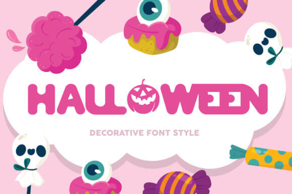
Halloween Cute goes the other direction and, thank goodness, it commits. This one feels sweet, playful, and slightly goofy, so it suits pastel spooky projects, kawaii merch, and family-friendly promotions that still want October flavor. If your audience loves ghosts more than gore, this is the safer bet.
Sweet Spots For This Font
- Kawaii Sticker Sheets – Pair well with smiling bats, ghosts, and candy art.
- Baby Bodysuit Prints – Keep seasonal apparel adorable, not intense.
- Sweet Shop Menus – Dress cupcakes and treats in a light spooky mood.
- Friendly App Banners – Add themed polish to kid-safe digital campaigns.
Halloween Skulls For Edgy Merch Art
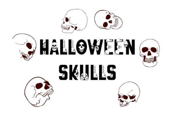
Halloween Skulls packs a sharper attitude. The skull theme gives it instant edge, which makes it useful for alt merch, tattoo-adjacent graphics, rock-bar flyers, and sticker packs that want to look rough without turning unreadable. We think it works best in short bursts, not dense text blocks.
Where The Skull Vibe Works
- Tattoo Flash Posts – Match bold artwork with type that feels equally tough.
- Alt Clothing Tags – Give fashion labels a darker seasonal punch.
- Rock Bar Flyers – Support gig promos with quick, gritty impact.
- Skull Sticker Packs – Keep pack covers cohesive with the theme inside.
Happy Halloween For Friendly Event Graphics
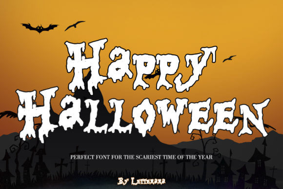
Happy Halloween feels open, upbeat, and made for community pieces. Use it when the job calls for smiles, pumpkins, treats, and neighborhood energy rather than haunted-house menace. For schools, bakeries, local events, and cheerful promo graphics, it keeps the season visible without scaring off the crowd.
Best Uses For Friendly Horror
- School Parade Posters – Promote events with fun, age-safe energy.
- Pumpkin Patch Signs – Add seasonal personality to outdoor wayfinding.
- Neighborhood Party Cards – Make invites feel warm and welcoming.
- Bakery Special Boards – Dress up cookies, pies, and treat menus fast.
Pumpkin Halloween For Cozy Autumn Labels
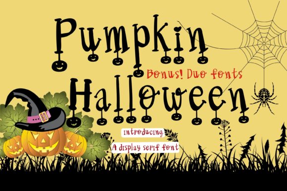
Pumpkin Halloween sits in that cozy lane between spooky and harvest. It looks great when a brand wants warmth, rustic texture, and autumn charm, especially on labels, recipe cards, market posts, or candle graphics. Honestly, this is one of the easier halloween fonts to blend with soft earth-tone palettes.
Cozy Projects For This Style
- Farm Stand Labels – Bring a handmade harvest feel to local goods.
- Candle Jar Wraps – Support seasonal scents with softer typography.
- Harvest Social Posts – Make promos feel snug instead of shouty.
- Recipe Card Headers – Add a fall touch to printable kitchen content.
Skull Halloween For Grim Poster Work
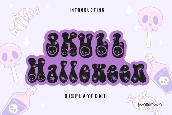
Skull Halloween feels heavier and darker than the playful skull stuff. It pushes more grit, more menace, and a cleaner poster-ready punch, which helps when you need bold cover art, bar-event graphics, or horror zine titles. Use it with restraint and it hits hard. Overuse it, and the whole layout groans.
Strong Fits For Grim Design
- Metal Merch Mockups – Pair well with louder apparel and sticker concepts.
- Dark Podcast Covers – Strengthen spooky episode art at a glance.
- Late-Night Bar Posters – Sell adult Halloween events with more bite.
- Horror Zine Titles – Anchor indie cover layouts with a grim voice.
Halloween People For Character-Led Titles
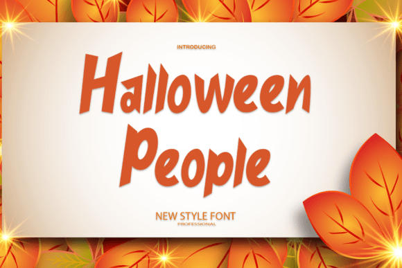
Halloween People adds personality through character energy, which is a nice break from plain letterform tricks. It suits costumes, activity sheets, playful merch, and themed graphics where the type should feel social, animated, almost theatrical. We like it when a project needs movement more than menace.
Where Character Fonts Shine
- Character Logo Concepts – Help mascots and themed brands feel more alive.
- Kids Activity Printables – Support games and coloring sheets with playful type.
- Photo Booth Props – Add more personality to quick party signage.
- Costume Crew Shirts – Keep group apparel fun and easy to spot.
Halloween Pixel For Retro Arcade Horror
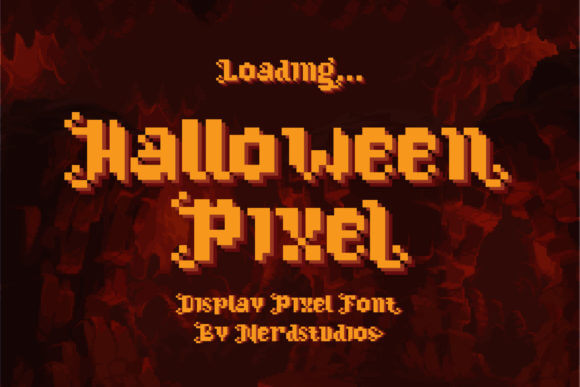
Halloween Pixel taps straight into 8-bit nostalgia. The blocky rhythm feels perfect for retro game streams, arcade-night invites, techy sticker packs, and horror art with a digital twist. If you want halloween fonts alphabet vibes that feel easy to draw, easy to spot, and weirdly charming, this one’s a blast.
Best Retro Uses
- Pixel Stream Screens – Match retro gameplay with on-theme title text.
- Arcade Party Invites – Push fun Halloween energy with old-school charm.
- Retro App Graphics – Add seasonal flavor to game and utility promos.
- 8-Bit Sticker Sets – Tie spooky icons together with consistent lettering.
Pick The Halloween Font That Feels Alive
Some halloween fonts scream with dripping chaos. Some whisper through crooked script, and honestly, that quieter stuff often wins because it gives your art room to breathe. Match the font to the job, not just the season. If one of these makes your poster, label, invite, or shirt graphic feel finished in ten seconds flat, grab it and build the rest of the design around that spark.