At IncreoBox, we treat halloween fonts like costume design for words. Type carries the mood before anyone reads the copy, and one rough edge can shove a plain flyer into creepy lettering territory fast. Most seasonal graphics still lean on the same tired blood-drip gimmick. Boring, honestly.
This set gives you sharper options – cracked display styles, pumpkin-friendly curves, gothic drama, playful handwritten shapes, and witchy details that actually work on posters, decals, Cricut cuts, party invites, packaging, shop banners, and social graphics. A clean headline can do half the branding work on its own, maybe more. We pulled 12 picks that cover loud, soft, retro, occult, and cute without slipping into cheap, so you can stop scrolling and start designing.
The content on this website was created with the help of AI.
Night Trimmer For Bold Halloween Titles
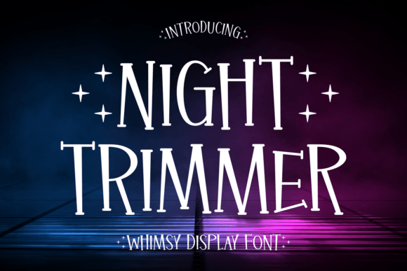
Among halloween fonts, Night Trimmer goes sharp and restless. We like it for spooky typography on posters, merch, and video covers where you want menace, not cartoon goo. It feels cleaner than the usual blood font, and weirdly, that makes it hit harder.
Best Places To Use It
- Haunted House Posters – Big titles that need bite.
- Shirt Graphics – Short slogans read well.
- Yard Signs – Sharp shapes stay visible.
- Video Covers – Adds instant horror tension.
Halloween Font With Classic Spooky Energy
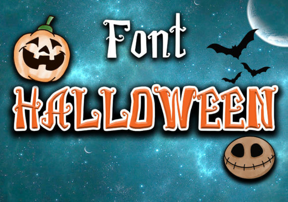
Some halloween fonts scream so hard they wreck the layout. This one leans classic instead – decorative, spooky, and flexible enough for flyers, treat tags, and seasonal promos. We’d use it for retro horror lettering when a design needs instant October flavor without sliding into tacky chaos.
Smart Projects For This Style
- Party Invitations – Classic seasonal mood.
- Flyer Headlines – Decorative but readable.
- Bake Sale Signs – Fun, not childish.
- Promo Banners – Good for quick campaigns.
Pumpkin Halloween Font For Cute Autumn Art
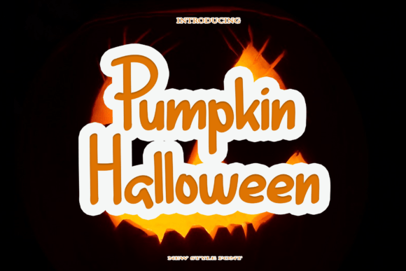
Pumpkin Halloween softens the mood right away. The curves feel friendly, almost storybook, which makes it handy for pumpkin patch promos, menu boards, and family event art where scary would be a bad call. For cute fall invites or craft labels, this one keeps the season playful and still on-theme.
Where This Font Shines
- Pumpkin Patch Ads – Friendly autumn energy.
- Family Event Cards – Cute without sugar overload.
- Craft Stickers – Great on small surfaces.
- Menu Boards – Soft seasonal charm.
Midnight Halloween Font For Gothic Layouts
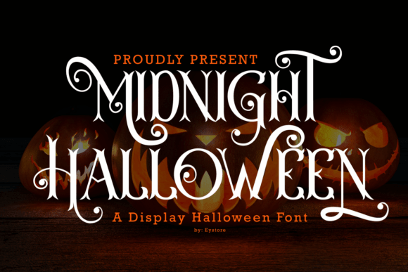
Midnight Halloween goes darker and slimmer, with a mood that suits moonlit posters, occult packaging, and dramatic cover art. We think it nails gothic headline design because it gives you tension without shredding legibility. No fake slime, no cheesy drips – just eerie control.
Best Design Fits
- Book Covers – Dark and elegant.
- Candle Labels – Strong occult vibe.
- Poster Series – Dramatic headline contrast.
- Website Hero Text – Reads with style.
Baby Halloween Font For Sweet Spooky Crafts
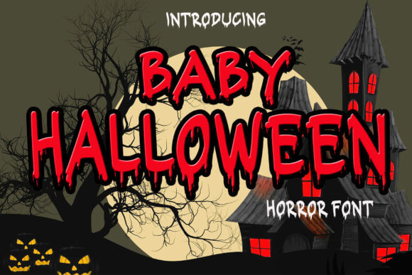
Baby Halloween sounds soft because it is. The letters feel rounded and sweet, so this font makes sense for toddler tees, school party printables, and calm seasonal cards where you want ghosts, not nightmares. For kids party crafts, it solves that annoying gap between plain and overly scary.
Cute Uses That Work
- Kids Invitations – Gentle spooky tone.
- Teacher Printables – Friendly classroom fit.
- Baby Tees – Sweet seasonal quotes.
- Scrapbook Pages – Soft handmade look.
Spooky Halloween Font For Playful Party Design
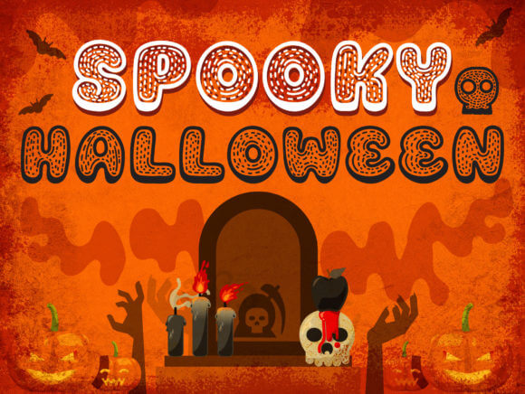
Spooky Halloween sits in the middle – lively, festive, a little goofy in the best way. We’d drop it onto sticker sheets, cupcake toppers, and quick promo posts when the brief wants energy fast. It’s a solid pick for playful halloween branding because it reads clearly and still brings that October mess.
Projects We’d Pair It With
- Sticker Packs – Fun, busy layouts.
- Cupcake Toppers – Pops at small sizes.
- Social Graphics – Fast festive headlines.
- Party Decor – Easy to mix with icons.
Demit Halloween Font With Sharp Horror Style
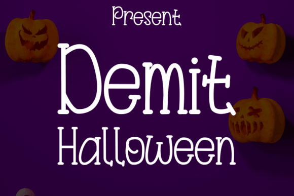
Demit Halloween looks more severe. The strokes feel sharper and more editorial, so it works when you want fear with a designer brain still switched on. For creepy poster text, trailer-style titles, or moody apparel graphics, this one carries tension without turning into a visual mess. Honestly, that’s rare.
Where It Hits Hard
- Film Posters – Cold, serious mood.
- Apparel Prints – Edgy statement text.
- Music Artwork – Great for darker releases.
- Editorial Covers – Stylish horror energy.
Halloween Skull Font For Creepy Poster Design
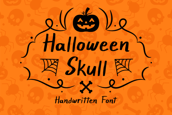
Halloween Skull leans straight into the theme, and yeah, that works because it does it with attitude. We’d use it on biker-event art, haunted attraction promos, or punchy badges where a rough emblem feel matters more than softness. If you need skull logo ideas with readable letterforms, this font pulls its weight.
Best Niches For This Look
- Haunted Event Logos – Strong themed mark.
- Biker Posters – Rough visual punch.
- Game Stream Panels – Bold niche branding.
- Badge Designs – Skulls feel intentional.
Halloween Crack Font With Broken Texture
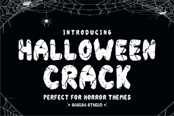
Halloween Crack brings texture first. The broken edges make short words feel damaged and old, almost like a sign ripped off a cemetery gate . . . which is fun, frankly. For cracked title effects on posters, game covers, or horror thumbnails, it adds grit fast without forcing you to stack extra distress filters.
Good Matches For This Texture
- Horror Thumbnails – Texture grabs fast.
- Escape Room Ads – Broken look sells the mood.
- Game Titles – Distressed and readable.
- Cemetery Sign Art – Fits eerie themes.
Mystic Halloween Font For Witchy Branding
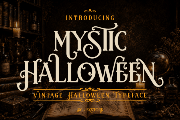
Mystic Halloween turns away from brute-force horror and leans witchy, ornate, and a touch magical. We like it for candle labels, tarot promos, and moon-soaked shop graphics where atmosphere beats shock value. For witchy shop graphics, it feels stylish, feminine, and weird enough to stay memorable.
Best Witchy Applications
- Tarot Branding – Mystical shop feel.
- Crystal Labels – Decorative and clear.
- Moon Event Flyers – Elegant witchy mood.
- Spell Book Covers – Thematic without clutter.
Trick Or Treat Font For Party Graphics
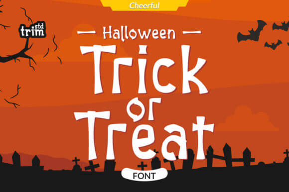
Trick Or Treat feels cheerful and direct, which makes it useful for the projects people actually print in a rush – candy signs, classroom sheets, party boards, and favor tags. We’d choose it for trick or treat signage when legibility matters but plain sans text would kill the vibe. Simple, good, done.
Fast Wins For This Font
- Candy Bar Signs – Easy to read fast.
- Classroom Boards – Friendly festive tone.
- Favor Tags – Works on tiny text blocks.
- Neighborhood Events – Cheerful public style.
Fall In Halloween Font For Cozy Seasonal Projects
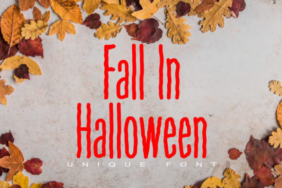
Fall In Halloween mixes autumn warmth with spooky flavor, so it fits the softer end of seasonal design. Think boutique labels, mug quotes, porch décor cards, and homemade gift wraps. For cozy spooky packaging, this font gives you October mood without going full haunted basement, and sometimes that’s exactly the move.
Where We’d Use It
- Boutique Packaging – Warm autumn feel.
- Mug Quotes – Cozy seasonal merch.
- Porch Decor Cards – Soft spooky messaging.
- Gift Wrap Labels – Charming handmade finish.
Pick The Font That Fits The Mood
If you need halloween fonts that feel less generic and more usable, this set gives you cute, cracked, gothic, playful, and witchy options without the usual junk. We’d start with Night Trimmer for punch, Mystic Halloween for occult vibes, and Baby Halloween for softer craft work. Grab a few, test them on real layouts, and trust your eyeballs – the right headline shows itself fast.