Choosing the right halloween fonts sounds tiny, until your poster, shirt, party invite, or shop banner falls flat because the letters feel wrong. Cute artwork paired with dull type, or a scary concept wrecked by a font that looks like it wandered in from a baby shower. Good halloween typography does the heavy lifting fast. It sets mood, hints at genre, and makes even plain words hit harder.
This roundup pulls 20 halloween fonts that cover witchy handwriting, grunge texture, retro display styles, spooky lettering, and cleaner options for Cricut crafts, flyers, logos, packaging, and social promos. Some lean playful, some go full haunted-house chaos, and a few work shockingly well when you need halloween fonts free for last-minute design jobs. If you want halloween fonts alphabet ideas, blood-drip drama, or a softer witch font vibe, you’re in the right messy little corner.
The content on this website was created with the help of AI.
Halloween Witch Font With Witchy Handwritten Charm
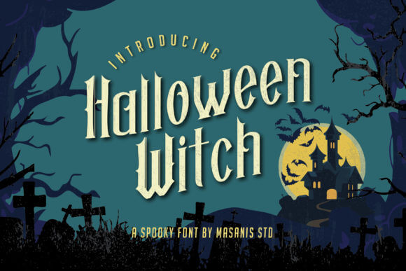
Halloween Witch leans playful, curly, and a bit chaotic – the good kind. If you like halloween fonts that feel hand-drawn instead of stiff, this one slides nicely onto mugs, treat tags, shirt graphics, and cozy fall packaging. We’d reach for it when a design needs spooky branding with charm, not fake-blood overload.
Best Projects For This Font
- Treat Bag Labels – Adds a handmade witchy vibe fast.
- Kids Party Invites – Feels fun, not intense.
- Candle Packaging – Great for small seasonal drops.
- Fall Quote Prints – Cute enough for wall art.
The Spooktacular Halloween Bundle Vol 01 For Mixed Projects
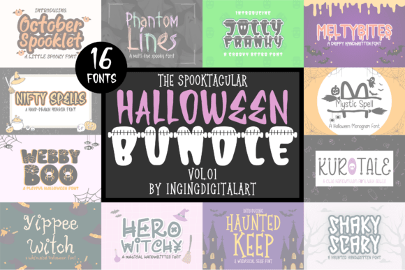
The Spooktacular Halloween Bundle Vol 01 is for the indecisive among us, which honestly means most designers by week three of October. You get range – cute, eerie, loud, maybe a little retro – so you can build matching campaigns without starting from zero each time. For busy shops and creators, smart font bundles save a ridiculous amount of time.
Where This Font Works Best
- Shop Launch Kits – Mix styles across one campaign.
- Seasonal Email Headers – Keeps promos varied.
- Sticker Sheet Packs – Easy style switching.
- Multi-Event Branding – Covers cute to creepy.
Preppy Halloween Font For Cute Trend-Led Crafts
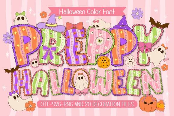
Preppy Halloween feels trend-forward and sweet, like ghost season got a pink makeover and didn’t apologize for it. We think it works best when you want halloween fonts that stay fun, polished, and light enough for younger audiences or soft aesthetic brands. It’s a solid pick for cute classroom crafts, sticker drops, and boutique apparel.
Smart Uses For This Style
- Classroom Decor – Bright and friendly.
- Teen Apparel – Fits trendy seasonal tees.
- Planner Covers – Cute without feeling childish.
- Sorority Party Cards – Stylish and playful.
Halloween Night Font For Dark Poster Design
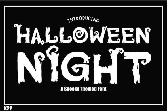
Halloween Night goes darker and moodier, closer to film-poster energy than party-store fluff. The shapes feel built for headlines, so short phrases, event names, and promo graphics land harder right away. When a project calls for night event posters or haunted-house marketing, this one doesn’t mess around.
Best Projects For This Font
- Haunted House Flyers – Strong dramatic title work.
- Movie Night Posters – Feels cinematic fast.
- Bar Event Graphics – Dark and readable.
- Web Banners – Grabs attention quickly.
Halloween Grunge Font With Rough Texture
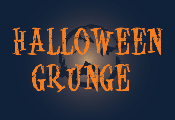
Halloween Grunge looks scraped up, weathered, and gloriously imperfect. Clean layouts can feel bland with spooky themes, and this font fixes that fast by adding friction, texture, and a little dirt to the page. We like it for makers who need distressed label design, band art, or vintage-feeling packaging that shouldn’t look too polished.
Where This Font Works Best
- Vintage Labels – Adds instant wear and grit.
- Band Posters – Loud without trying too hard.
- Coffee Bag Sleeves – Great for autumn editions.
- Rustic Signage – Feels rough in a good way.
Spooky Halloween Font For Playful Haunted Graphics
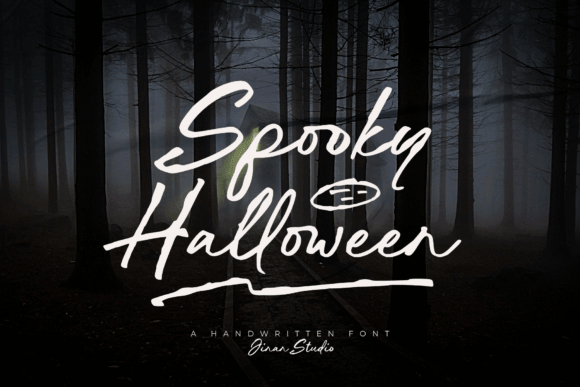
Spooky Halloween sits in that sweet spot between friendly and eerie, which is harder to find than people admit. The letterforms feel readable at a glance, so you can use them across cover images, promo cards, and quick seasonal posts without losing clarity. For fast haunted social graphics, this one behaves.
Smart Uses For This Style
- Social Post Covers – Clear at small sizes.
- Reel Title Cards – Feels seasonal, not chaotic.
- E-Card Graphics – Friendly spooky mood.
- Community Event Ads – Readable and fun.
Infectious Halloween Font With Zombie Energy
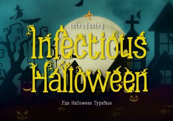
Infectious Halloween sounds gross, and yeah, that’s the point. This style brings drippy, infected, almost zombie-movie energy that works best when you want tension on sight and zero cuteness. We’d throw it onto horror game covers, escape-room art, or brutal teaser graphics where subtlety would just be weird.
Best Projects For This Font
- Escape Room Ads – Pushes suspense fast.
- Zombie Stream Graphics – Great for horror vibes.
- Game Splash Screens – Built for drama.
- Dark Merch – Looks intentionally nasty.
Halloween Party Font For Bold Invite Layouts
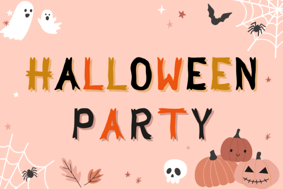
Halloween Party is loud in a useful way. It grabs attention fast, stays readable, and feels built for invites, promos, and any design that needs to say fun first, scary second. If you’re making party invitation templates or printable decor packs, this font does the heavy lifting without turning messy.
Where This Font Works Best
- Birthday Invites – Bold and friendly.
- Event Tickets – Clear in small spaces.
- Printable Banners – Big, festive energy.
- Snack Table Signs – Cute and readable.
Happy Halloween Font For Bright Seasonal Merch
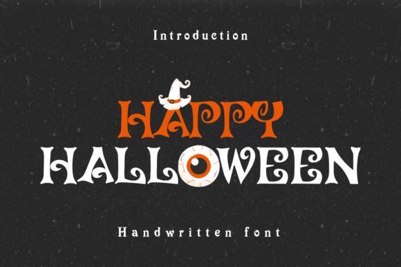
Happy Halloween takes a brighter route and, honestly, that’s a relief after pages of gore fonts. It fits family events, classroom handouts, candy packaging, and cheerful craft files where the mood needs to stay upbeat. For shops selling cheerful seasonal merch, this one feels easy to use and easy to love.
Smart Uses For This Style
- Kids Merch – Sweet and safe-looking.
- School Handouts – Keeps the vibe light.
- Candy Bag Toppers – Very giftable.
- Family Event Posters – Bright and simple.
Halloween Wizard Font With Magical Display Style
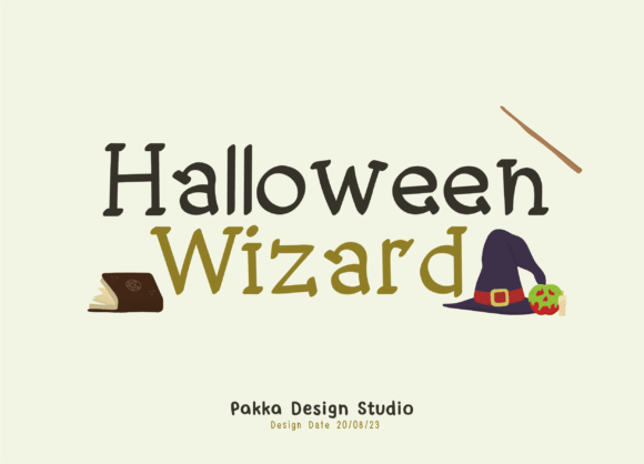
Halloween Wizard pulls the theme toward magic instead of monsters. The vibe feels storybook, spellbound, a little theatrical – perfect when your design needs mystery with elegance still intact. We like it for fantasy book titles, potion labels, and event graphics that want stars, moons, and proper sorcery energy.
Best Projects For This Font
- Book Covers – Feels magical fast.
- Potion Labels – Great for themed packaging.
- Fantasy Menus – Adds a mysterious twist.
- Workshop Ads – Ideal for occult events.
Witch Halloween Font For Spell-Casting Looks
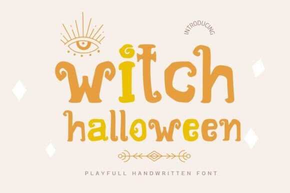
Witch Halloween has that boutique occult feel – soft enough for lifestyle products, strong enough for headlines. It works when you want witchiness without going full cliché skull pile, and that balance matters more than people think. We’d use it on witch shop signage, candle wraps, and mystical quote prints.
Where This Font Works Best
- Candle Labels – Cozy and mystical.
- Boutique Logos – Nice for niche shops.
- Tarot Social Posts – Strong but soft.
- Moon Prints – Great for art sellers.
Halloween Carve Font Inspired By Pumpkin Cuts
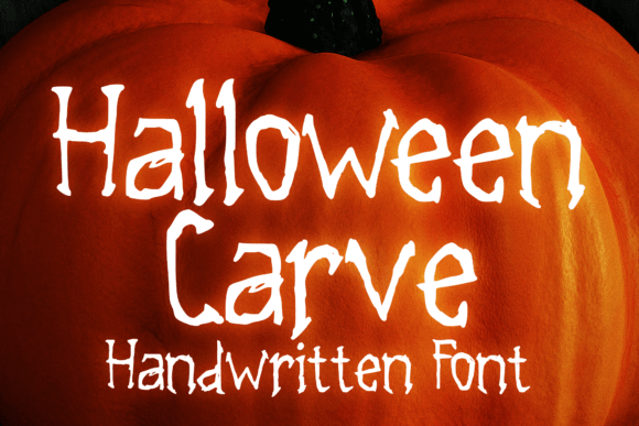
Halloween Carve feels sharp and cut-out, like the letters were sliced right into a pumpkin shell. That makes it handy for handmade projects where you want a crafty look but still need clean readability in the alphabet. It’s an easy win for pumpkin carving stencils, yard signs, and DIY sets that need instant October texture.
Smart Uses For This Style
- Carving Templates – The theme writes itself.
- DIY Workshop Sheets – Very approachable style.
- Porch Signs – Reads well from a distance.
- Printable Alphabets – Great for home crafts.
Halloween Sparkle Font For Glam Spooky Projects
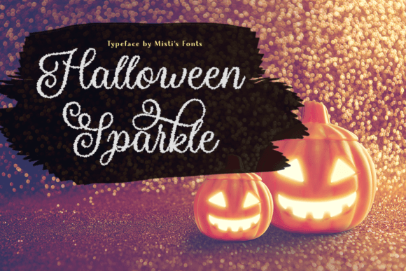
Halloween Sparkle proves spooky design doesn’t always need dirt, slime, or fake scratches everywhere. This one leans bright, shiny, and festive, which is great for softer brands, glam party sets, or projects that mix witches with glitter and don’t care who rolls their eyes. Perfect for glittery planner stickers and cute product promos.
Best Projects For This Font
- Planner Stickers – Sweet and decorative.
- Glam Invites – Fits sparkly party themes.
- Beauty Promo Posts – Works for chic brands.
- Girls Night Decor – Fun without feeling cheesy.
Halloween Nightmare Font For Horror-Heavy Artwork
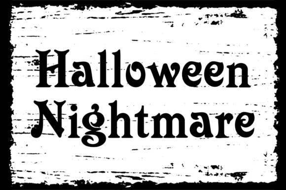
Halloween Nightmare goes harder. The mood feels tense, cinematic, and a little unhinged, so short headlines hit best and longer paragraphs can just sit this one out. We’d save it for haunted movie thumbnails, scream-worthy posters, and dark campaign art that wants a proper horror edge.
Where This Font Works Best
- Trailer Art – Built for drama.
- Horror Thumbnails – Big impact, fast read.
- Podcast Covers – Dark and memorable.
- Teaser Ads – Strong tension in one line.
Creepy Halloween Font For Eerie Statement Pieces
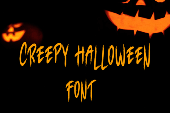
Creepy Halloween lands right in the middle of usable and unsettling. It has enough character to feel eerie, but it doesn’t become unreadable nonsense once you scale it down, which is a small miracle in this niche. That balance makes it strong for creepy t-shirt designs, mugs, and spooky giftables.
Smart Uses For This Style
- T-Shirt Graphics – Great headline energy.
- Mug Quotes – Holds up at small sizes.
- Sticker Packs – Fun with a dark edge.
- Giftable Merch – Easy to style quickly.
Halloween Font 1654 For Classic October Headlines
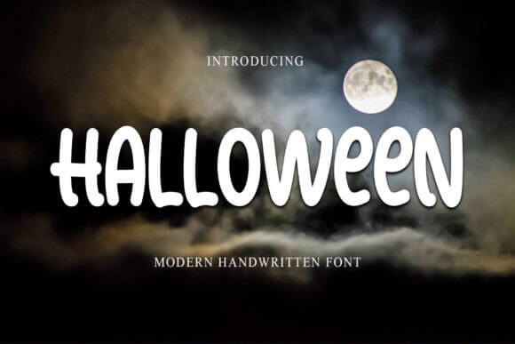
Halloween 1654 feels classic, straightforward, and versatile – the font you grab when you need the season without extra theatrics. Some projects just want solid spooky mood and readable letters, end of story. This one works nicely on spooky scrapbook pages, memory books, and everyday October printables.
Best Projects For This Font
- Scrapbook Titles – Clean seasonal mood.
- Memory Albums – Easy to pair with photos.
- Classroom Worksheets – Readable and themed.
- Party Tags – Simple and useful.
Fantasia Halloween Font With Whimsical Magic
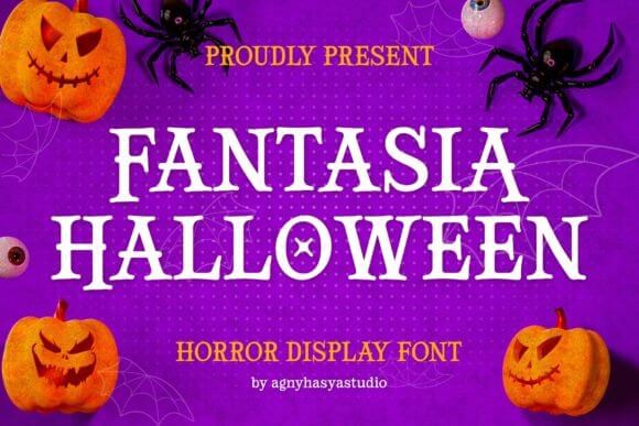
Fantasia Halloween brings whimsy into the room and sort of floats there, grinning. The shapes suggest magic, fantasy, maybe a bit of fairy-tale darkness, so it suits designs that want wonder before fear. We think it shines on whimsical tarot packaging, story promos, and dreamy seasonal branding.
Where This Font Works Best
- Tarot Boxes – Mystical and playful.
- Bookish Merch – Great for fantasy fans.
- Story Blogs – Adds a dreamy hook.
- Gift Cards – Magical without clutter.
Halloween Night Party Font For Club Flyer Drama
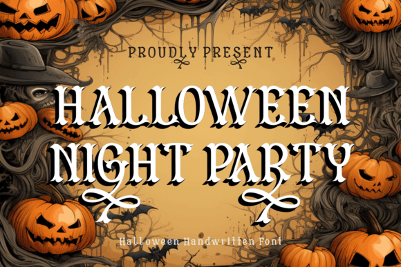
Halloween Night Party feels built for loud nightlife visuals – flyers, screens, headers, quick promos, the lot. The tone is energetic rather than delicate, so it handles bold color, layered effects, and crowded layouts better than sweeter script fonts do. For punchy club flyer typography, it’s a very safe bet.
Smart Uses For This Style
- DJ Flyers – Strong nightclub vibe.
- Venue Screens – Reads big and bright.
- Ticket Graphics – Good for fast info.
- Promo Stories – Punchy seasonal energy.
Halloween Font 1880 For Moody Gothic Styling
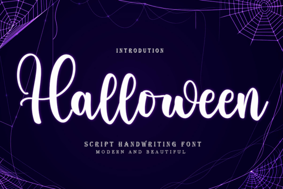
Halloween 1880 reads moodier and more gothic to us, the kind of style that looks great with black backgrounds, muted orange, and old-paper textures. If you want halloween fonts that don’t scream cartoon, this one has more restraint and more bite. It’s a strong fit for gothic quote prints, journals, and darker editorial-style graphics.
Best Projects For This Font
- Journal Covers – Quiet but atmospheric.
- Quote Art Prints – Looks strong in frames.
- Gothic Blogs – Nice for title graphics.
- Editorial Layouts – Mature spooky tone.
Spider Halloween Font With Webbed Character
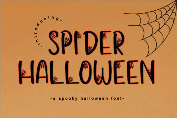
Spider Halloween leans into webs, tension, and that skittery little edge people either love or absolutely hate. Good – strong themed fonts should pick a side. We’d use it when a design needs unmistakable spiderweb logo concepts, creepy badges, or Halloween headers that snap into focus fast.
Where This Font Works Best
- Logo Badges – Distinct themed identity.
- Window Decals – Reads well on glass.
- Web Headers – Sharp seasonal hook.
- Contest Signs – Instant spooky cue.
Our Final Take
The best halloween fonts don’t just decorate words – they set the whole mood before anyone reads a thing. Some of these feel sugary, some feel feral, and that’s exactly why a mixed list matters. Grab the ones that fit your brand, test them on a headline, and keep a few seasonal design assets ready before October chaos kicks the door in.