Halloween fonts can flip a design from flat to unforgettable in a blink. A jagged headline sells a haunted flyer fast. A bubbly retro script softens a shirt graphic. A drippy display face screams candy slime, horror nights, and goofy October fun before anyone even reads the words. That is why we pulled 17 styles covering spooky writing, cute lettering, gothic moods, retro party energy, and clean display options for shirts, stickers, mugs, invites, packaging, and promo posts.
If you keep hunting for a halloween fonts alphabet that feels usable, not just weird for weird’s sake, this list should help. We point out where each pick works, where it can flop, and what kind of project it suits best, from horror typography and classroom printables to small business branding and seasonal merch. No fluff. Just solid fonts with real design jobs to do.
Spooky Halloween Font For Eerie Display Work
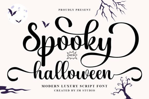
Spooky Halloween leans scratchy and theatrical, so it grabs attention fast without turning into unreadable mush. We like it for seasonal typography that needs instant mood on banners, tags, or punchy product mockups.
It is loud, yes, but not chaotic. That balance matters when you want eerie energy and still need people to read the headline from three steps away.
Good Places To Use It
- Haunted Event Posters – Big titles stay readable and moody.
- Trick Bag Stickers – Adds a spooky pop to candy packaging.
- Window Sale Headers – Pulls attention in seasonal storefronts.
- October Email Banners – Gives promos instant Halloween tone.
Groovy Halloween Font With Retro Party Energy
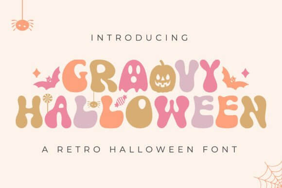
Groovy Halloween skips gore and brings warm, bouncy curves that feel lifted from an old party invite. If your brand likes vintage party branding, this one keeps October fun instead of grim.
It shines on shirts, stickers, and social headers where a soft retro rhythm beats fake blood every time.
Best Project Matches
- Disco Costume Invites – Retro curves suit fun announcements.
- Throwback Tee Prints – Feels easy on casual apparel.
- Candy Bar Wraps – Adds playful nostalgia to packaging.
- Photo Booth Signs – Keeps props lively and readable.
Mitoos Halloween Font For Playful Spooky Crafts
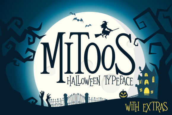
Mitoos Halloween feels handmade and a little odd, in a good way. The letters carry playful spooky lettering energy that works for kid-friendly crafts, printable packs, and casual decor.
We would not force it onto a brutal horror poster. For cute chaos, though, it lands.
Where It Looks Natural
- Kids Activity Sheets – Makes simple pages feel more festive.
- Cute Planner Stickers – Fits tiny labels and fun icons.
- Handmade Gift Tags – Adds charm without overdesigning.
- Homeschool Decor Cards – Keeps seasonal lessons friendly.
Slime Drip Halloween Font With Oozy Horror Vibes
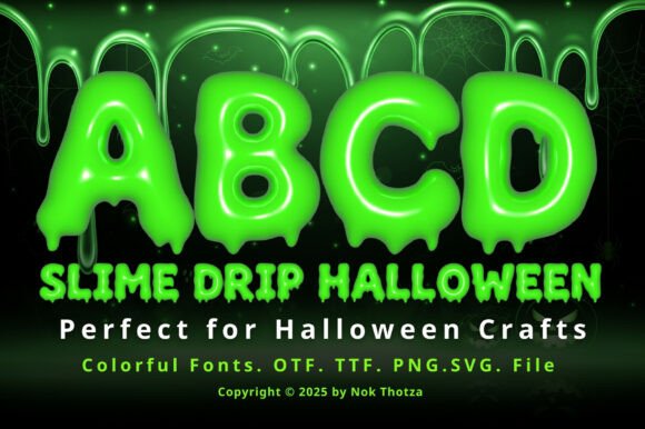
Slime Drip Halloween does exactly what the name promises – gooey, loud, and shameless. Use it when horror headline design needs motion, mess, and that cheap-creepy B-movie kick.
Keep the text short. Big titles, sticker words, and poster openers suit it way better than long copy.
Smart Uses For The Slime Style
- Slasher Promo Cards – Brings instant gross-out energy.
- Escape Room Openers – Helps titles feel tense and weird.
- Monster Slime Labels – Perfect for novelty packaging.
- Toxic Drink Menus – Adds nasty fun to themed events.
Happy Halloween Font For Cute Seasonal Graphics
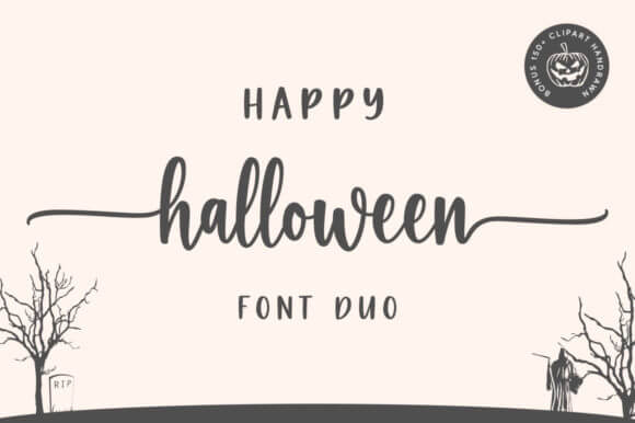
Happy Halloween feels friendly, round, and easy on the eyes. For cute October graphics, that matters, because cheerful seasonal products still need charm without looking bland.
Think family events, classroom decor, and gift tags. It keeps the mood festive, not scary.
Easy Wins For This Font
- Classroom Board Titles – Bright and readable for school decor.
- Family Bash Invites – Fits low-stress party themes.
- Pumpkin Coupon Cards – Works for small seasonal promos.
- Friendly Porch Signs – Adds warmth to home displays.
Peace Love Halloween Font With Chill Boho Flair
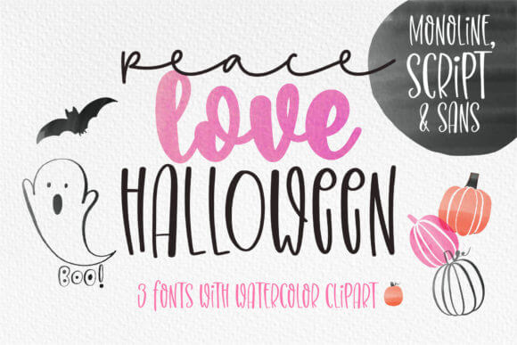
Peace Love Halloween brings retro softness with a mellow boho tilt. We reach for this kind of relaxed seasonal merch font when a spooky theme needs warmth and personality.
It suits sweatshirts, tote bags, and boutique promos more than haunted maze ads. Different lane. Better result.
Projects That Fit The Mood
- Boho Sweatshirt Art – Great for wearable autumn graphics.
- Boutique Tote Graphics – Feels casual and giftable.
- Wellness Pop-Up Flyers – Softens themed event marketing.
- Autumn Sticker Bundles – Plays nicely with cute icons.
Halloween Nurse Font For Dark Niche Merch
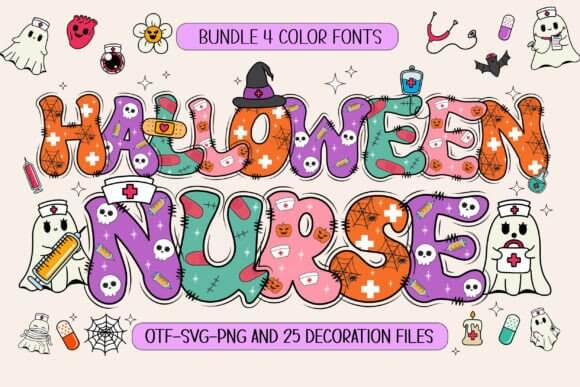
Halloween Nurse is niche, and honestly, that is the fun of it. If you sell costume tees or meme-ready designs, costume theme branding like this can feel specific enough to convert.
It will not fit every shop. For medical humor, party props, and novelty prints, though, it hits.
Best Niches For This Pick
- Nurse Costume Tees – Leans straight into themed apparel.
- ER Theme Decor – Adds character to party signage.
- Novelty Mug Quotes – Good for funny gift products.
- Medical Meme Packs – Feels tailored, not generic.
Little Spider Font For Creepy Cute Lettering
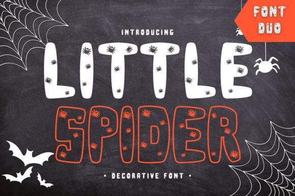
Little Spider feels creepy-cute instead of full horror. The name alone nudges it toward whimsical web lettering for invitations, scrapbooks, stickers, and kids’ seasonal projects.
We think it works best when you lean into tiny details, webs, doodles, and soft scares. Don’t overcook it.
Where The Spider Vibe Works
- Spider Web Invites – Makes themed cards feel playful.
- Scrapbook Chapter Titles – Adds cute seasonal texture.
- Tiny Product Hangtags – Reads well on small pieces.
- Kids Craft Posters – Keeps the mood light.
Halloween Font For Bold Haunted Headlines
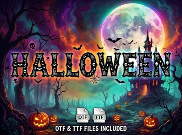
Halloween is the straight-ahead option in the bunch – bold, readable, and useful when you need haunted promo text that does the job fast. No gimmick circus, just solid display energy.
This is the sort of font you can drop into a sale banner, mug quote, or event graphic and keep moving. Easy.
Strong Fits For Everyday Use
- Haunted House Banners – Holds up at large sizes.
- Flash Sale Tiles – Works for quick retail promos.
- Spooky Mug Quotes – Keeps text clear on merch.
- Social Ad Covers – Good for direct seasonal messaging.
Halloween Font For Soft Vintage October Looks
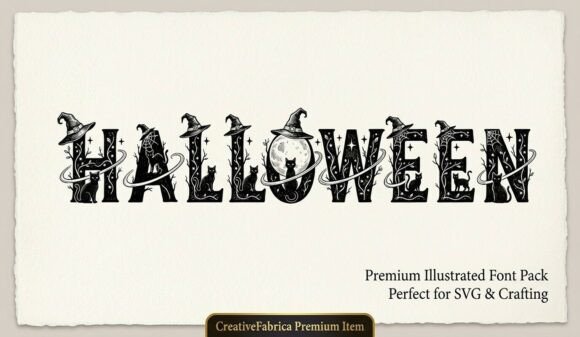
This Halloween font feels a touch more nostalgic, so it fits softer October campaigns better than high-drama horror art. For retro autumn display pieces, that calm tone can actually sell more.
Try it on market signage, candle labels, or cozy digital headers where you want fall mood with a spooky wink.
Where The Vintage Mood Lands
- Rustic Market Signs – Gives seasonal stalls a warm feel.
- Candle Jar Wraps – Looks right on handmade packaging.
- Cozy Blog Headers – Suits soft lifestyle branding.
- Nostalgic Photo Cards – Pairs well with warm imagery.
Mystery Halloween Font With Moody Gothic Pull
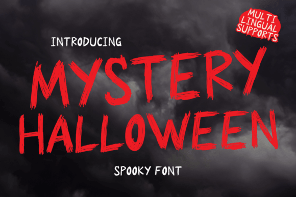
Mystery Halloween pulls darker and moodier, with enough drama for titles that need a secretive edge. We like it for gothic mystery branding and story-led visuals that need tension.
Subscription boxes, tarot nights, or escape game promos can use that shadowy vibe without feeling too theatrical.
Great Uses For Darker Work
- Mystery Box Logos – Helps products feel intriguing.
- Tarot Night Flyers – Adds moody event atmosphere.
- Gothic Fiction Covers – Suits dramatic title treatment.
- Escape Clue Cards – Builds suspense fast.
Scream Halloween Font For Loud Horror Posters
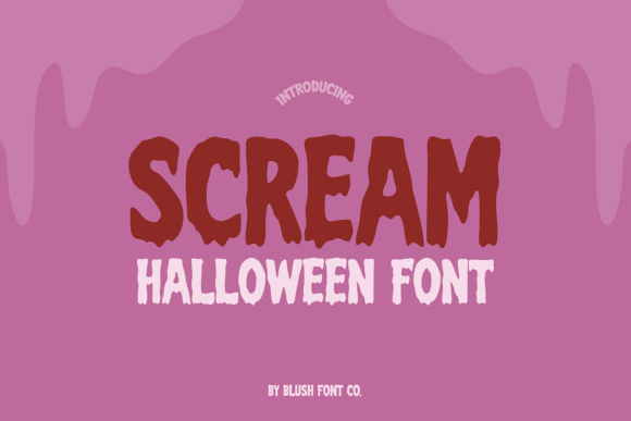
Scream Halloween goes loud, sharp, and a bit unhinged. That makes it solid for scary poster typography where you want immediate panic, not subtle atmosphere.
Use it sparingly and big. One killer line can work. Five stacked lines will look like a mess, fast.
Places It Hits Hard
- Slasher Film Titles – Pushes obvious horror energy.
- Thriller Stream Thumbnails – Stops the scroll quickly.
- Scream Room Posters – Reads well at distance.
- Fear Fest Wristbands – Adds attitude to event print.
Creepy Halloween Font For Uneasy Display Text
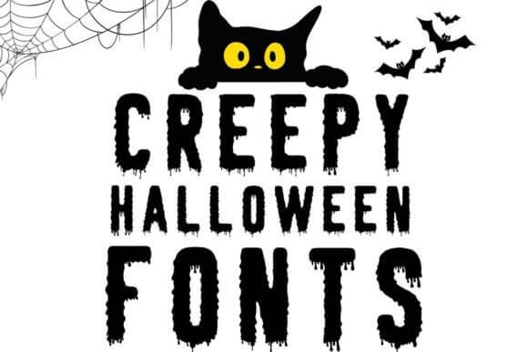
Creepy Halloween feels twitchy and uneasy, like the letters should not be standing still. That mood helps eerie label design feel more alive on stickers, prints, and spooky packaging.
We like it when a project needs discomfort, not gore. Different emotion, stronger result.
Best Spots For Uneasy Energy
- Potion Bottle Stickers – Sells the creepy detail fast.
- Ghost Tour Tickets – Adds haunted character.
- Dark Tote Graphics – Feels stylish, not childish.
- Haunted Label Sets – Great for printable packs.
Halloween Sadnight Font With Haunted Drama
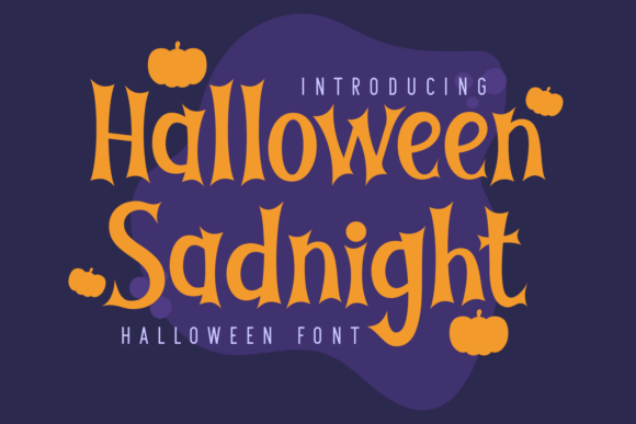
Halloween Sadnight brings gloom and drama, almost poetic in places. If you build moody night branding for darker seasonal art, this one has more feeling than the average novelty font.
It suits lyric posters, gothic quotes, and dreamy Halloween merch where sadness and beauty sit in the same room.
Projects With More Drama
- Midnight Playlist Covers – Pairs well with dark visuals.
- Gothic Quote Prints – Gives text emotional weight.
- Moonlit Brand Seals – Works for niche packaging.
- Poetry Zine Titles – Feels artsy and haunted.
Spooky Halloween Font For Rough Trick Art
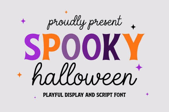
This Spooky Halloween font feels rougher and more distressed, which gives distressed halloween lettering a handmade punch. Great for trick signage, grunge tees, and louder promo art.
It is not polished, and that’s the point. Clean design can wait for November.
Where Rough Texture Helps
- Trick Gate Banners – Feels gritty and immediate.
- Distressed Hoodie Art – Strong fit for casual merch.
- Monster Yard Boards – Reads boldly outdoors.
- Grunge Deal Graphics – Adds edge to promos.
Halloween Pumpkin Font For Fall Market Designs
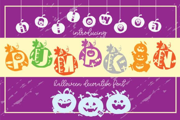
Halloween Pumpkin leans friendly and harvest-ready, so it bridges spooky and cozy without a fight. We like that for pumpkin patch design where families, shops, and markets need easy seasonal charm.
Bakery menus, label sets, and event boards all get mileage from that softer pumpkin mood.
Easy Uses For Pumpkin Season
- Pumpkin Farm Menus – Keeps signage clear and cute.
- Fall Bakery Labels – Fits sweet seasonal packaging.
- Jack-O’-Lantern Tags – Adds charm to product bundles.
- Harvest Fair Badges – Works for community events.
Halloween Season Font For Everyday October Branding
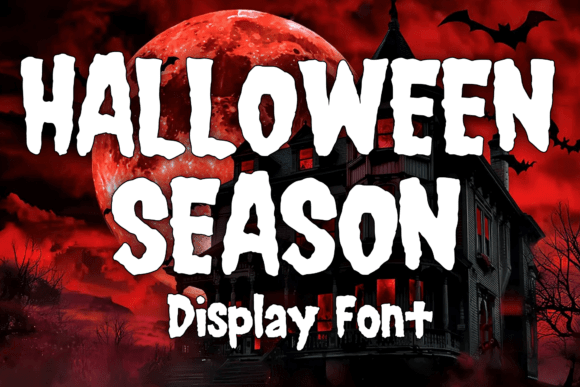
Halloween Season sounds broad, and that is actually useful. For brands that want october campaign fonts rather than one-night horror drama, this style feels flexible and easy to reuse.
It can carry newsletters, packaging, promos, and planner covers through the whole month without burning out.
Where It Can Carry A Campaign
- October Store Headers – Works across repeated promos.
- Monthly Planner Covers – Feels seasonal without overload.
- Seasonal Mailer Designs – Good for email and print.
- Cozy Spooky Packaging – Balances cute and festive.
Pick The Mood First, Then The Font
The best halloween fonts do one thing really well – they choose a mood fast. Some of these lean goofy, some go full horror, and a few sit nicely in that cozy October middle. Pick the vibe before the color palette, test readability at real sizes, then grab the font that earns its spot. Easy rule, better design.