Picking halloween fonts sounds easy until every option starts looking like the same drippy cliché. Some projects need creepy lettering, some need a cute handwritten twist, and some need a full halloween fonts alphabet that holds up on flyers, product labels, shirts, and printables without turning into mush. We sorted through 15 styles that cover that whole messy range – retro, witchy, bloody, playful, rough, and clean enough for real design work.
If you are building party invites, seasonal branding, classroom sheets, or fast social promos, the font usually sets the mood before color does. That is why we looked for halloween fonts free to download, strong headline shapes, usable numbers, and alphabets that still feel distinct when scaled up or squeezed down. A good spooky font should do more than look festive. It should sell the idea in one glance.
The content on this website was created with the help of AI.
Wicked Halloween For Vintage Horror Titles
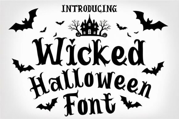
Wicked Halloween hits that old-movie nerve right away. The letterforms feel jagged, a little cursed, and perfect when you need vintage horror lettering that does not look generic. We’d use it for poster titles, haunted attraction ads, or shirt graphics where the headline has to carry the whole mood in one shot.
Best Uses For This Font
- Haunted Attraction Posters – Sharp titles that grab attention fast.
- Halloween T-Shirts – Big chest prints with instant mood.
- Event Cover Graphics – Strong for headers and promos.
- Video Thumbnails – Readable even at small sizes.
Halloween For Spooky Witch Poster Text
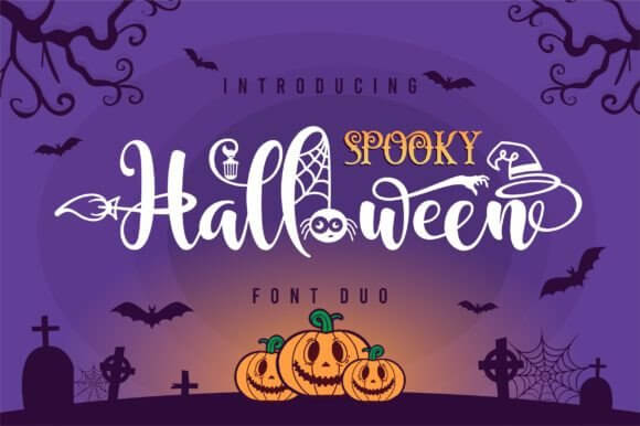
Halloween leans into a witchy vibe without going unreadable, which matters more than people admit. If you want spooky witch aesthetic text for invitations, candle labels, or classroom decor, this one keeps the charm and skips the visual chaos. It also works nicely when you need halloween fonts alphabet ideas that still print clean at smaller sizes.
Where This Style Fits
- Witch Shop Labels – Great for jars, oils, and soaps.
- Party Invitations – Adds magic without clutter.
- Classroom Decor – Seasonal but still readable.
- Candle Packaging – Pairs well with dark palettes.
Groovy Halloween For Retro Party Graphics
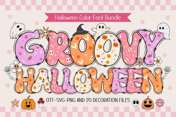
Groovy Halloween swerves away from gore and goes straight for retro fun. The curves feel warm, almost 70s, so retro Halloween typography lovers can build party invites, fall market signage, or social graphics that look festive instead of grim. Honestly, it is the kind of font that makes orange and purple palettes look way better.
Smart Places To Use It
- Retro Party Invites – Soft curves feel upbeat.
- Fall Market Signage – Friendly and easy to spot.
- Tote Bag Quotes – Fun for merch and gifting.
- Photo Booth Props – Great for playful short words.
Halloween Cat For Cute Spooky Branding
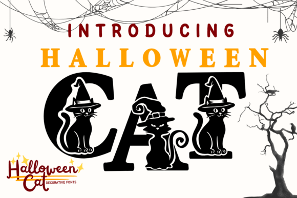
Halloween Cat is cute, but not babyish. That balance is gold when a brand needs cute cat lettering for stickers, pet boutique promos, trick-or-treat bags, or crafty packaging with a little mischief in it. We think this style shines on short words, names, and badges where the personality gets room to breathe.
Good Matches For This Look
- Pet Boutique Promos – Sweet with a sly edge.
- Sticker Sheets – Works well on tiny designs.
- Kids Treat Bags – Fun, not too spooky.
- Handmade Soap Labels – Adds charm to packaging.
Bones Halloween For Skeletal Display Text
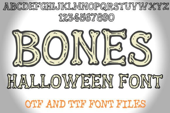
Bones Halloween goes all in on skeletal detail, and yeah, it looks bold as hell. Use it when bone-style display font energy matters more than subtlety – yard signs, spooky menu boards, event headers, or scrapbook titles. It is louder than most halloween fonts free options people grab first, which is exactly why it stands out.
Best Projects For Bones Halloween
- Yard Signs – Visible from a distance.
- Menu Boards – Perfect for themed specials.
- Scrapbook Covers – Adds instant Halloween texture.
- Escape Room Branding – Memorable and dramatic.
Halloween Nightmare Duo For Layered Headlines
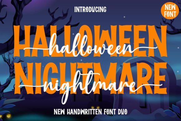
Halloween Nightmare Duo gives you a paired setup, so building a headline system feels faster and less annoying. For designers who need layered headline system options on flyers, merch, or themed landing pages, this one offers contrast without forcing weird font pairings. One style can scream, the other can support – easy win.
Where The Duo Shines
- Merch Collections – Strong for main and support text.
- Flyer Layouts – Easy hierarchy right away.
- Website Hero Banners – Big impact up top.
- Product Bundles – Useful for multi-font branding.
Dripping Blood Halloween For Gore Style Text
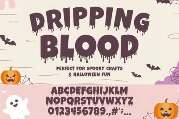
Dripping Blood Halloween does one thing and does it with zero shame. If the project needs blood drip text effect drama for horror covers, escape room promos, or movie-night posters, this font lands hard and fast. We would not use it for long copy, no chance, but for short blasts, giant names, and fake-gory merch, it rules.
Use It When You Want Shock
- Horror Book Covers – Loud and cinematic.
- Movie Night Posters – Instant gore signal.
- Haunted Maze Tickets – Strong for event names.
- Streaming Graphics – Great for quick title cards.
Spooky Halloween For Playful Seasonal Designs
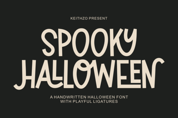
Spooky Halloween feels lighter and more flexible than the name suggests. It can handle playful spooky branding for handmade treats, classroom packs, seasonal stickers, or cute can labels without tipping into full horror territory. FYI, that makes it useful for people who want halloween fonts easy to read, draw from, and reuse across different products.
Great Picks For Soft Spooky Work
- Cookie Packaging – Friendly and seasonal.
- Teacher Printables – Fun for younger audiences.
- Seasonal Stickers – Works on small surfaces.
- Craft Fair Signs – Cheerful and inviting.
Halloween Font For Classic October Headlines
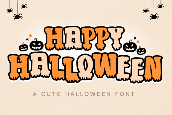
Halloween Font is the straightforward pick, and sometimes that is exactly what the job needs. Its familiar vibe suits classic Halloween display type on promo graphics, porch signs, printable decor, and quick client work when you do not want to overthink the headline. Simple, legible, a bit eerie – job done.
Clean Uses For A Classic Look
- Porch Signs – Easy to read outdoors.
- Printable Wall Art – Great for home decor packs.
- Retail Sale Headers – Fast seasonal update.
- Community Event Ads – Familiar and safe.
Spooky Boo For Fun Haunted Signage
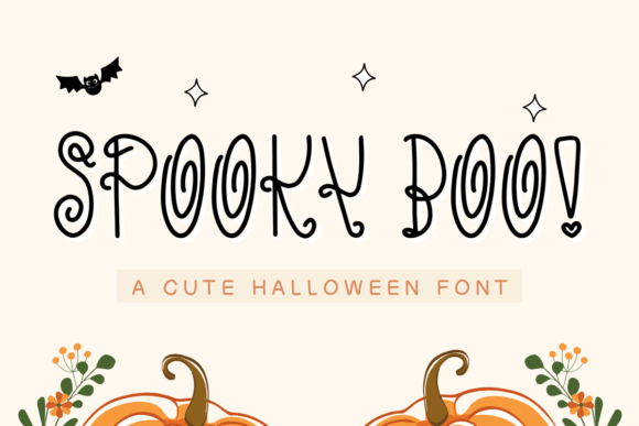
Spooky Boo has a cheeky, lighthearted bounce that works great for kid-friendly work. We like it for boo-themed signage, candy table cards, party packs, and names on shirts where a darker horror font would feel wrong. It also plays nicely with halloween fonts numbers for countdown boards, treat labels, and simple classroom sets.
Fun Projects For Spooky Boo
- Candy Buffet Cards – Cute and readable.
- Kids Shirts – Soft spooky energy.
- Cupcake Toppers – Great for short words.
- Countdown Boards – Works with numbers well.
Halloween Crayon For Messy Hand Drawn Type
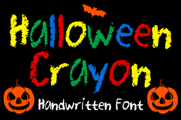
Halloween Crayon looks rough on purpose, like a hand-sketched note from a tiny monster. That messy texture makes crayon handwritten style projects feel more human – think school printables, activity sheets, coloring books, or DIY tags. Maybe not for polished luxury branding, obviously, but for crafty seasonal stuff it slaps.
Crafty Jobs It Nails
- Coloring Sheets – Perfect for playful pages.
- Activity Packs – Adds hand-drawn energy.
- DIY Gift Tags – Quick and charming.
- Homeschool Worksheets – Seasonal without fuss.
Happy Halloween For Bright Festive Copy
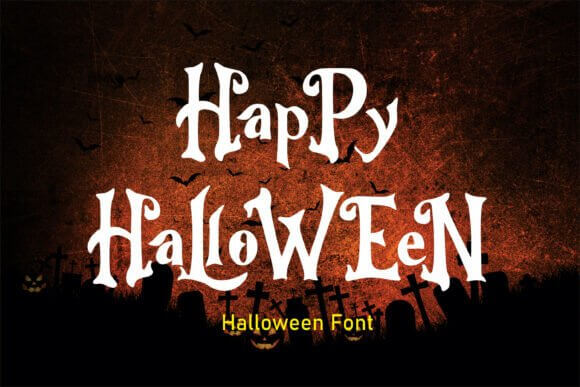
Happy Halloween brings a brighter mood, which can be weirdly hard to find in this niche. When you need cheerful seasonal script for bakery promos, greeting cards, market stalls, or social headers, it gives you October flavor without the doom and gloom. Cute sells too. People forget that a lot.
Bright Seasonal Uses
- Bakery Specials – Sweet and inviting.
- Greeting Cards – Warm seasonal feel.
- Vendor Booth Signs – Easy to spot.
- Social Headers – Happy, festive tone.
Spooky Halloween For Ghostly Statement Text
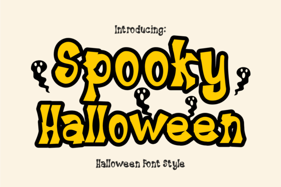
This Spooky Halloween version leans more dramatic and airy, so headlines feel bigger without turning chunky. We would reach for it when ghostly title lettering needs room on posters, invitation covers, or themed blog graphics. It has that floaty, haunted look that makes plain layouts feel alive in about five seconds.
Best For Airy Spooky Layouts
- Invitation Covers – Elegant but eerie.
- Blog Hero Images – Great visual lift.
- Podcast Artwork – Strong at medium size.
- Window Decals – Nicely spaced lettering.
Another Halloween For Quirky Horror Layouts
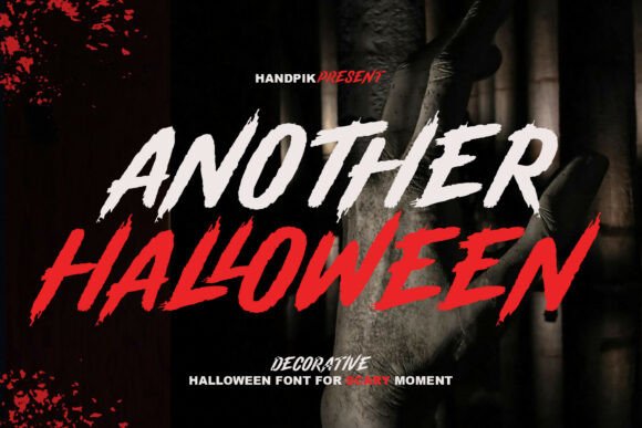
Another Halloween sounds casual, but the style can push a layout into weird, fun territory fast. If you want quirky horror headlines for maker markets, novelty products, themed cafes, or campaign graphics, this one keeps things offbeat and memorable. It is less polished, more character-driven – and honestly, that roughness is the point.
Where The Weirdness Works
- Novelty Mugs – Fun for short phrases.
- Themed Cafe Menus – Adds character fast.
- Market Banners – Strong from afar.
- Promo Reels – Good for animated text.
Halloween Letter For Sketchy Alphabet Looks
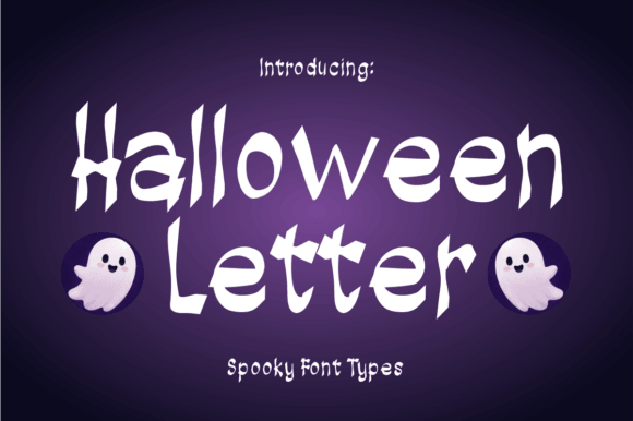
Halloween Letter works best when the alphabet itself becomes part of the design. For monograms, name art, classroom banners, and printable packs, sketchy alphabet art gives you that illustrated look people love in handmade seasonal projects. Great choice if you need halloween fonts alphabet letters with personality instead of plain filler.
Strong Uses For Alphabet Art
- Name Posters – Great for custom designs.
- Alphabet Printables – Fun learning material.
- Monograms – Strong decorative initials.
- Bulletin Boards – Adds handmade charm.
Choosing The Right Halloween Font
The best halloween fonts do not all scream the same thing, and that is the whole point. Some of these lean cute, some weird, some full-on horror, so your pick should match the job, not just the season. Grab one that fits your headline length, print size, and audience, then test it fast. When the letters click, the rest of the layout suddenly gets a lot easier.