We see it all the time at Increobox – one good typeface fixes a “meh” layout faster than a new color palette. Retro fonts work because they cheat a little: chunky curves, funky counters, loud rhythm, instant nostalgia . . . and your headline suddenly looks designed, not typed. Most viewers decide in seconds, so your poster fonts, vintage typography, and logo lettering can’t whisper. This list stays practical: quick vibe notes, where to use, and clean download links so you can build a retro font modern look (or go full disco) without spiraling for hours.
Retro Groovy Display Lettering For Retro Fonts
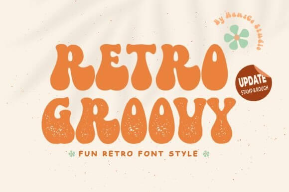
Soft, bouncy, and loud in a friendly way – this one screams retro font logo without trying too hard.
We’d pair it with a calm sans and let the headline do the dancing.
Best Places To Use It
- Beauty Brands – cheerful packaging text.
- Sticker Shops – punchy names, short phrases.
- Event Flyers – big titles, fast reads.
- Merch – tees, totes, little slogans.
Magic Retro Psychedelic Type For Retro Fonts
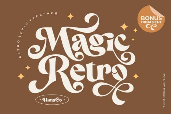
Wavy shapes, trippy mood, zero chill. This is retro font magic for posters that need attention now, not later.
Keep your spacing generous or it gets… dense.
Where This One Looks Right
- Music Nights – psychedelic poster headers.
- Art Markets – booth signs, price boards.
- Candle Labels – playful scent names.
- Reels Covers – bold thumbnails that pop.
Retro Butterfly – Whimsical Display Retro Fonts
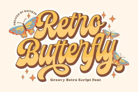
It lands in that sweet retro font aesthetic zone: cute but not childish, decorative but still readable.
Use it for short names, not paragraphs. FYI.
Great Fits For
- Journaling Prints – titles, mini quotes.
- Birthday Invites – headline + date.
- Kids Boutique – tags, shelf cards.
- Scrapbook Kits – themed word art.
Retro Notes Funky Headline Type For Retro Fonts
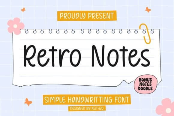
Snappy strokes and a steady rhythm make it easy to build retro font combinations with a plain serif or a clean grotesk.
It feels “designed” even at small sizes, which we love.
Where To Drop It In
- Podcast Covers – readable on small screens.
- Recipe Cards – bold section headers.
- Planner Pages – titles, tabs, dividers.
- Brand Guides – hero type for mood pages.
Retro Groovy – Bold Bubble Letters For Retro Fonts
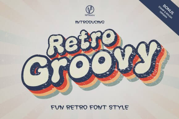
This is retro font bold energy – thick shapes, happy curves, and strong silhouette for quick branding wins.
IMO it looks best with tight color palettes, two or three tones.
Use Cases We’d Bet On
- Snack Packaging – loud flavor names.
- Mini Logos – icons + short wordmarks.
- Craft Fair Signs – price and promo text.
- Social Templates – punchy hooks.
Retro Music Display Type With Rhythm And Bounce
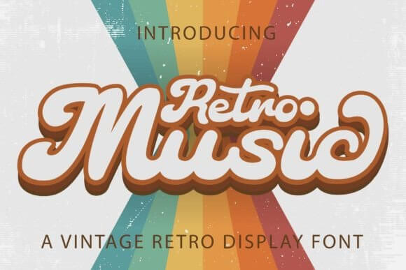
It feels like a record store wall, in the best way. Grab it when you need retro font design that reads like sound.
Pair with condensed body text and you’re done.
Where It Works
- Band Posters – tour titles, venues.
- Dance Studios – class names, schedules.
- Playlist Covers – bold headers.
- Vinyl-Themed Shops – signage, labels.
Toddler Retro Font Cute Chunky Letterforms
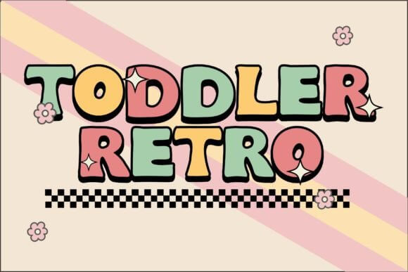
Playful without being messy, and that’s rare. When you need retro font ideas for kid-friendly branding, start here and stop overthinking.
It also prints clean, which saves your sanity.
Sweet Spots
- Kids Parties – invites, welcome signs.
- Teacher Prints – labels, classroom decor.
- Baby Milestones – monthly cards.
- Play Cafes – menus, wall quotes.
Retro Modern Clean Display Type With Vintage Edge
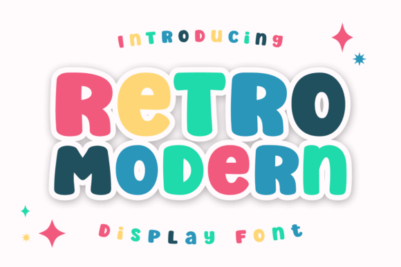
Clean lines, slight throwback, no costume vibes. This nails retro font modern for brands that want nostalgia without looking like a thrift store flyer.
Use it in UI graphics too, it behaves.
Best Project Matches
- Skincare Brands – minimal retro labels.
- Website Headers – hero text, banners.
- Lookbooks – section titles.
- App Promos – punchy ads.
Retro Doodle Hand-Drawn Retro Fonts For Fun
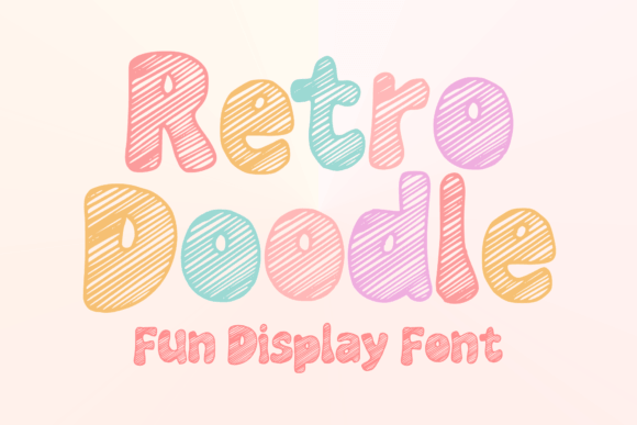
Loose, sketchy edges give instant personality. If you chase a casual retro font style, this one keeps things human, not sterile.
Don’t try to make it corporate. It will fight you.
Where It Shines
- Handmade Shops – thank-you cards.
- DIY Guides – headers, callouts.
- Recipe Reels – overlay titles.
- Kids Crafts – worksheets, stickers.
Comic Retro – Punchy Display For Retro Fonts
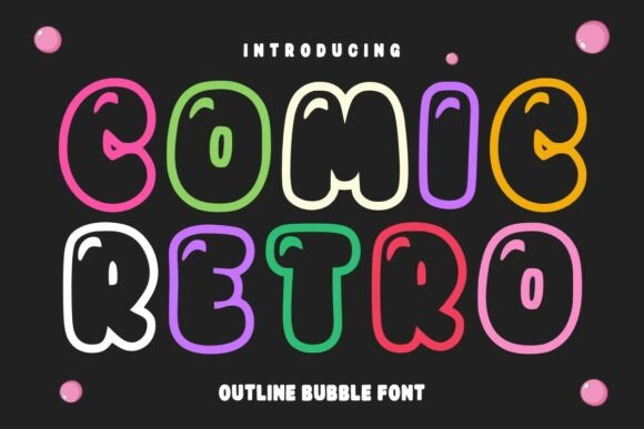
Big attitude, quick readability, and a playful snap. This is the vibe when you want retro font free downloads that still look pro on a poster.
Heads up: let it breathe, don’t crush tracking.
Where To Use It
- Pop-Up Promos – sale headers.
- Comics & Zines – cover titles.
- Food Trucks – menu specials.
- Game Nights – flyers, invites.
Super Groovy – Curvy Headline Retro Fonts
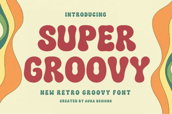
Classic 70s curves with confident weight. When you need groovy lettering that looks great in one word, this does the job fast.
We’d use it for headlines only. Period.
Good Calls
- Salon Promos – bold offer titles.
- Album Art – big central word.
- Wall Prints – short quotes.
- Club Flyers – themed nights.
Groovy Doodle Playful Retro Fonts With Texture
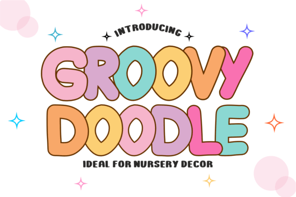
It looks hand-made, so your layouts feel less “template.” Use it for poster fonts when you want charm over precision.
Print it on matte paper and it hits different.
Where It Fits
- Workshop Posters – creative class titles.
- Eco Brands – earthy product names.
- Scrap Kits – themed headings.
- Cafe Boards – specials and promos.
Block Retro – Chunky Geometry Display Type
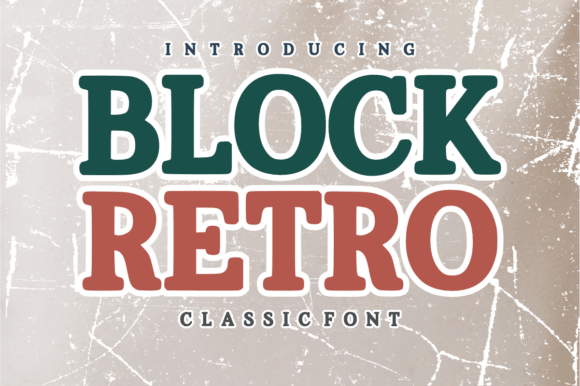
Strong blocks, clean edges, easy hierarchy. This helps build vintage logos that stay readable at tiny sizes.
Try it with a thin sans for contrast, simple and sharp.
Where It Wins
- Sports Merch – bold wordmarks.
- Shipping Labels – clear headers.
- Patch Designs – embroidered text.
- Product Badges – “new”, “limited”, etc.
Vintage Melinda Elegant Retro Script For Labels
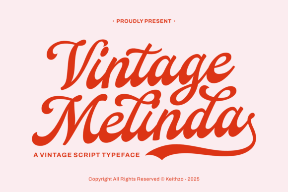
A smoother, dressier mood – less disco, more boutique. Use it for creative typography moments like names, signatures, and short taglines.
Don’t set it in all caps. Just don’t.
Best Uses
- Gift Packaging – tags, ribbons.
- Wedding Details – place cards, menus.
- Perfume Labels – elegant product names.
- Photo Watermarks – subtle brand marks.
Chunky Angela Heavy Retro Display With Sweet Punch
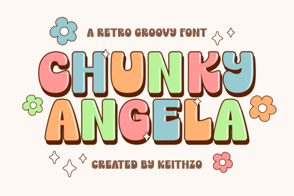
Big, friendly, and slightly sassy. If you want an oldschool font that still feels modern on social graphics, this one behaves nicely.
Use it for short hooks and product names.
Where It Clicks
- Snack Brands – bold flavor text.
- Beauty Promos – sale headers.
- Craft Stores – category signs.
- Digital Stickers – fun phrases.
Retro Street Urban Display Retro Fonts For Headlines
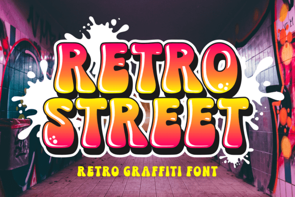
Edgier curves, street-poster mood, and a confident stance. Build a punchy retro title and you basically finish the layout in one move.
Pair with gritty textures or keep it clean – both work, weirdly.
Where It Belongs
- Streetwear – drops, lookbooks.
- Bar Menus – specials, event nights.
- Skate Shops – posters, stickers.
- Album Promos – cover headlines.
Quick Wrap-Up And What To Do Next
Retro fonts aren’t just nostalgia, they’re a shortcut to mood, hierarchy, and “stop scrolling” energy. Test two picks, build one tight pairing, and keep your palette simple. If you want a custom wordmark instead of another downloaded file, we get it – go bespoke and make it yours.