Retro fonts don’t “just” look cute, they change how people read your message . . . faster, louder, and with way more mood. Nielsen Norman-style readability tests keep showing what designers already feel in their bones: display type drives attention, then structure keeps it there. So we pulled 15 retro typefaces that cover varsity blocks, disco curves, neon signage, and planner-friendly vintage scripts, with quick use cases so you don’t waste an hour pairing letters like it’s a personality quiz. Expect bold swashes, chunky counters, and a few fonts that behave like a loud friend at brunch, in the best way.
College Retro Display Font For Varsity Logo Work
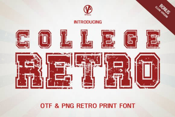
This one screams campus energy without trying too hard, thick strokes, clean edges, and that confident “team jacket” silhouette. We like it for brand identity when you want retro fonts that read from across the room, not just up close.
Pair it with a plain sans for body text and don’t over-style it, honestly. The letter shapes already do the flexing.
Where To Use This Font
- Sports Logos – Varsity badges, team merch, club marks.
- Streetwear Drops – Hoodie fronts, sleeve hits, patches.
- School Events – Posters for games, pep rallies, fundraisers.
- Product Labels – “Heritage” editions, limited releases.
Retro Disco Display Font For 70s Poster Headlines
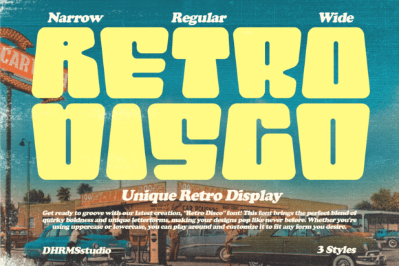
Retro Disco leans into round terminals and bouncy rhythm, the kind of retro font style that makes a single word feel like a dance move. Use it when you need poster typography that feels warm, playful, and slightly loud.
It’s happiest at big sizes. Tiny captions? Nah, let another font handle that job.
Where To Use This Font
- Event Flyers – Disco nights, themed parties, DJ sets.
- Album Art – Covers, tracklist panels, stickers.
- Social Graphics – Quote cards, reels covers, promos.
- Merch – Tote bags, tees, enamel-style prints.
Lucky Daddy Retro Script For Playful Packaging Copy
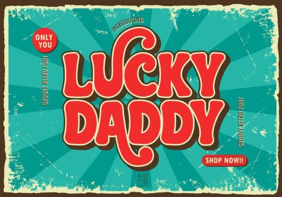
Lucky Daddy has that cheeky brush-script attitude, like old diner signage got rebooted with better kerning. It’s a sweet pick for packaging design when you want retro fonts that feel human, not sterile, and still read clean.
We’d keep the palette simple, cream, red, one dark accent, done.
Where To Use This Font
- Food Brands – Sauce labels, bakery tags, coffee bags.
- Bar Menus – Specials boards, cocktail headers.
- Gift Tags – Small runs, handmade vibes.
- Sticker Packs – Catchphrases, punchlines, mini logos.
Vintage Mother Retro Serif For Elegant Nostalgia
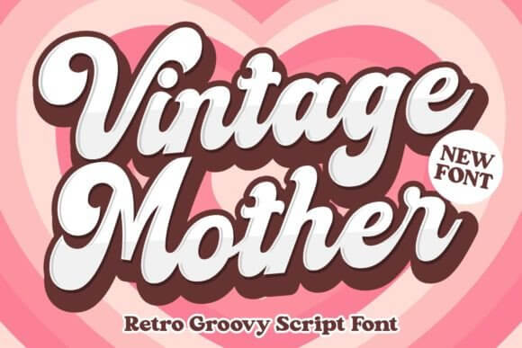
Vintage Mother feels softer than the bold 70s stuff, more like boutique signage and old magazine headers. If you’re chasing retro logo design with a calmer voice, this one lands that “timeless but not boring” note.
Try it with thin lines, lots of negative space, and one strong icon.
Where To Use This Font
- Beauty Brands – Labels, wordmarks, product names.
- Wedding Prints – Welcome signs, menus, vow cards.
- Editorial Layouts – Section titles, pull quotes.
- Handmade Shops – Thank-you cards, packaging sleeves.
Vintage Children Playful Retro Display For Cute Labels
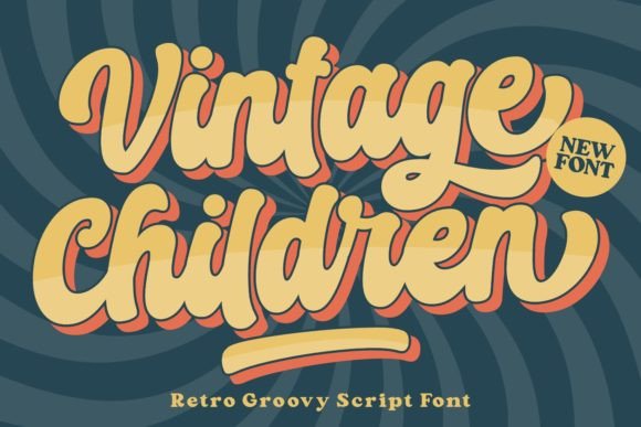
This one brings friendly shapes and a toy-box bounce, without getting messy or hard to read. We’d use it for kids brand graphics where retro fonts need to look fun, safe, and a little quirky, like cereal box typography done right.
Pro move: keep contrast high so it stays readable on prints.
Where To Use This Font
- Kids Products – Snacks, toys, learning kits.
- Party Supplies – Banners, cupcake toppers, invites.
- Classroom Prints – Flashcards, reward charts, posters.
- Family Merch – Matching tees, reunion graphics.
Stay Retro Bold Type For Sticker And Tee Graphics
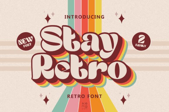
Stay Retro is thick, punchy, and built for headlines that don’t apologize. If you want bold typography that survives printing, cutting, and shrinking onto a sticker, this is your steady workhorse in the retro fonts pile.
We’d add a simple shadow or outline, then stop before it gets tacky.
Where To Use This Font
- Sticker Shops – Die-cuts, label sheets, car decals.
- T-Shirt Designs – Slogans, back prints, chest hits.
- YouTube Thumbnails – Big words, quick reads.
- Workshop Posters – Announcements, schedules, promos.
Vintage 158 Retro Lettering For Classic Sign Looks
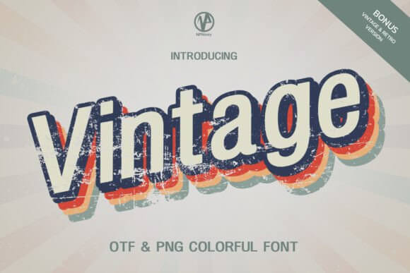
Vintage 158 sits in that sweet spot between rugged and polished, like an old workshop sign that still gets repainted every spring. It’s great for vintage signage layouts where retro fonts need grit, but you still want clean letterforms.
Try a textured background, but keep the type itself crisp.
Where To Use This Font
- Craft Brands – Leather, wood, candles, tools.
- Cafe Menus – Headings, section titles, specials.
- Market Booth Signs – Price boards, banners, labels.
- Badge Logos – Crests, stamps, round marks.
Bigland Retro Display Font For Chunky Brand Marks
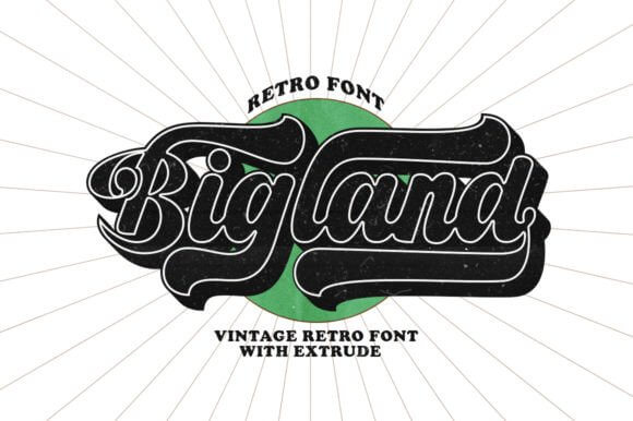
Bigland Retro goes heavy on presence, wide shapes, confident curves, and a strong baseline that feels stable. When you need logo lettering that holds up in small icons and big storefront mockups, this retro font modern vibe hits.
Don’t pair it with another loud display font. One diva per stage.
Where To Use This Font
- Brand Marks – Wordmarks, sub-brands, badges.
- Apparel Labels – Neck tags, woven labels, hang tags.
- Sports Bars – Signage, promo posters, menus.
- Gaming Teams – Titles, overlays, stream panels.
Lovely Retro Soft Display For Cute Retro Aesthetic
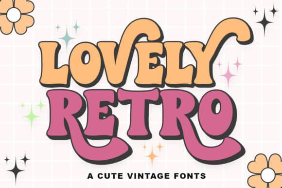
Lovely Retro feels like bubblegum signage, rounded, sweet, and super legible even with styling. We reach for it when clients ask for retro font aesthetic that stays clean, not chaotic, and still gives that “aww” reaction.
It plays nice with thin serif body text if you keep spacing generous.
Where To Use This Font
- Beauty Promos – Sale graphics, product drops, banners.
- Small Business Cards – Names, taglines, highlights.
- Journal Covers – Titles, sections, tabs.
- Printable Wall Art – Short quotes, single words.
Retro Neon Display Font For Electric Sign Energy
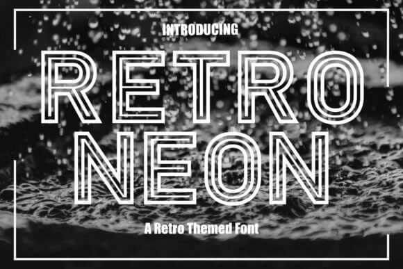
Retro Neon looks like it belongs on a late-night boulevard, bright tubes, shiny edges, and big confidence. If you’re building retro poster design for nightlife, music, or anything that needs glow, this font gets you there fast.
We’d fake the neon with outer glow and subtle grain, not more effects.
Where To Use This Font
- Club Flyers – Headliners, dates, ticket callouts.
- Music Branding – Single covers, playlists, promos.
- Window Signs – Sales, open/closed, special hours.
- Video Titles – Intro cards, chapter screens.
Austine Retro Script For Boutique Logo Lockups
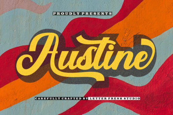
Austine brings smooth strokes and a confident handwritten vibe, less “messy brush” and more signature on a good day. Use it for feminine branding where retro fonts need charm, readability, and a little luxury without going full wedding-cursive.
Looks best with minimal flourishes around it, let the script breathe.
Where To Use This Font
- Salon Logos – Wordmarks, appointment cards, signage.
- Product Names – Collections, scent lines, kits.
- Social Covers – Highlights, profile headers, promos.
- Gift Packaging – Ribbons, tags, belly bands.
Vintage Planner Retro Font For Cute, Clean Organizing
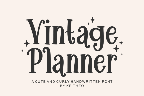
Vintage Planner feels tidy, friendly, and built for structure, like retro stationery that actually wants to help you. If you make templates, trackers, or printables, this is a smart printable design pick among retro fonts because it stays readable in small blocks.
We’d keep line weights light and use icons sparingly, it’s a planner, not a circus.
Where To Use This Font
- Planners – Weekly spreads, headers, tab titles.
- Printable Trackers – Habits, meals, budgets, goals.
- Digital Notebooks – Section covers, titles, dividers.
- Teacher Resources – Worksheets, calendars, lists.
Block Retro Display Font For Strong Retro Type Design
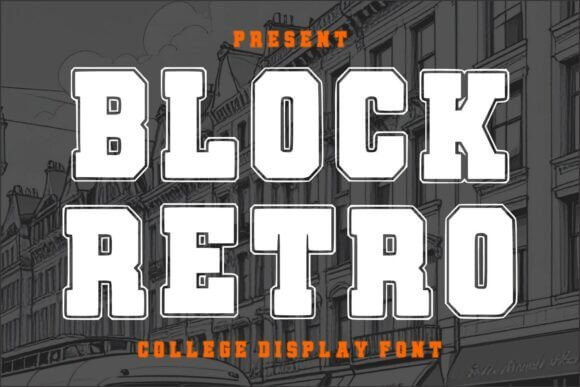
Block Retro is square, bold, and kind of unapologetic, which is exactly why it works. When you need headline fonts that hold their shape under texture, gradients, and print wear, this one behaves, and still feels like classic retro fonts.
Give it room. Tight tracking makes it look like a traffic jam.
Where To Use This Font
- Retro Posters – Big titles, date blocks, callouts.
- Product Packaging – Flavor names, “new” labels.
- Podcast Covers – Strong titles, quick recognition.
- Thrift Branding – Tags, signage, sticker labels.
Beach Retro Display Font For Sunny Vintage Vibes
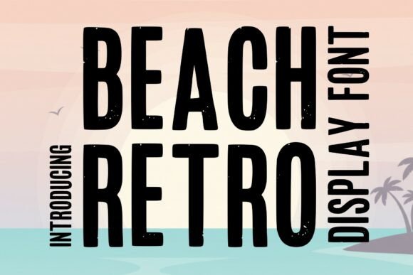
Beach Retro does sunshine without getting childish, rounded forms, relaxed rhythm, and that postcard-era vibe. We like it for summer campaign design when retro fonts should feel breezy, friendly, and still sharp enough for real branding work.
It pairs well with condensed sans fonts for details like dates and locations.
Where To Use This Font
- Travel Posters – Destinations, tour ads, postcards.
- Beach Brands – Surf shops, swimwear, sunscreen labels.
- Seasonal Promos – Summer sales, pop-ups, events.
- Menu Boards – Smoothie bars, ice cream shops.
Smothy Retro Script Font For Friendly Logo Typography
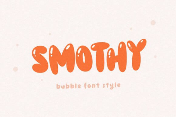
Smothy feels warm and casual, like hand-painted shop lettering that still respects spacing and rhythm. It’s a solid choice for retro font combinations too, because the script can headline, then you drop a simple serif underneath and it just works.
FYI, it looks awesome with subtle texture overlays, not heavy distressing.
Where To Use This Font
- Food And Drink – Smoothie cups, coffee sleeves, labels.
- Local Shops – Window decals, loyalty cards, signage.
- Handmade Packaging – Soap wraps, candles, stickers.
- Content Titles – Recipe covers, blog headers, thumbnails.
Quick Wrap-Up And A Simple Next Step
Retro fonts work best when you stop forcing them to do everything, pick one hero typeface, give it space, then support it with calm text around it. Grab a couple from this list, test them on a mock poster or logo, and if none nail your vibe . . . yeah, get a custom font built and own the look.