Retro fonts aren’t just “cute old lettering” – they’re a shortcut to mood, memory, and instant vibe. Designers keep leaning on 60s curves, 70s bubble shapes, and 90s punchy outlines because they read fast on feeds, on labels, on merch, on literally anything you want people to notice. We pulled 12 picks that cover clean vintage, graffiti chaos, holiday nostalgia, and trippy display energy, plus quick ideas for where each one actually works (not the generic “use it anywhere” lie). If you want your typography to do the talking, start here.
Rainbow Memories – Playful Retro Display Lettering
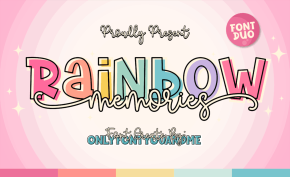
Rainbow Memories feels like the intro screen to a beloved old game – bright, rounded, a little cheeky. If you’re chasing that retro font aesthetic without going full cartoon, this one hits the sweet spot and stays readable even when you stack colors or add outlines.
Where To Use Rainbow Memories
- Logo Concepts – Punchy wordmarks for boutiques, stickers, and side hustles.
- Poster Headlines – Big titles that still look friendly, not shouty.
- Merch Prints – Tees, tote bags, and patches that need instant charm.
- Social Graphics – Reels covers, quote cards, thumbnails, the whole circus.
- Packaging Labels – Candy, bath goods, kidcore drops, small batch snacks.
Vintage Christmas – Nostalgic Holiday Serif Style
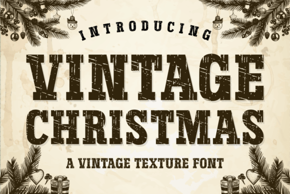
This one leans cozy – classic shapes, warm curves, and that “printed on a 1970s card” feeling. Use it when you want seasonal nostalgia without glitter overload; it pairs nicely with muted reds, kraft paper textures, and vintage lettering fonts vibes in general.
Where To Use Vintage Christmas
- Holiday Packaging – Gift tags, cookie boxes, candles, cocoa labels.
- Event Invitations – Market nights, family parties, winter pop-ups.
- Product Cards – Thank-you inserts that look “designed,” not templated.
- Seasonal Posters – Store windows, cafe boards, workshop flyers.
- Recipe Prints – Grandma-core layouts, menus, holiday cheat sheets.
Retro Drip – Melting Display Font With Attitude
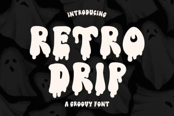
Retro Drip is messy on purpose, like neon paint running down a wall, and yeah it’s fun. When you need a retro font bold headline that doesn’t look polite, this is the move – just keep body text simple so the drip gets to be the star.
Where To Use Retro Drip
- Streetwear Drops – Hoodie fronts, cap embroidery mockups, sticker packs.
- Album Covers – Loud titles with high contrast and texture.
- Gaming Graphics – Stream overlays, badges, “new level” screens.
- Event Flyers – Club nights, DJ sets, late-night pop-ups.
- Youth Branding – Snacks, drinks, skate brands, anything with edge.
Retro Crab – Chunky Wavy Display For Fun Branding
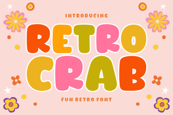
Retro Crab has that bouncy baseline and chunky geometry that screams “summer menu board,” even if you’re designing in January. It’s a good option for retro font design work where you want playful shapes, yet you still care about spacing and clean edges.
Where To Use Retro Crab
- Food Brands – Seafood, soda, ice cream, diner-style menus.
- Kids Products – Toy labels, book covers, classroom printables.
- Beach Events – Summer flyers, surf comps, local festivals.
- Sticker Sets – Big words, simple icons, loud outlines.
- Retro Posters – Color-block layouts with 60s/70s energy.
Retro Bubble – Inflated Bold Letters For Posters
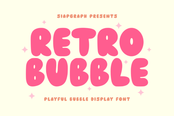
Retro Bubble is pure dopamine typography – thick, rounded, and impossible to ignore. If you want a bubbly retro font for headlines, this gives you that inflatable look without needing extra effects, and it loves bright palettes and soft shadows.
Where To Use Retro Bubble
- Beauty Promos – Nail sets, gloss drops, salon deal posters.
- Birthday Invites – Loud titles that feel happy, not childish.
- Craft Packaging – Candles, slime kits, handmade soaps, sticker labels.
- Digital Ads – Quick-scrolling attention grabs for launches.
- Thumbnail Titles – Big readable words at small sizes.
Beautiful Smile – Retro Script With A Soft Glow Feel
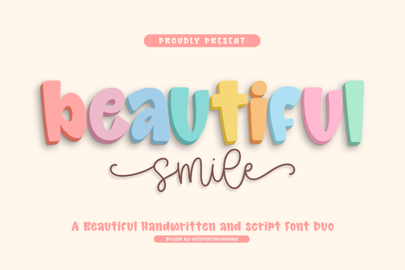
Beautiful Smile is the chill friend in this list – smooth script, a little flirty, and it doesn’t fight your layout. When you need a romantic accent that still nods retro, this brush lettering font works great as a second font next to clean sans or a tight serif.
Where To Use Beautiful Smile
- Wedding Details – Name cards, signage, welcome boards.
- Skincare Labels – Soft branding with a handmade hint.
- Quote Graphics – Short lines, signatures, “love, me” moments.
- Blog Headers – Personal brands, lifestyle pages, creator intros.
- Packaging Stickers – Seals, thank-you rounds, small tags.
Bertod Retro – Condensed Display For Clean Vintage Logos
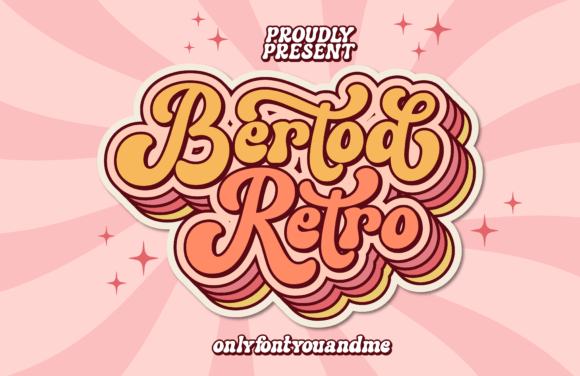
Bertod Retro feels more “brand system” than “novelty,” which we love because you can actually build a full identity around it. It’s strong for a retro font logo where you want vintage flavor, yet you still need the wordmark to behave across web, labels, and signage.
Where To Use Bertod Retro
- Brand Wordmarks – Shops, studios, cafes, makers.
- Label Design – Bottles, jars, coffee bags, spice tins.
- Editorial Headers – Section titles, pull quotes, magazine covers.
- Signage – Window decals, market booths, direction boards.
- Apparel Tags – Neck labels, hang tags, woven patches.
Retro Groove – 70s Curves For Groovy Headlines
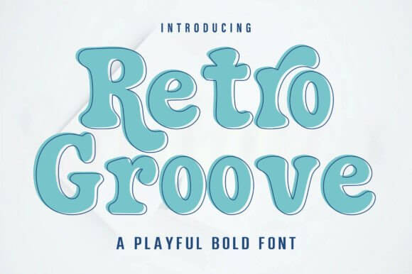
Retro Groove 4 leans hard into 70s rhythm – soft curves, confident weight, and a little swagger in the terminals. It’s ideal when you want groovy typography style without making your design look like a costume, because it still holds up in clean layouts.
Where To Use Retro Groove
- Poster Series – Retro events, art fairs, themed workshops.
- Product Launches – Drop graphics with bold titles and simple info.
- Playlist Covers – Funk, disco, indie soul, throwback sets.
- Wall Prints – Quote posters, typographic art, dorm decor.
- Brand Campaigns – Seasonal visuals with a consistent headline font.
Retro Tag Graffiti – Street Tag Display With Edge
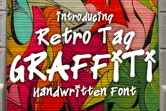
Retro Tag Graffiti is loud and imperfect, and that’s the whole point. If your project needs raw energy (and you’re tired of “clean” everything), this is a strong pick for fonts branding in streetwear, music, and punchy youth campaigns.
Where To Use Retro Tag Graffiti
- Streetwear Graphics – Back prints, sticker bombs, label marks.
- Music Promos – Single covers, tour posters, DJ night flyers.
- Sports Teams – Hype graphics, locker room quotes, merch.
- Youth Events – Skate contests, dance battles, pop-up jams.
- Urban Posters – Big type, gritty textures, photo overlays.
Sugar Groovy – Sweet Rounded Retro Display Font
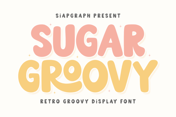
Sugar Groovy sits right between bubble and bold, with rounded shapes that feel candy-coated but still usable. It shines when you’re testing retro font combinations – pair it with a simple serif for contrast, or a minimalist sans for that “cute but grown” vibe.
Where To Use Sugar Groovy
- Beauty Branding – Lash boxes, gloss labels, skincare launches.
- Food Packaging – Candy, bakery items, soda labels, snack pouches.
- Creator Merch – Stickers, notebooks, enamel pin cards.
- Ad Headlines – Quick promos where legibility matters.
- Party Themes – Banners, invites, photo booth props.
Magic Retro – Psychedelic Display For Trippy Type
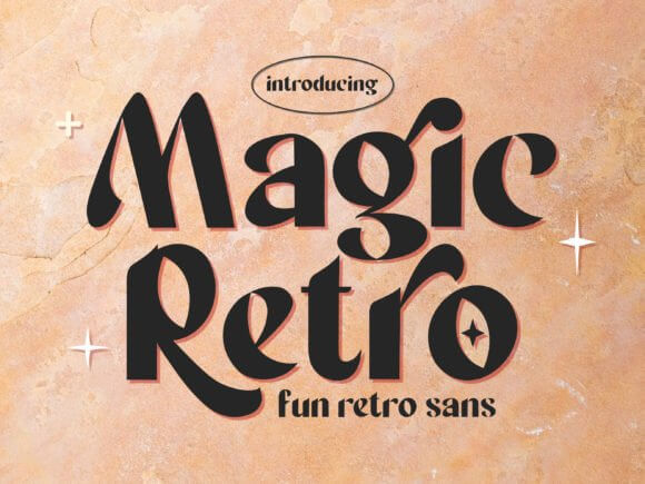
Magic Retro goes full psychedelic – warped shapes, dreamy bounce, and serious poster energy. Use it when you want retro font magic right up front, then keep the rest of the layout restrained so the headline can breathe . . . or it turns into visual noise fast.
Where To Use Magic Retro
- Gig Posters – Psychedelic nights, indie bands, festival promos.
- Art Prints – Typographic wall art with color gradients.
- Album Artwork – Retro revival covers and title treatments.
- Creative Campaigns – Limited editions, collabs, “summer capsule” drops.
- Video Titles – Openers, chapter cards, stylized captions.
Chunky Student – Heavy Rounded Type For Big Titles
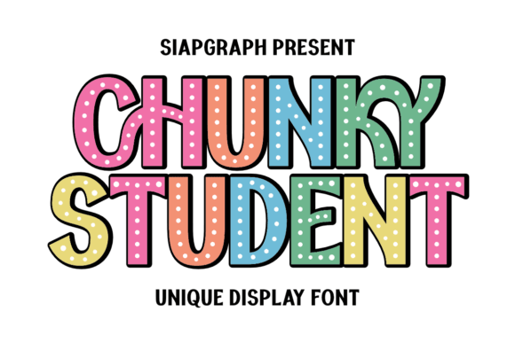
Chunky Student is thick, friendly, and super readable, which makes it weirdly versatile for retro fonts. If you’re building something clean but still playful, it gives retro font modern energy – like a new brand borrowing old-school confidence without the dust.
Where To Use Chunky Student
- Educational Projects – Worksheets, classroom posters, course covers.
- Startup Branding – Youthful logos and punchy headline systems.
- Packaging – Bold names on minimal label designs.
- Book Covers – Fun titles, kidlit, cozy how-to guides.
- UI Headlines – Feature banners, promo modules, landing hero text.
Quick Picks And Next Steps
Retro fonts work best when you pick a clear job for them – headline hero, logo core, or sweet accent – and stop there. Try two options, mock them on a real poster or label, and you’ll feel the winner instantly. Want help pairing, spacing, or building a custom look? We’re into that.