Choosing business fonts sounds tiny… until you realize typography can lift conversion, readability, and trust in one swing. We see it constantly: the same offer, same photos, same colors, and the version with cleaner kerning and a confident headline wins. Below are 19+ fonts with distinct moods – airy scripts, sturdy serifs, punchy displays – built for logos, packaging, storefront signage, pitch decks, and the everyday templates that carry your brand. Pick one “hero” font, pair it with a simple supporting face, and stop letting default typography drain the energy out of your work.
Seaside Resort – Breezy Script For Business Logos
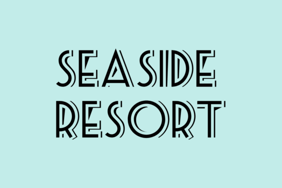
Seaside Resort feels like a warm signboard you’d actually trust – relaxed, but still polished enough to sell something. We like it when you want logo typography with soft confidence, not sugary “craft fair” energy.
Where To Use Seaside Resort
- Coastal Boutique Logos – Friendly wordmarks that still look premium.
- Skincare Label Headers – A clean hero line over minimalist packaging.
- Salon Gift Cards – Elegant script without the messy swashes.
- Brunch Menu Titles – Adds mood fast, keeps items readable.
- Instagram Quote Covers – Soft headlines that don’t shout.
Stealdream – Heavy Display Business Font With Edge
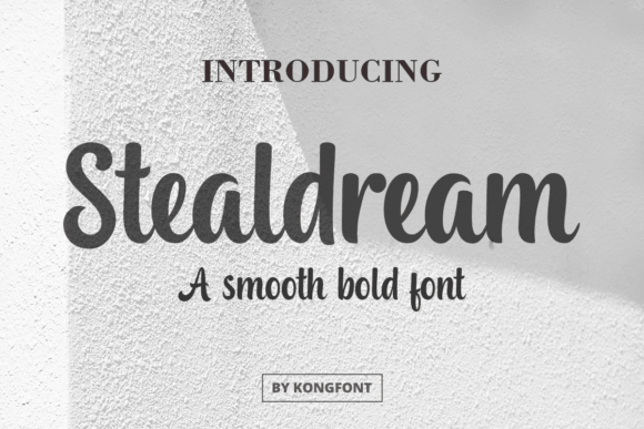
Stealdream comes in loud and sturdy, like signage you spot from across the street even in bad weather. When your brand needs headline typography that looks engineered, this one does the job . . . no apologies.
Where To Use Stealdream
- Gym Banner Headlines – Big weight, instant impact.
- Streetwear Hang Tags – Tough vibe without looking messy.
- Tool Brand Packaging – Feels durable, like the product.
- YouTube Thumbnail Titles – Clear words at tiny sizes.
Road Sunshine – Retro Lettering For Small Business Kits
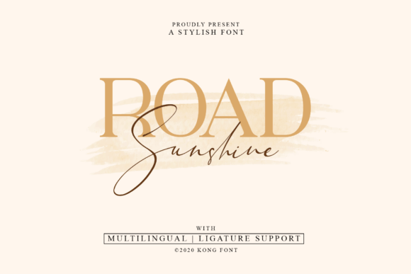
Road Sunshine leans vintage, sunny, and slightly playful, like an old postcard but cleaner. We reach for it when brand identity needs charm without turning into a costume party.
Where To Use Road Sunshine
- Cafe Loyalty Cards – Retro warmth, easy readability.
- Food Truck Logos – Friendly, memorable, quick to spot.
- Sticker Pack Titles – Adds personality in one word.
- Workshop Flyers – Makes “class night” feel fun.
- Summer Promo Posts – Bright vibe without neon chaos.
Bubble Kids – Cute Display Font For Friendly Brands
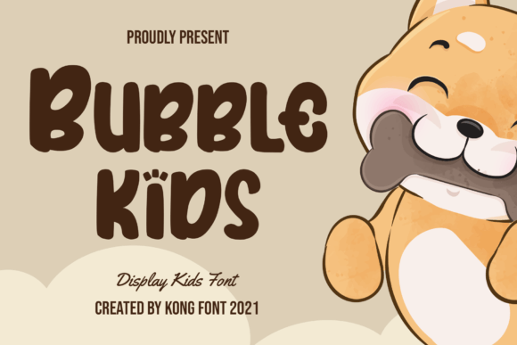
Bubble Kids is round, bouncy, and honestly kind of adorable, but it still prints cleanly which matters more than people admit. For packaging design that needs to feel safe, sweet, and clear, it’s a solid pick.
Where To Use Bubble Kids
- Kids Boutique Signs – Big friendly letters that read fast.
- Daycare Welcome Boards – Warm tone, zero fuss.
- Snack Label Names – Cute without being babyish.
- Birthday Service Flyers – Fun headers, easy scanning.
Blackburr – Modern Serif For Premium Business Fonts
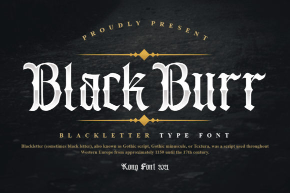
Blackburr gives that editorial, high-end serif energy without looking like you copied a magazine masthead. If your typography hierarchy feels flat, drop this in as the “title voice” and it wakes up.
Where To Use Blackburr
- Jewelry Brand Wordmarks – Crisp luxury in a few letters.
- Perfume Box Fronts – Classic serif drama, controlled.
- Lookbook Cover Titles – Feels styled, not loud.
- High-Ticket Service PDFs – Makes pages feel expensive.
- Signature Email Headers – Subtle authority, clean lines.
Glory Sunshine – Bold Script For Confident Branding
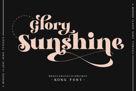
Glory Sunshine is expressive, thick, and punchy, like a brush sign that got perfected by a designer who cares about spacing. We use it for small business branding when you need “human” without looking sloppy.
Where To Use Glory Sunshine
- Candle Label Names – Adds warmth and presence.
- Pop-Up Shop Posters – Grabs eyes in crowded spaces.
- Event Photo Booth Backdrops – Big words, clean silhouette.
- Bakery Box Stickers – Friendly, bold, readable.
Mick Caster – Vintage Serif For Business Stationery
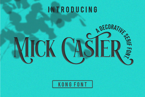
Mick Caster leans classic with a slightly rugged finish, like an old print shop but with better alignment. It’s a smart move when visual identity system needs heritage vibes and still has to look sharp on invoices.
Where To Use Mick Caster
- Barbershop Price Lists – Vintage tone, crisp structure.
- Craft Whiskey Labels – Old-school without clutter.
- Wedding Vendor Cards – Formal, still warm.
- Leather Goods Tags – Matches “handmade” energy.
- Workshop Certificates – Classic serif authority.
Graduation – Clean Display Font For Pro Announcements
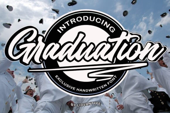
Graduation reads crisp and organized, like you finally fixed your template library and tossed the random fonts from 2016. For corporate typography that still feels friendly, it lands right in that sweet spot.
Where To Use Graduation
- Course Slide Titles – Clear headings that don’t blur.
- Coaching Program Workbooks – Structured pages, easy scanning.
- Clinic Brochure Covers – Professional tone, low stress.
- Real Estate One-Sheets – Clean numbers, sharp titles.
Distery Bvarly – Stylish Script For Boutique Brands
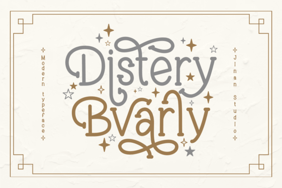
Distery Bvarly is glamorous script with enough contrast to feel designed, not auto-generated. It works when signature logo needs to look personal, like a real name on a real product.
Where To Use Distery Bvarly
- Hair Extension Packaging – Luxe script, strong first impression.
- Makeup Artist Logos – Personal brand, clean finish.
- Bridal Studio Signage – Soft elegance, readable at distance.
- Thank-You Card Headers – Adds warmth without clutter.
- Handmade Soap Bands – Pretty naming that still prints well.
Battalion Commander – Strong Display Font For Labels
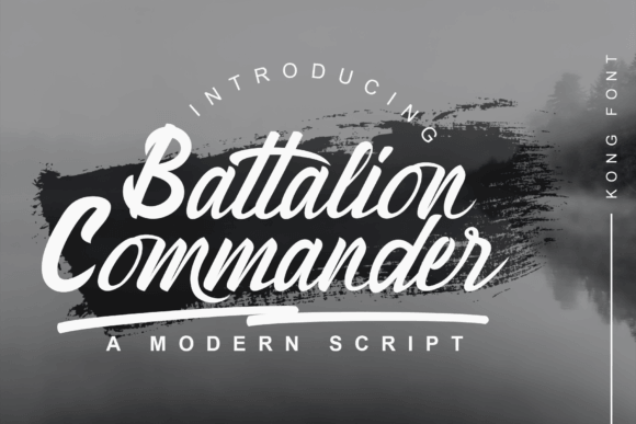
Battalion Commander looks commanding, blocky, and direct – the kind of type that stops scrolling. If you need impact font alternative energy but want something fresher, this gets you there.
Where To Use Battalion Commander
- Protein Jar Labels – Bold flavor names that pop.
- Security Service Flyers – Tough headers, clear authority.
- Motorsport Event Posters – Fast vibe, readable from far.
- Warehouse Sale Banners – Big words, zero ambiguity.
Logtown – Rugged Serif For Outdoor Business Brands
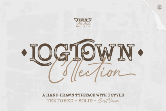
Logtown brings that “heritage meets utility” look, like a label you’d see on a well-made canvas bag. We like it for brand mark setups where the font has to carry texture even in one color.
Where To Use Logtown
- Camping Shop Logos – Outdoorsy tone, clean structure.
- Roastery Bag Labels – Rustic vibe with legible text.
- Woodworking Business Cards – Feels crafted, not trendy.
- Farm Stand Signs – Bold, friendly, easy to read.
- Adventure Podcast Covers – Strong title presence.
Baliday – Soft Handwritten Font For Cozy Brands
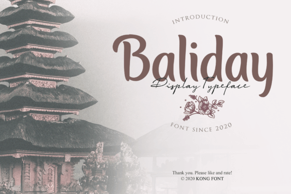
Baliday looks handwritten in a calm way, like you took time… but not like you tried too hard. For handwritten business font moments like labels and thank-you notes, it keeps the warmth without the wobble.
Where To Use Baliday
- Etsy Shop Banners – Friendly tone that still reads.
- Jar Label Names – Cozy product naming, clean print.
- Subscription Box Inserts – Personal note vibe, scalable.
- Wedding Favor Tags – Soft, intimate headers.
Northwest – Clean Sans Serif For Modern Brands
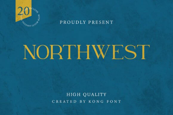
Northwest is clean, modern, and minimal, the kind of sans you can build a whole system around. If you’re chasing sans serif typography that feels current but not cold, Northwest behaves beautifully.
Where To Use Northwest
- SaaS Landing Page Headlines – Crisp readability, modern tone.
- App UI Mockups – Neutral, consistent letterforms.
- Architect Portfolio Covers – Minimal vibe, confident titles.
- Medical Spa Price Menus – Clean structure, calm energy.
- Brand Guidelines PDFs – System-friendly, easy pairing.
Sandwich – Playful Display For Food Business Fonts
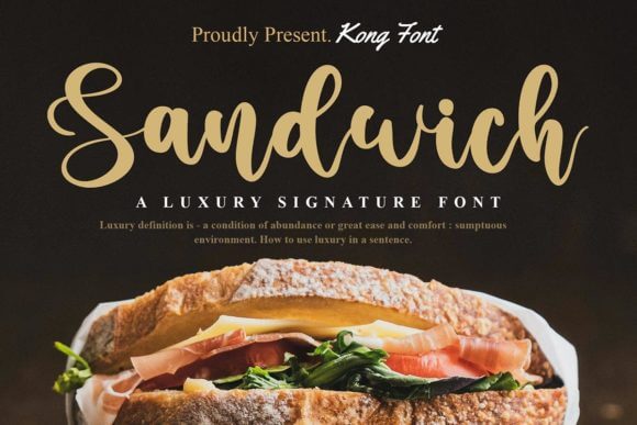
Sandwich is quirky in a controlled way, like a chalkboard menu that got upgraded into a real brand kit. Use it when menu design needs personality, then pair with a plain sans so it doesn’t get chaotic.
Where To Use Sandwich
- Deli Menu Boards – Fun headers, clear sections.
- Takeaway Box Stickers – Bold names that feel tasty.
- Weekend Special Posters – Quick attention, readable type.
- Food Blog Category Titles – Adds flavor without clutter.
The California – Chill Script For Lifestyle Branding
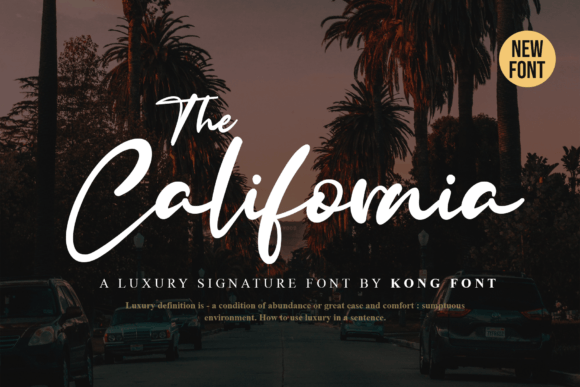
The California looks relaxed and stylish, like a handwritten note on a premium postcard. When you want lifestyle brand typography that feels effortless (but still designed), this is the move.
Where To Use The California
- Yoga Studio Logos – Calm script with clean flow.
- Resort Promo Graphics – Soft luxury, modern vibe.
- Swimwear Hang Tags – Chill naming, legible print.
- Travel Newsletter Headers – Friendly, airy titles.
- Beach Market Signage – Relaxed tone, quick readability.
Puerto Rico – Expressive Script For Bold Brand Names
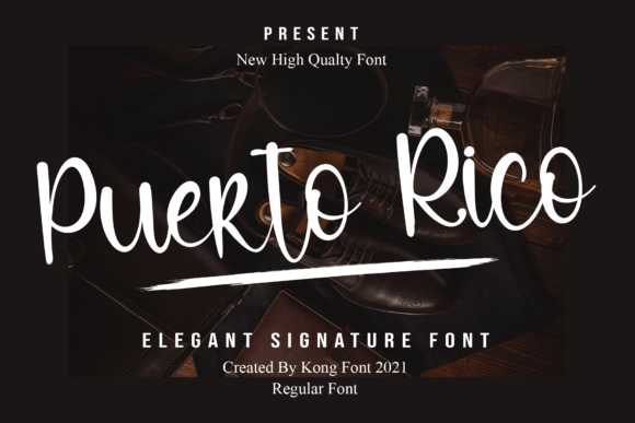
Puerto Rico brings flair – energetic strokes, confident curves, and that “signature” feel without turning unreadable. It shines in script logo design when your brand name should feel like the product itself.
Where To Use Puerto Rico
- Latin Fusion Restaurant Logos – Expressive name lettering.
- Dance Studio Posters – Movement in the headline.
- Cocktail Menu Titles – Bold vibe, premium feel.
- Festival Vendor Signs – Stands out in a crowd.
Spring Has Arrived – Light Script For Fresh Brands
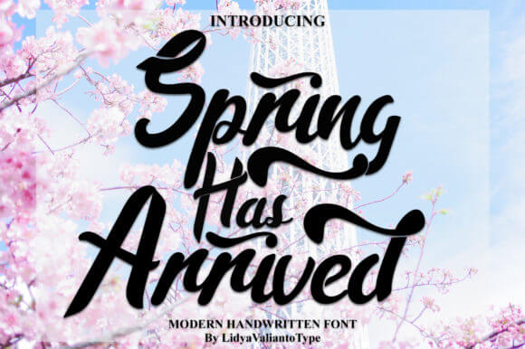
Spring Has Arrived looks airy and optimistic, like clean stationery with a tiny wink of personality. We use it when seasonal campaign design needs freshness without the “flower clipart explosion.”
Where To Use Spring Has Arrived
- Florist Promo Cards – Soft script for spring drops.
- Brunch Event Invites – Light headers, easy pairing.
- Natural Soap Launch Posts – Fresh vibe, gentle energy.
- Farmers Market Flyers – Friendly titles that read fast.
- Garden Shop Labels – Pretty naming, clean print.
Vintage Handmade – Textured Font For Crafted Brands
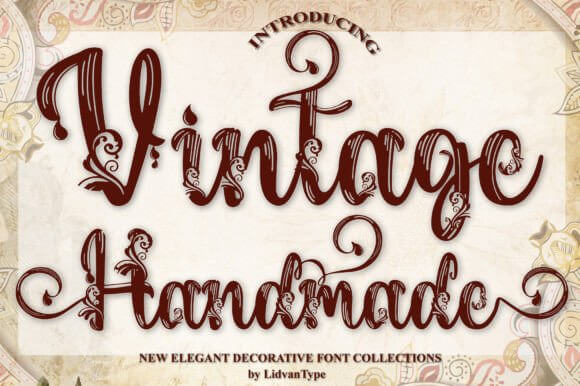
Vintage Handmade has that imperfect texture that makes designs feel touched by a real person, not just exported from a template. For artisan branding it’s gold, just keep body text simple so it can breathe.
Where To Use Vintage Handmade
- Craft Fair Booth Signs – Handmade vibe, big readable titles.
- Ceramics Maker Logos – Textured wordmarks with character.
- Paper Goods Packaging – Adds authenticity quickly.
- Small Batch Coffee Labels – Rustic naming, clean impact.
Angelitta – Elegant Script For Beauty Business Fonts
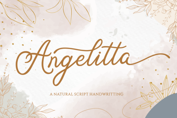
Angelitta reads like classic beauty branding – smooth curves, romantic energy, still legible in a logo lockup. If you’re building beauty brand identity and want instant elegance, this one does not disappoint.
Where To Use Angelitta
- Lash Tech Logos – Elegant script with clean strokes.
- Perfume Bottle Stickers – Romantic naming, premium vibe.
- Skincare Routine Cards – Soft titles that feel calm.
- Bridal Makeup Price Lists – Polished, feminine headers.
- Gift Set Packaging – Adds luxury without extra graphics.
Antique Atelier Duo – Vintage Pair For Brand Systems
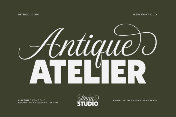
Antique Atelier Duo gives you a ready-made pairing vibe – display + supporting style – which saves time when you’re building consistent templates. We like it for brand typography pairing because it feels curated, not random.
Where To Use Antique Atelier Duo
- Vintage Clothing Labels – Old-school tone with structure.
- Apothecary Jar Stickers – Heritage look, clear hierarchy.
- Bookshop Tote Designs – Classic print-shop charm.
- Handcrafted Chocolate Boxes – Premium vintage energy.
- Studio Brand Guidelines – Cohesive system, easy reuse.
Quick Wrap-Up From Our Team
Business fonts don’t need to be complicated, they need to be consistent and intentional. Pick one font that “speaks” for your brand, add one clean supporting font, then reuse the combo everywhere so your posts, labels, and pages look like they belong to the same business.