We see it all the time at Increobox – a solid product, good photos, decent offer . . . and the wrong type kills trust in two seconds. Fonts shape perception faster than color, faster than copy, even faster than your “About” page, because people judge the vibe before they read a word.
This list rounds up 16 business fonts that play nice with logos, labels, websites, and social posts, from calm classics to loud display styles. Mix smart, keep contrast, watch spacing, and you’ll stop fighting your layouts and start shipping designs that look like you paid a studio. (You kinda did, just with better taste.)
North Hiking Font For Outdoor-Ready Branding
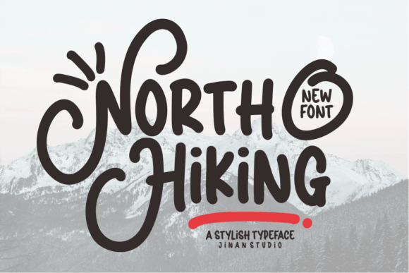
North Hiking gives your brand that “we actually go outside” confidence, with chunky letterforms that stay readable on signage and merch. We like it when you need bold personality but still want clean shapes.
Use it as a headline font, then pair with a simple sans for body copy so your layout doesn’t start yelling.
Where To Use North Hiking
- Adventure Logos – Stamp a bold mark that survives tiny sizes.
- Product Hang Tags – Add grit without messy distress textures.
- Apparel Graphics – Make tees and caps look intentional.
- Retail Signage – Keep distance readability in real life.
September Font For Soft Modern Business Identity
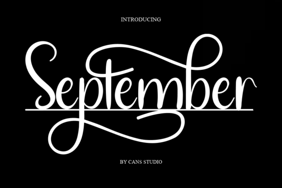
September feels calm and stylish, like a boutique brand that keeps its shelves tidy and its invoices cleaner. It works when you want warmth without going full “cute script overload”.
We’d set it for short names, taglines, and hero text, then keep the rest minimal.
Where To Use September
- Salon Branding – Add softness without losing polish.
- Skincare Packaging – Make labels feel premium fast.
- Web Hero Headers – Create a gentle first impression.
- Thank-You Cards – Keep it personal, not cheesy.
Brisca Font For Confident Display Typography
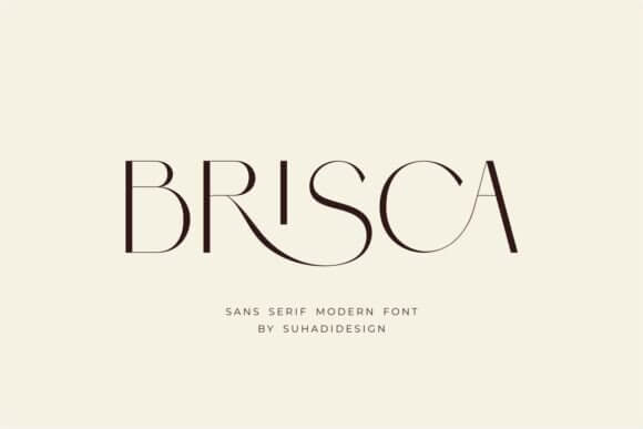
Brisca walks in loud, and yeah, sometimes you need that. The shapes push a strong brand voice for launches, banners, and big punchy headlines.
Keep your palette simple and let the type do the flexing, seriously.
Where To Use Brisca
- Campaign Posters – Grab attention in a scroll.
- Event Flyers – Make dates and titles pop.
- Podcast Covers – Stay readable at thumbnail size.
- Product Drops – Build hype without extra clutter.
Bulky Font For Thick, Playful Business Headlines
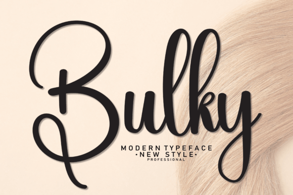
Bulky looks friendly, thick, and a little chaotic in a good way. It’s the kind of business font that makes a small brand feel approachable, like you can DM them and they’ll actually reply.
We’d use it as an accent – one strong headline, then breathe.
Where To Use Bulky
- Snack Packaging – Make flavors feel fun.
- Kids Product Labels – Stay bold and readable.
- Sticker Designs – Get that chunky, collectible vibe.
- Storefront Specials – Big text, instant impact.
Donaldson Font For Sharp Professional Branding Systems
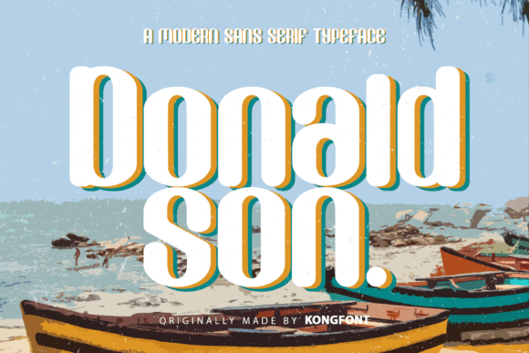
Donaldson feels structured and grown-up, the kind of font that doesn’t beg for attention yet still looks expensive. If you build a full brand identity kit, this one behaves across print and web.
Pair it with a lighter sans and you’ll get a crisp hierarchy without drama.
Where To Use Donaldson
- Consulting Logos – Communicate trust fast.
- Pitch Deck Covers – Make titles feel serious.
- Business Cards – Keep type clean at small sizes.
- Website Navigation – Stay readable, stay neat.
La Lemonti Font For Elegant Boutique Logos
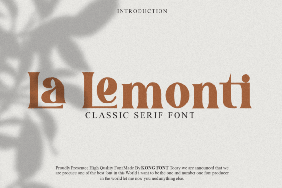
La Lemonti leans classy without turning stiff. You get that signature-like vibe for logo typography, but it still reads well if you don’t cram letters too tight.
We think it shines when you keep the word count short – name first, tagline second, done.
Where To Use La Lemonti
- Jewelry Branding – Add refined sparkle without extra icons.
- Beauty Services – Make price lists feel curated.
- Gift Boxes – Create a premium unboxing mood.
- Social Covers – Signature-style headers that look custom.
Poina Font For Minimal Business Copy And Labels
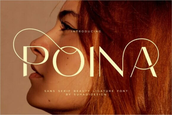
Poina stays cool and modern, the quiet friend in your font stack who always shows up on time. For corporate stationery and clean layouts, it gives you clarity without feeling bland.
FYI – give it generous line-height, it rewards breathing room.
Where To Use Poina
- Invoice Templates – Keep documents readable and calm.
- Shipping Inserts – Make instructions easy to scan.
- Product Labels – Clean info hierarchy, less mess.
- UI Microcopy – Buttons, tabs, small text that stays sharp.
Charlotte Font For Romantic Yet Professional Branding
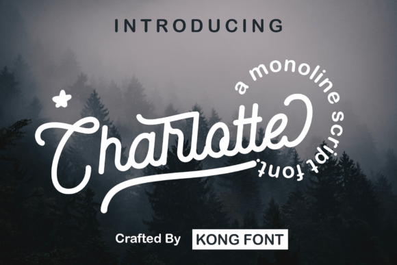
Charlotte brings graceful curves, but it doesn’t feel fragile. If your brand sells experience – photography, events, lifestyle – this can carry packaging design and headers with a soft premium tone.
Don’t overuse it, one hero line is plenty.
Where To Use Charlotte
- Photography Logos – Signature vibes without messy strokes.
- Event Collateral – Menus, place cards, signage.
- Gift Vouchers – Make offers feel more special.
- Landing Page Headlines – Add emotion up top.
Barbie Font For Loud Pop Branding And Merch
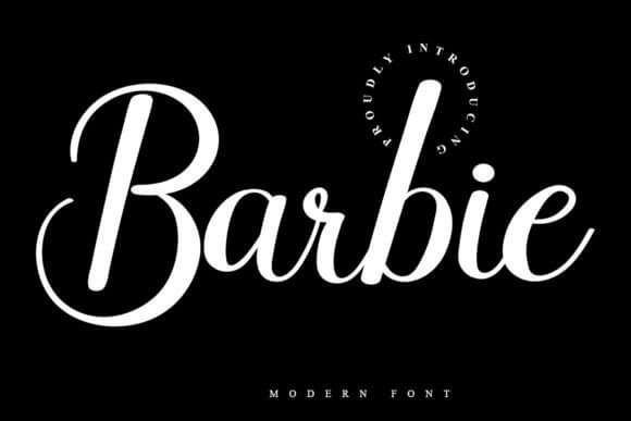
This one screams pop culture energy, so yeah – it’s not for accountants. When your audience loves bright visuals, Barbie-style lettering boosts social media templates and merch with instant attitude.
Keep your message short, this font wants to headline, not explain.
Where To Use Barbie
- Merch Drops – Tees, totes, stickers with punch.
- Beauty Promos – Bold offer text that grabs.
- Creator Thumbnails – Readable fast on small screens.
- Pop-Up Events – Signs that feel fun, not generic.
La Fleur Font For Chic Floral Brand Aesthetics
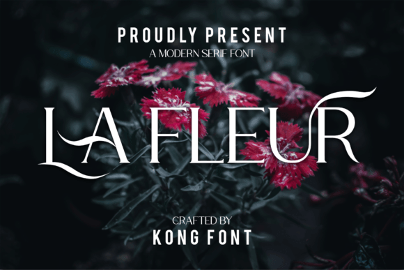
La Fleur sits in that sweet spot – chic, slightly artsy, still readable. We reach for it when we need website headers that look designed, not templated.
Try it with muted colors and lots of negative space, it loves that.
Where To Use La Fleur
- Florist Branding – Elegant wordmarks and taglines.
- Candle Labels – Soft luxury without overdecorating.
- Lookbooks – Titles and section dividers.
- Shop Announcements – New arrivals, seasonal edits.
Cookies Chip Font For Fun Handmade Business Vibes
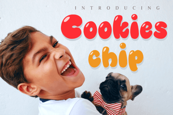
Cookies Chip looks homemade in a charming way, like a real person baked the thing and didn’t outsource the soul. Use it to warm up presentation slides or labels when your brand story matters.
It plays best as an accent font, not a full paragraph situation.
Where To Use Cookies Chip
- Bake Shop Menus – Friendly item names and headers.
- Craft Packaging – Handmade cues that feel authentic.
- Small Batch Stickers – “Fresh”, “Limited”, “Made Today”.
- Class Flyers – Workshops, community events, pop-ups.
Chucky Buck Font For Bold Retro Business Graphics
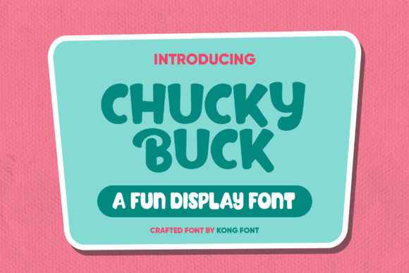
Chucky Buck goes retro and chunky, the kind of type you put on a poster and it just works. It’s great for email newsletter headers when you want a fun hook without drawing a whole illustration.
We’d keep kerning tight-ish and let the shapes carry the vibe.
Where To Use Chucky Buck
- Vintage Markets – Posters and booth signage.
- Food Trucks – Menu boards with personality.
- Brand Stickers – Bold marks for packaging.
- Promo Banners – Sales, announcements, quick wins.
Mickylet Font For Friendly Modern Brand Messaging
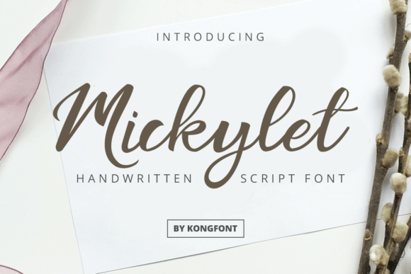
Mickylet feels friendly and approachable, like the brand voice that doesn’t talk down to you. For landing page copy, it can soften a sales message without looking childish.
Use it where you want a smile, not a shout.
Where To Use Mickylet
- Service Pages – Warm headers and callouts.
- Community Brands – Clubs, studios, local shops.
- Course Covers – Titles that feel inviting.
- Story Highlights – Simple labels that stay readable.
Master Bubble Font For Big Playful Display Type
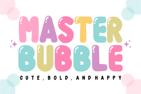
Master Bubble goes big and round, and it’s unapologetic about it. If your visuals need “fun” in three seconds, this helps product mockups and promos land with a punch.
Just don’t pair it with another loud display font, your design will trip over itself.
Where To Use Master Bubble
- Kids Brands – Toys, parties, playful packaging.
- Sticker Shops – Big titles that sell the vibe.
- Seasonal Promos – Flash sales, limited editions.
- Channel Banners – Bold headers that stay readable.
Retro Kingdom Font For Vintage Business Branding
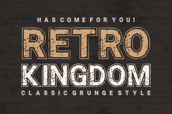
Retro Kingdom gives you that old-school charm without looking dusty. For brands chasing nostalgia, it builds brand guidelines that feel consistent across labels, posters, and web banners.
Try it with warm tones and textured paper backgrounds, it’s a vibe.
Where To Use Retro Kingdom
- Coffee Packaging – Roast names and label titles.
- Bar Branding – Menus, coasters, signage.
- Craft Beer Labels – Bold, vintage-forward headlines.
- Market Booth Signs – Stand out without neon chaos.
Bold Classic Font For Clean Corporate Typography
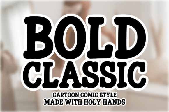
Bold Classic stays dependable – crisp, direct, and easy to place into almost any system. When you need typography hierarchy that reads clearly on web and print, this one behaves.
IMO it’s the safest pick here, and that’s a compliment.
Where To Use Bold Classic
- Corporate Reports – Strong headings and sections.
- Website UI – Buttons, titles, navigation labels.
- Case Studies – Clean structure that supports reading.
- Service One-Pagers – Quick skim-friendly layouts.
Picking Business Fonts Without Overthinking
Business fonts don’t need to feel boring, they just need to look intentional. Pick one “voice” font for headlines, one workhorse for body text, then test them on a logo, a label, and a mobile screen before you commit. Want a second set of eyes on pairings or layout choices? We’re always building better systems at Increobox – steal these picks and ship something you’re proud of.