Retro fonts aren’t “just vibes” – they steer trust, mood, and clicks faster than people admit. UX studies love repeating the same scary stat: visitors judge visuals in a blink, and typography does half the heavy lifting. So if your design feels flat, it’s often the type, not your color palette. Below we pulled 16 retro font styles (script, bold display, chunky serif, playful rounded) that work for modern branding too, not only throwback posters. We’ll point out where each one shines, plus a few pairing instincts we use when we build client-ready layouts at Increobox. Pick one, test it on a headline, then on a logo lockup . . . you’ll feel it.
Retro Script – Smooth Vintage Script For Branding
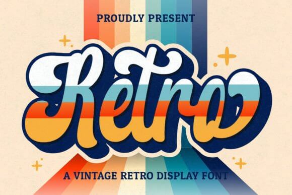
Retro Script lands in that sweet spot where “cute” still feels professional. We think it looks best when you keep the tracking a little tight, then let the swashes do the flirting, not your whole layout. Use it as a hero line, then pair with a clean sans for body copy and you’ve got logo typography that doesn’t try too hard.
Best Places To Use This Font
- Beauty Logos – Soft wordmarks that still read fast.
- Candle Labels – Cozy packaging with a handmade vibe.
- Bridal Shower Invites – Script that feels warm, not stiff.
- Social Quote Templates – Big headline energy in one line.
Funky Grunge – Rough Retro Display With Attitude
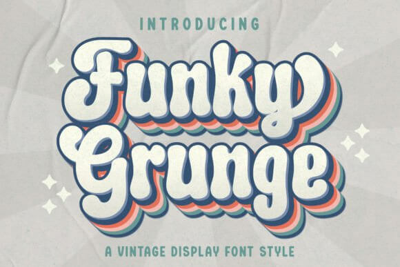
Funky Grunge looks like you printed a poster, crumpled it, then decided it slaps harder that way. Keep backgrounds simple because the texture already brings noise, and it can get messy fast. For punchy poster fonts, this one shows up loud and proud.
Great Fits For Real Projects
- Band Flyers – DIY grit without illegible chaos.
- Streetwear Drops – A headline that feels “limited run”.
- Skate Stickers – Rough edges, clean read.
- Event Posters – Big type that grabs from far away.
Lucky Retro – Playful 70s Lettering For Headlines
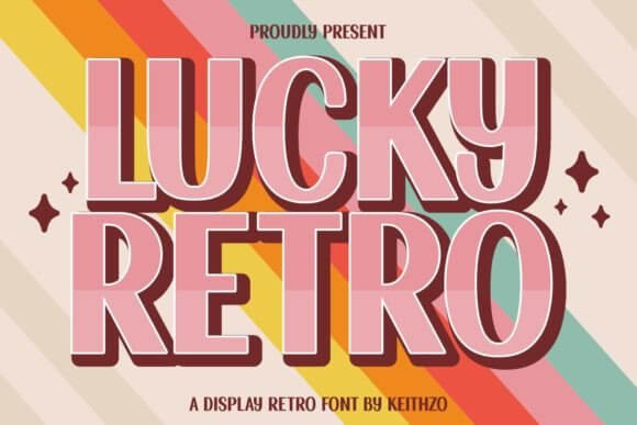
Lucky Retro feels sunny, bubbly, and a little cheeky. We’d use it when a brand needs friendliness more than “luxury”, like that fun shop you keep revisiting. It also plays nice in retro font combinations when you match it with a thin serif for contrast.
Where This One Works Hard
- Kids Party Decor – Bright headers that don’t scream.
- Sticker Shops – Cute product names that pop.
- Summer Menus – Smooth readability on drinks lists.
- Craft Fair Signage – Friendly type from a distance.
Retro Groovy Bundle – Mixed Retro Font Styles Pack
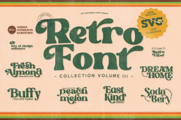
A bundle saves you when you need options fast, and Retro Groovy Bundle does exactly that. Swap styles for headlines, subheads, little badges, and your layout suddenly feels “designed” instead of assembled at 2 a.m. If you build brand kits, this pack supports retro font design across a whole system.
Use Cases We’d Actually Recommend
- Brand Moodboards – Quick type exploration in one place.
- Packaging Sets – Badges, flavor names, and callouts.
- Promo Banners – Multiple weights for hierarchy.
- Lookbooks – Headings that feel styled, not random.
Sodabery Designers Edition – Bold Retro Soda Shop Display
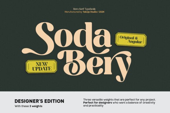
Sodabery Designers Edition gives classic diner energy without looking like a knockoff sign. It’s thick, confident, and super legible, which sounds boring until you try it on packaging and sales pages. For retro font bold headlines, this one keeps its shape even when you add outlines.
Best Project Matches
- Food Branding – Burgers, desserts, soda, all of it.
- Merch Graphics – Tees and totes love chunky type.
- Window Signage – Reads fast from the street.
- Product Badges – “New”, “Limited”, “Bestseller”.
Coastal Delight – Light Retro Script With Beachy Charm
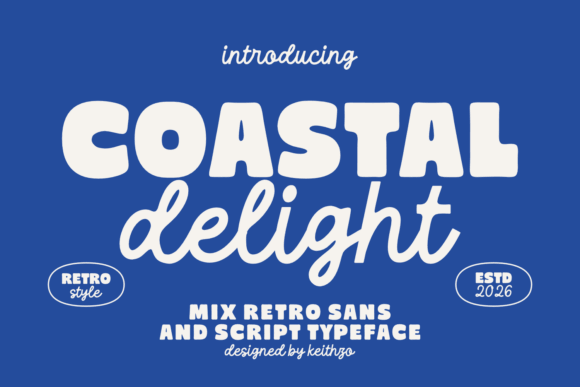
Coastal Delight feels airy, like a postcard you actually keep. Don’t cram it into tiny spaces – let it breathe, give it margins, give it sunlight, you know? It nails retro font aesthetic for lifestyle brands that want soft nostalgia, not heavy disco.
Where It Looks Effortless
- Beach Rental Logos – Friendly, calm wordmarks.
- Soap Packaging – Clean labels with a gentle twist.
- Travel Posts – Big titles over photos.
- Wellness Brands – Chill scripts for calming layouts.
Retro Heart You – Sweet Groovy Script For Cute Branding
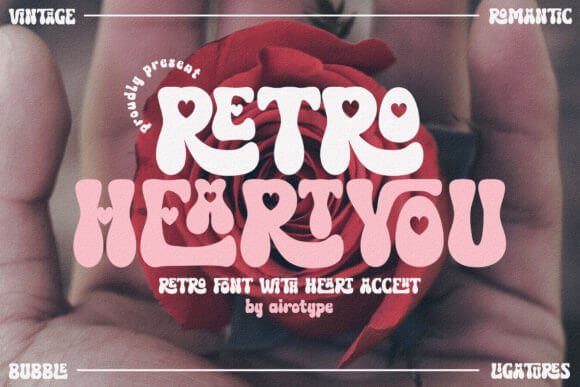
Retro Heart You goes full lovable, and yeah, we’re into it. It works when you want emotional warmth without turning your brand into baby-talk, which is a real line people cross. Use it for a name, then support with a neutral sans for retro font logo balance.
Projects That Fit The Vibe
- Gift Shops – Product names that feel personal.
- Valentine Collections – Cards, tags, and bundle covers.
- Handmade Businesses – Warm headers for storefronts.
- Scrapbook Titles – Cute, readable, not fussy.
Retro Honey – Rounded Retro Display With Warmth
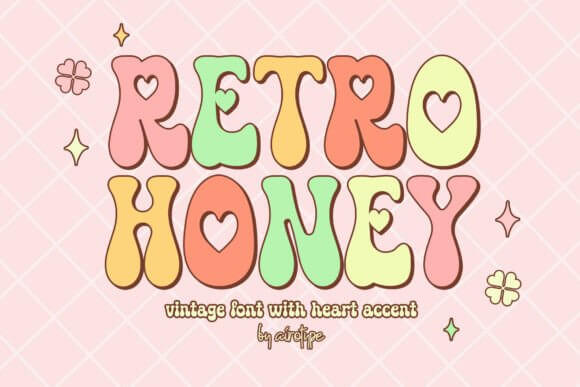
Retro Honey looks like soft caramel, rounded corners, easy smiles. It stays readable even when you stack letters or curve text on a badge, which designers quietly love. For quick retro font ideas, try it with a grain texture and a muted palette.
Where It Prints Nicely
- Coffee Packaging – Cozy labels that feel handmade.
- Bakery Menus – Friendly headers for sections.
- Product Stickers – Bold names on small formats.
- Holiday Gift Tags – Cute without being childish.
Funky Retro – Classic Groovy Display For Titles
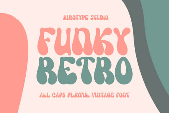
Funky Retro is the one you grab when you need “70s” in one second. It has that swelling stroke rhythm that looks amazing in big sizes, and kind of sad in tiny captions, so don’t fight it. It’s a strong pick for creative typography on posters and covers.
Use It For Loud, Fun Layouts
- Album Covers – Big type that carries the composition.
- Party Invites – Retro titles that feel instant.
- Campaign Headers – One-word hooks that pop.
- Retro Stickers – Bold text with curves.
Hippie Moment – Groovy Retro Lettering With Peace Vibes
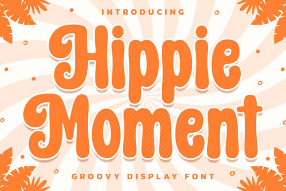
Hippie Moment leans into the mellow, wavy, peace-sign era without turning into a costume font. We’d drop it on a headline, then keep everything else simple so it feels intentional. It’s a fun route to retro title styling when you want softness, not grit.
Good Niches For This Look
- Yoga Studios – Warm promo titles and class posters.
- Festival Branding – Flyers, schedules, lineup graphics.
- Natural Skincare – Laid-back product naming.
- Art Prints – Retro sayings with flow.
The Funky – Chunky Retro Display For Brand Systems
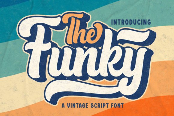
The Funky feels thick and graphic, like it belongs on a storefront sign with paint still drying. It holds up in a full brand system too – headers, badges, even short subheads if you keep line length tight. Try it when you need fonts branding that doesn’t whisper.
Where It Shines
- Pop-Up Shops – Bold signage and promo boards.
- Food Trucks – Big readable menu headers.
- Product Launch Pages – Punchy hero statements.
- Club Posters – Loud titles, quick impact.
Retro Holly – Festive Retro Display With Vintage Charm
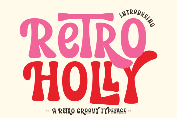
Retro Holly gives seasonal nostalgia without the tired clipart vibe. It’s bold enough to sit on busy holiday patterns, and it still reads clean when you add shadows or outlines. Use it for vintage typography design when you want cheer with structure.
Smart Holiday Uses
- Gift Guides – Section headers that feel curated.
- Market Booth Signs – Big titles on printed boards.
- Product Bundles – Covers for seasonal collections.
- Greeting Cards – Retro headlines with warmth.
Summer Fresh – Bright Retro Typeface For Sunny Graphics
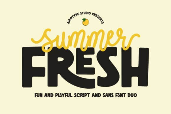
Summer Fresh feels like a cold drink poster taped to a shop window. It looks best with high-contrast color, then a little texture on top if you want that printed feel. We use fonts like this for retro graphic style layouts that need instant season energy.
Where It Fits Naturally
- Beach Event Flyers – Titles that sell the mood.
- Drink Labels – Flavor names that pop.
- Travel Merch – Tees, postcards, sticker packs.
- Summer Sales – Banners and promo tiles.
Varsity Lover – Retro Varsity Lettering With A Twist
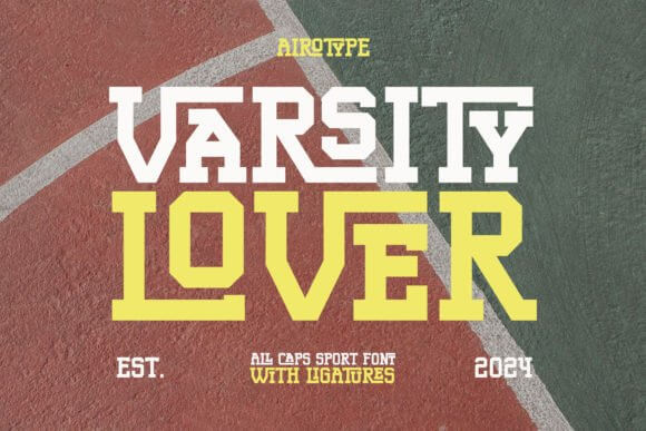
Varsity Lover gives collegiate structure, but it still feels playful, not stiff. Put it on curved text, add a stroke, and you’ve got that classic patch look in minutes. For sharp letter print design, this font makes even basic words feel “designed”.
Best Use Cases
- Team Merch – Names, numbers, slogan graphics.
- School Events – Posters and tickets with punch.
- Sports Clubs – Strong headers for promos.
- Retro Streetwear – Badge-style typography.
Flower Blossom – Cute Retro Script For Feminine Branding
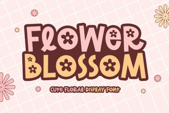
Flower Blossom feels romantic, but it doesn’t melt into unreadable curls, which we respect. It works best in short phrases, brand names, and sticker-style designs where you want instant sweetness. If you want fonts girly energy without looking generic, start here.
Where It Looks On-Brand Fast
- Boutique Logos – Soft wordmarks with personality.
- Makeup Labels – Pretty names that still read.
- Baby Shower Decor – Cute titles for signs and games.
- Planner Stickers – Small phrases with charm.
Lovely Summer – Modern Retro Script For Lifestyle Brands
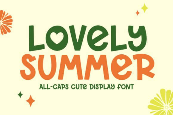
Lovely Summer brings a cleaner, more modern retro vibe, like a refreshed vintage label that still feels current. We’d pair it with a plain grotesk sans and call it a day, honestly. For quick retro typeface wins on lifestyle graphics, it’s easy to deploy.
Where It Plays Nice
- Home Decor Prints – Short quotes and room signs.
- Small Business Banners – Sale headlines with warmth.
- Photo Overlays – Titles that don’t overpower imagery.
- Packaging Sleeves – Brand name plus flavor notes.
Quick Wrap-Up And A Practical Next Step
Retro fonts work best when you treat them like a spice, not the whole meal. Pick one hero style, pair it with something boring on purpose, then test readability at small sizes before you fall in love. If you want help refining a font file or building a custom set for your brand, our team at Increobox cheers you on – and we’d honestly rather you ship something clean than “almost”.