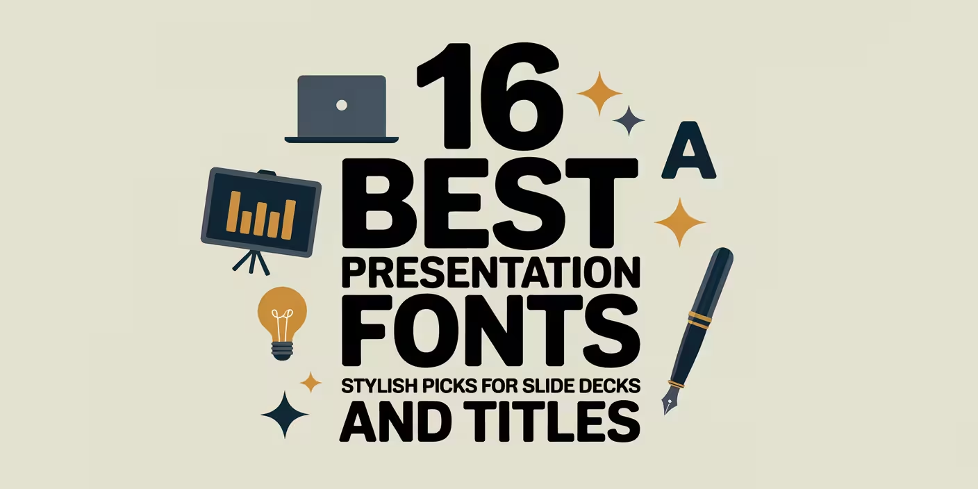
Presentation fonts can make or break a deck before anyone reads a single bullet. People form first impressions crazy fast, so your typography has to land instantly: clear hierarchy, sane spacing, strong contrast, and a vibe that matches your brand voice, not your mood at 2 a.m.
Below, we pulled 16 presentation fonts that behave nicely in PowerPoint and slide tools, from friendly scripts to crisp minimal sans styles, plus a few “loud” display faces for big statements. Mix one headline font with one body-safe font, keep kerning tidy, and your slides stop looking homemade . . . and start looking intentional.
Hello Florida Presentation Script For Sunny Headlines
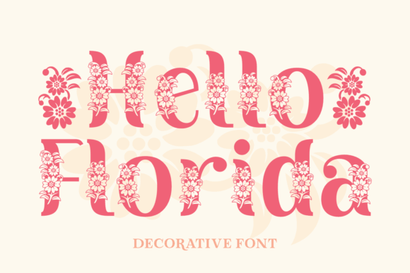
Hello Florida brings that breezy, handwritten energy that makes a title slide feel human, not corporate gray. Use it for short headlines only, keep tracking a touch open, and it suddenly looks like you hired a designer. We like it as a “spark” font in pitch deck design, then pair a calm sans for body copy.
Where Hello Florida Fits Best
- Title Slides And Openers – Big friendly headlines that feel personal.
- Beauty And Lifestyle Brands – Soft, warm, approachable tone.
- Workshop And Event Decks – A quick “welcome” that doesn’t look stiff.
- Social Ad Slides – Short hooks that stop scrolling.
Graciella Elegant Serif For Polished Presentations
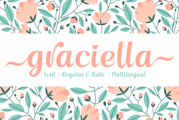
Graciella reads like modern editorial, the kind of serif that makes a “Problem” slide feel expensive. Keep it for headings and pull quotes, then let a simple sans handle the details. If your deck needs quiet authority, this one nails slide typography without trying too hard.
Where Graciella Works Smoothly
- Consulting And Strategy Decks – Clean, composed, credible headers.
- Fashion Lookbooks – Editorial titles with premium flavor.
- Case Study Slides – Strong section dividers and quotes.
- Portfolio Presentations – Makes projects feel curated.
Strong Display Sans For Loud, Clear Slide Titles
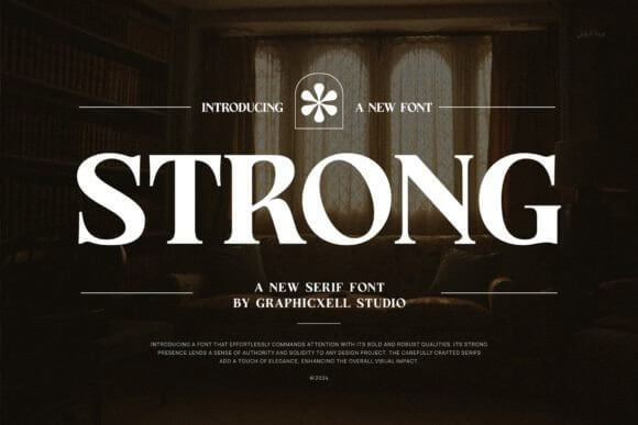
Strong is blunt in the best way. It punches through busy backgrounds, screenshots, and charts, so your message doesn’t get swallowed by visual noise. Use it for 3–6 word headings, then step back and let whitespace do the flex . . . it’s perfect when brand guidelines demand readability over flair.
Where Strong Looks Right
- Startup Metrics Slides – Headlines that survive tiny screens.
- Product Demos – Feature callouts that feel confident.
- Conference Keynotes – Big-room readability, no drama.
- Internal Training Decks – Clear sections and slide labels.
Fresh Juice Playful Display Font For Fun Decks
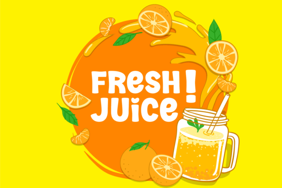
Fresh Juice feels like a sticker on a laptop, bright and a little cheeky. It works when your presentation needs charm more than “boardroom energy,” and honestly that’s a lot of projects. Drop it into a bold cover slide, keep the rest simple, and your PowerPoint template stops looking like every other deck on earth.
Where Fresh Juice Pops Off
- Creative Studio Intros – Fun headlines with personality.
- Kids And Education Projects – Friendly titles and prompts.
- Food And Beverage Pitching – On-theme, playful, memorable.
- Seasonal Campaign Slides – Quick energy for launch moments.
Strong Heart Duo Font Pair For Instant Hierarchy
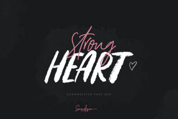
Strong Heart Duo gives you a built-in pairing, which saves time and prevents that classic “why do these fonts hate each other” problem. Use the louder style for headings, the calmer style for subheads, and your slides gain structure fast. It’s a solid move for a cohesive Google Slides theme when deadlines get spicy.
Where Strong Heart Duo Helps Most
- Brand Story Decks – Clear sections with a warm tone.
- Small Business Presentations – Easy hierarchy without extra work.
- Workshop Slides – Titles and steps stay readable.
- Client Proposals – Looks intentional, not thrown together.
Merova Modern Serif For Premium Slide Headlines
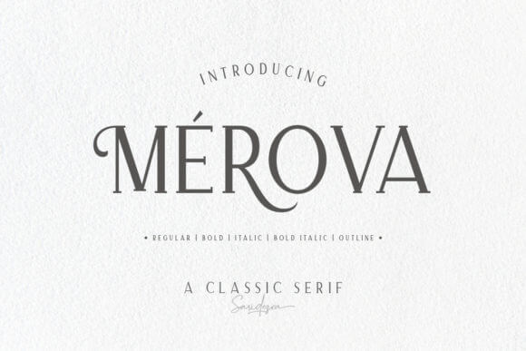
Merova sits in that sweet spot: elegant, readable, still a little dramatic. Put it on section headers, use generous line spacing, and let it breathe, because it looks worse when cramped. For founders building a startup presentation, it adds “we’re legit” energy without shouting.
Where Merova Feels Natural
- Investor Narratives – Clean confidence on key slides.
- Luxury Services – Premium tone for offers and packages.
- Editorial Style Decks – Big quotes and chapter titles.
- Agency Pitches – Strong headings over mood imagery.
Minimal Clean Sans For Crisp, Modern Presentations
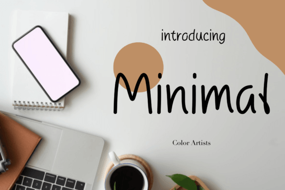
Minimal is the font you pick when you want zero drama and maximum clarity. It plays well with charts, UI screenshots, and dense info slides, because it doesn’t add visual clutter. Use it as your body font, then pair a bolder display face for titles, and your marketing deck instantly feels cleaner.
Where Minimal Wins
- Data And KPI Slides – Numbers stay sharp and readable.
- Product Roadmaps – Clear labels and timelines.
- Corporate Updates – Professional, simple, predictable (good).
- UX Case Studies – Doesn’t fight the interface screenshots.
Gravity Wanders Handwritten Font For Personal Stories
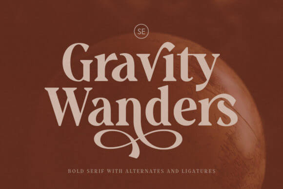
Gravity Wanders looks like a real marker line, which can feel risky, but it works beautifully on story slides. Use it to label moments, lessons, or quotes, then anchor everything with a clean sans. It’s a great accent for conference keynote decks that lean on narrative, not spreadsheets.
Where Gravity Wanders Shines
- Founder Stories – Human tone for “why we started” slides.
- Coaching And Mentoring – Quotes and key takeaways.
- Creative Process Decks – Annotations over visuals.
- Community Updates – Friendly, casual headings.
Pink Average Cute Display Font For Bright Slides
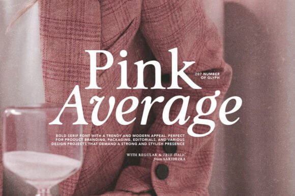
Pink Average feels sweet, but it can still look sharp when you keep your layout disciplined. Use it in big sizes for slide titles, avoid long sentences, and let color blocks do the supporting work. We’d grab it for a webinar slides cover page when the vibe needs to feel upbeat, not stiff.
Where Pink Average Feels On-Brand
- Beauty Tutorials – Fun chapter titles and sections.
- Creator Media Kits – Playful headers over clean grids.
- Seasonal Promos – Bright callouts and short hooks.
- Teen And Youth Programs – Friendly, approachable tone.
Outfits Bold Display Font For Trendy Deck Covers
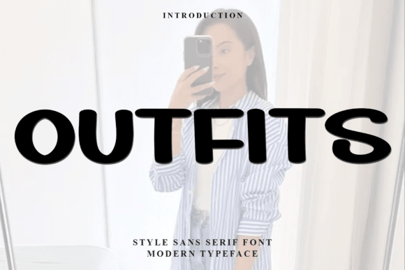
Outfits brings that punchy, poster-like energy that makes a deck cover feel intentional. Use it for the first slide, section dividers, and maybe one big statistic slide, then stop before it gets noisy. It pairs well with clean body fonts and helps a creative portfolio look more curated.
Where Outfits Goes Hard
- Fashion And Retail Decks – Trendy titles and lookbook sections.
- Campaign Recaps – Big results slides with attitude.
- Brand Mood Presentations – Strong typography-led layouts.
- Launch Teasers – Title slides that feel like a poster.
Bellflower Soft Serif For Romantic, Gentle Headings
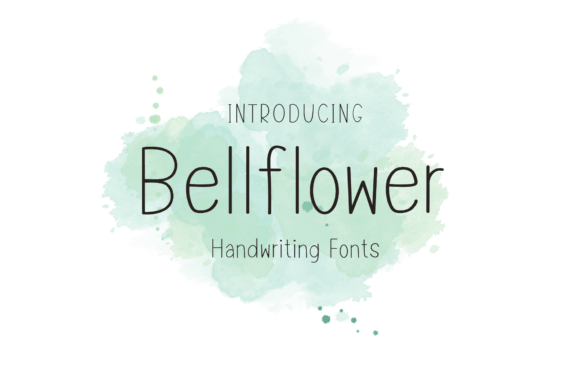
Bellflower feels delicate without turning into unreadable fluff, which is rare. Keep it for headings and short captions, and don’t be afraid of extra line height, it likes air. We’d use it in a product launch deck for wellness or boutique brands where tone matters as much as content.
Where Bellflower Fits Naturally
- Wellness And Skincare – Calm, refined typography.
- Wedding And Event Proposals – Elegant section headers.
- Brand Identity Decks – Soft editorial vibe for storytelling.
- Lookbooks And Catalog Slides – Pretty titles over imagery.
Pimoora Modern Display Font For Punchy Sections
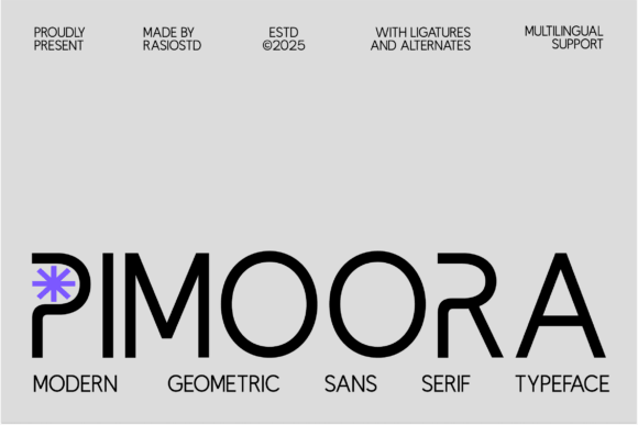
Pimoora gives you a bold silhouette that reads fast, even when someone watches your slides on a phone. Use it for section titles, “Key Takeaway” slides, and short callouts, then keep body copy neutral. It helps a sales presentation feel direct, like you actually know what you’re doing.
Where Pimoora Performs
- Sales And Proposal Decks – Strong section breaks and headings.
- Agency Capability Slides – Confident labels and services.
- Webinar Promos – Big readable title frames.
- Case Study Highlights – Quick “results” callouts.
Saphira Stylish Script For Signature Moments In Slides
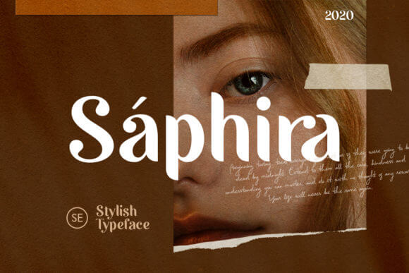
Saphira works like a signature. Use it once per slide max, for emphasis, a name, a theme word, a promise, and then let it go. Paired with a crisp sans, it adds softness without wrecking readability, so it’s handy for educational slides that still need warmth.
Where Saphira Adds Value
- Course And Lesson Decks – Friendly accents for key ideas.
- Personal Brand Slides – Names, taglines, and quote frames.
- Creative Proposals – Soft emphasis on outcomes.
- Event Speakers – Signature-style name slides.
Nayumi Minimal Display Font For Calm, Smart Decks
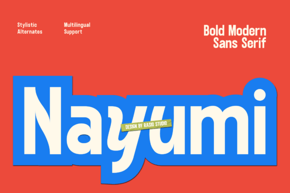
Nayumi feels modern and tidy, like the font version of a clean desk. It handles headings and subheads without getting fussy, and it plays nice with icons and simple grids. Use it when your deck needs a consistent system, like an investor update where clarity beats decoration.
Where Nayumi Makes Sense
- Monthly Reporting Decks – Consistent hierarchy across slides.
- Product Strategy – Calm titles over frameworks.
- Team Training – Clear modules and lesson labels.
- Minimal Brand Presentations – Simple, sharp typography.
Hamsters Cute Display Font For Playful Presentations
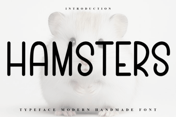
Hamsters is adorable, full stop. Use it for short headings, activity slides, or big labels, because it can get messy at small sizes. If your presentation needs to feel welcoming and fun, this font does the job, and it also works for event signage when you want people to smile.
Where Hamsters Feels Right
- Kids Activities – Titles, prompts, and game slides.
- Community Events – Friendly headers and directions.
- School Clubs – Fun section dividers.
- Craft And Hobby Workshops – Playful titles and labels.
Thursday Modern Serif For Confident, Clean Titles
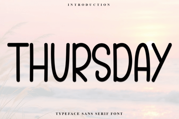
Thursday feels like a modern serif that knows how to behave. It looks strong on title slides, doesn’t wobble in long headings, and brings a bit of style without turning into a costume. Use it for a clean deck system, then repurpose the same look into a social media carousel so your campaign stays consistent.
Where Thursday Looks Professional
- Business Proposals – Clear, confident section titles.
- Service Menus – Premium vibe without heavy ornament.
- Brand Guidelines Slides – Strong headers and callouts.
- Portfolio Case Studies – Modern editorial structure.
A Quick Wrap And A Practical Tip
Pick one headline font from this list, then lock in one calm body font and stop collecting random typefaces like souvenirs. Test your slides on a phone, a laptop, and a projector if you can, because readability exposes everything. If you want help building a consistent deck system, we’re into that sort of work at IncreoBox.