Choosing vintage fonts sounds easy until you open a library and get buried under dusty serifs, fake distress, and groovy curves that all start blending together. We pulled 15 options that actually earn their space – some lean into old newspaper texture, some hit clean retro branding, and some bring that loud vintage fonts alphabet energy designers keep chasing for posters, packaging, logos, menus, and social graphics.
If you want vintage fonts aesthetic without the cheesy costume vibe, this list cuts through the clutter. You’ll see retro typography, typewriter letters, label-friendly classics, playful display font shapes, and a few softer picks that help branding, editorial covers, merch, and handmade packaging feel alive. We think the right vintage font style does half the selling before a single word lands . . . and yeah, that still matters.
The content on this website was created with the help of AI.
Vintage King For Bold Retro Branding
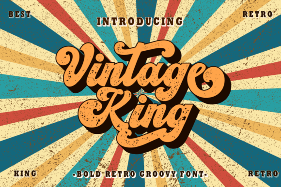
Vintage King feels like the font you grab when a layout needs swagger fast. The letters look bold, worn, and proud, so headlines land with weight instead of floating around like filler on a weak mockup. We like it for retro logo design, beer labels, bar menus, and merch that needs old-school muscle without turning stiff or weirdly theatrical.
Where This Font Works Best
- Craft Beer Branding – Strong headlines for cans, taps, and menu boards.
- Motorcycle Club Merch – Adds grit to tees, patches, and decals.
- Barbershop Identity Kits – Gives classic shop branding extra punch.
- Fairground Poster Titles – Holds attention from a distance.
Vintage Rainbow For Groovy 70s Letters
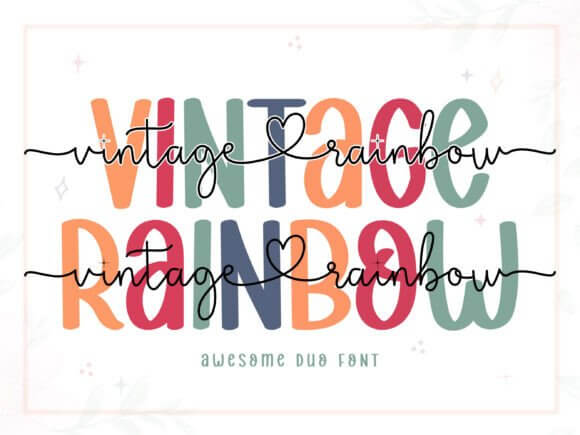
Vintage Rainbow leans cheerful, a little cheeky, and very 70s without going full costume. Its rounded shapes make big titles feel friendly, which helps when you’re building a dreamy palette, a summer campaign, or a brand that wants warmth instead of edge. It works best in groovy poster typography where color, curves, and nostalgia need to play nice on the same canvas.
Best Fits For Real Projects
- Summer Event Flyers – Bright, happy type for feel-good promos.
- Kids Apparel Graphics – Keeps lettering playful and easy to read.
- Retro Cafe Menus – Adds color without visual chaos.
- Playlist Cover Art – Nails a soft 70s mood fast.
Brighton Vintage For Soft Heritage Design
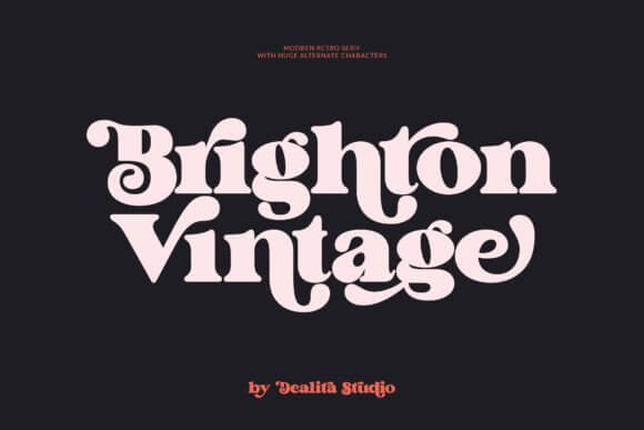
Brighton Vintage brings a softer mood, and we mean that in a good way. The spacing and curves feel polished but still human, like vintage font letters dressed up for a boutique window instead of a dusty flea-market cliché. We’d use it for feminine brand identity, candle labels, mood boards, and packaging that wants romance with a clean finish.
Smart Uses For This Typeface
- Boutique Candle Labels – Feels polished on soft packaging.
- Wedding Welcome Signs – Brings charm to romantic layouts.
- Beauty Studio Logos – Supports delicate branding systems.
- Lifestyle Blog Headers – Keeps titles airy and warm.
Old Newspaper For Distressed Editorial Style
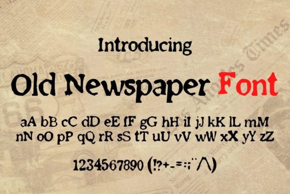
Old Newspaper is rough in the right way. It gives headlines that clipped-from-the-archive edge, the kind of texture that makes a poster, flyer, or editorial spread feel lived in right away without begging for extra grunge effects. For editorial headline styling, true crime graphics, café broadsides, or themed event signage, this one has bite and zero fake polish.
Where This One Shines
- Editorial Cover Lines – Creates archive-style tension fast.
- Themed Escape Room Props – Sells the story at first glance.
- Coffeehouse Broadsheets – Gives menus and posters rough charm.
- Mystery Podcast Artwork – Adds mood to title typography.
Vintage Browner For Rustic Label Design
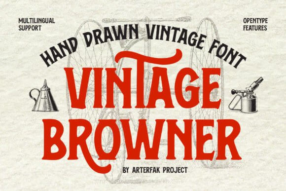
Vintage Browner feels earthy and a bit rugged, like a market label printed on kraft stock after three cups of strong coffee and a long morning at the press. The tone suits handmade goods, heritage packaging, and logos that need warmth instead of gloss. We keep it in mind for artisan packaging fonts and rustic badge layouts that should feel honest, not precious.
Best Niches For This Look
- Farm Shop Packaging – Matches handmade goods and natural textures.
- Soap Label Design – Feels warm on kraft wraps and tags.
- Country Market Signage – Brings charm to stall graphics.
- Bakery Stamp Logos – Works well in circular badge layouts.
Antique For Classic Serif Character
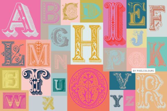
Antique does what the name promises – classic shapes, old-world charm, and enough detail to make even short words look expensive. It doesn’t chase attention with gimmicks, which is refreshing, because some vintage fonts try way too hard. We rate it for heritage serif branding, book covers, apothecary labels, and upscale menu titles that need authority.
Strong Places To Use It
- Bookshop Branding – Adds literary weight to logos and signs.
- Apothecary Jar Labels – Feels old-world and trustworthy.
- Fine Dining Menus – Keeps section titles classy.
- Historic Event Invitations – Sets a formal tone quickly.
Barbie Vintage Extrude For 3D Retro Pop
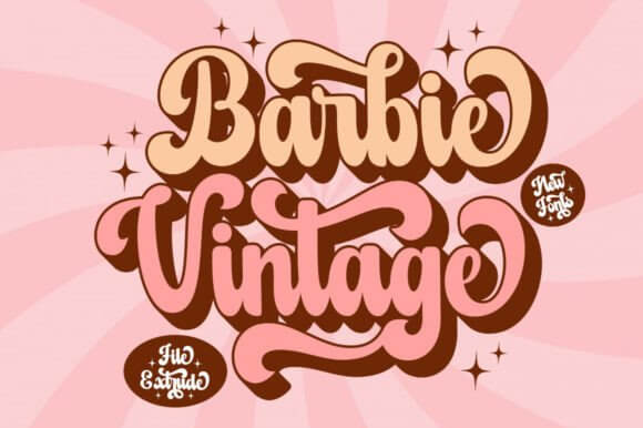
Barbie Vintage Extrude goes playful and loud, full stop. The extruded look adds instant depth, so even plain text starts acting like display art, and that saves time when a layout needs attitude fast. If a design wants sparkle, sass, and obvious throwback flavor, 3D retro lettering is where this font really earns its keep and steals the frame.
Great Matches For This Style
- Toy Brand Campaigns – Makes big words feel fun and loud.
- Birthday Decor Sets – Pops on banners and favor tags.
- Pop Culture Sticker Packs – Loves short phrases and color.
- Y2K Throwback Posts – Adds depth to playful text art.
Fresco Vintage Duo For Layered Type Play
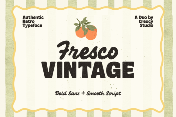
Fresco Vintage Duo gives you more to work with because the duo setup lets you layer contrast without fussing for an hour. One style can carry the message, the other can flirt around it, which sounds dramatic… because it is. That makes it handy for mixed font pairing, branding kits, packaging fronts, and stylish promo graphics where you want polish and personality together.
Practical Uses Designers Will Love
- Boutique Brand Systems – Mixes headline and accent styles neatly.
- Perfume Box Fronts – Looks rich with layered typography.
- Fashion Promo Graphics – Gives social posts extra contrast.
- Creative Workshop Slides – Keeps titles stylish, not stiff.
Old Spokes For Rugged Signage And Logos
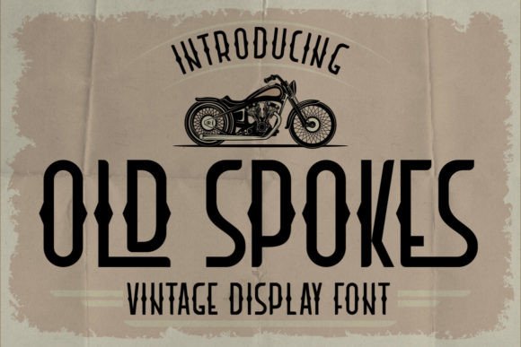
Old Spokes feels mechanical, rugged, and a little adventurous. We can see it on bike brands, repair shops, outdoor goods, or any logo that wants grit without drifting into cowboy territory or dusty parody. For vintage badge typography, it brings that handcrafted sign-painter mood designers keep trying to fake with filters and never quite nail.
Where It Lands Best
- Cycling Shop Logos – Feels right at home in badge marks.
- Camping Gear Labels – Adds rugged charm to product names.
- Garage Event Posters – Gives headlines a mechanical edge.
- Handmade Tool Packaging – Supports durable, no-frills branding.
Old Scotch For Whiskey Label Vibes
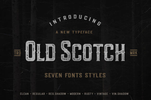
Old Scotch has strong label energy – dark, rich, maybe a touch boozy, honestly. The letterforms suit premium packaging where tradition matters and every line needs authority, so the font does a lot of heavy lifting before color even joins the party. We’d reach for it in whiskey label design, restaurant branding, masculine gift boxes, and product seals with heritage flavor.
Smart Picks For Brand Work
- Whiskey Bottle Labels – Signals heritage and confidence.
- Steakhouse Menu Covers – Strengthens premium dining visuals.
- Gentlemens Gift Packaging – Adds tradition to boxed sets.
- Cigar Lounge Signage – Fits rich, dark brand moods.
Nolton Vintage For Refined Retro Branding
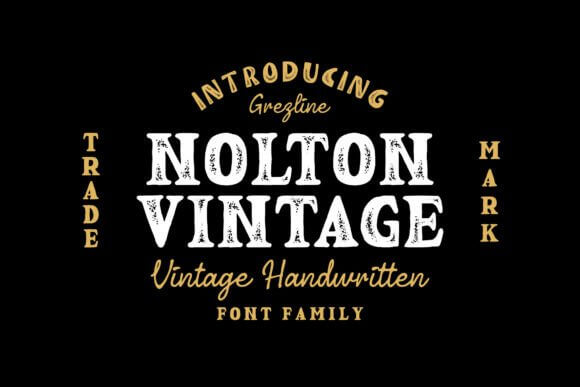
Nolton Vintage looks tighter and cleaner than some of the louder picks here, which is nice. Not every retro project wants noise, distress, or gimmicky curves flung everywhere like confetti. This one fits refined logo systems where you need a vintage font style that feels upscale, steady, and easy to place across packaging, cards, and signage.
Where This Font Works Best
- Jewelry Brand Marks – Keeps vintage style clean and upscale.
- Hotel Wayfinding Titles – Feels refined on print and signage.
- Tailored Stationery Sets – Works beautifully on cards and envelopes.
- Premium Tea Packaging – Adds calm heritage to labels.
Vintage Retro For Loud Throwback Graphics
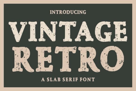
Vintage Retro is the kind of name that sounds broad, and yeah, the font has range. It can go fun, bold, or a little weird depending on color and spacing, which gives designers real room to push instead of just swapping backgrounds and calling it done. We like it for throwback campaign graphics, album art, stickers, and punchy headers that need instant nostalgia.
Best Fits For Real Projects
- Album Cover Concepts – Brings instant nostalgia to title art.
- Street Market Posters – Reads loud in busy layouts.
- Skate Sticker Designs – Loves bold color and attitude.
- Throwback Social Ads – Helps campaigns feel energetic fast.
Vintage Millenia For Timeless Logo Work
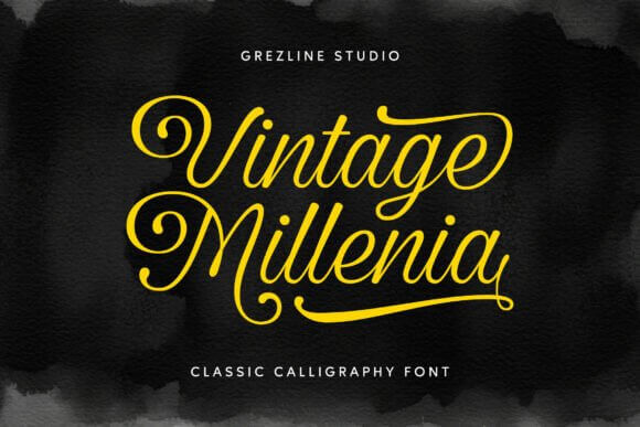
Vintage Millenia feels smoother and more composed, almost like a bridge between classic typography habits and modern branding demands. It carries history without looking stale, which is harder to pull off than people think. That balance makes it smart for timeless wordmarks, beauty packaging, journal covers, and clean logo refreshes that still want a whisper of the past.
Smart Uses For This Typeface
- Skincare Logo Refreshes – Balances old soul and modern polish.
- Journal Cover Design – Gives titles a calm, classic lift.
- Florist Packaging Bands – Feels elegant on wraps and boxes.
- Home Decor Brand Assets – Supports timeless product storytelling.
Typewriter2 For Raw Editorial Texture
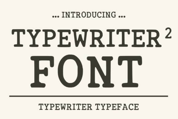
Typewriter2 strips things back and lets texture do the talking. The uneven rhythm and familiar letter pattern create emotion fast, which is exactly why typewriter styles still work for storytelling pieces and mood-heavy brands. We rely on it for typewriter text effects, memoir covers, stationery, zines, and editorial layouts that need human friction instead of glossy perfection.
Where This One Shines
- Memoir Book Titles – Adds emotion before the first page.
- Indie Zine Layouts – Brings texture to editorial spreads.
- Poetry Print Cards – Feels intimate and unfiltered.
- Detective Game Props – Sells clues, notes, and documents.
Chunky Vintage For Playful Poster Energy
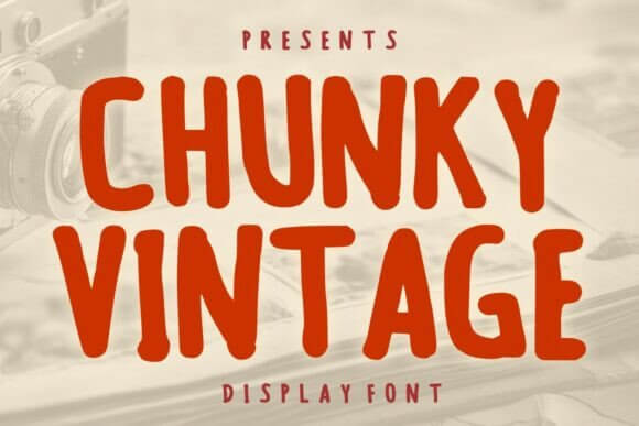
Chunky Vintage is big, fun, and impossible to ignore. Those heavier shapes make short phrases pop, so you don’t need ten extra effects cluttering the canvas or rescuing a weak headline. For bold poster lettering, kids brands, sticker packs, market signs, or retro merch, it delivers energy with zero apology and a nice dose of loud charm.
Best Niches For This Look
- Food Truck Posters – Demands attention from far away.
- Kids Party Invites – Keeps big lettering fun and clear.
- Sticker Shop Branding – Works great on playful mini marks.
- Retro Market Banners – Brings cheerful weight to short slogans.
Choosing The Right Vintage Font Style
The best vintage fonts don’t all chase the same mood, and that’s the point. Some sell grit, some sell charm, some just make a plain headline finally look alive. Start with the feeling your project needs first, then match the letters to that job. If one of these picks clicks, grab it, test it in a real layout, and trust your eye – not the hype.