Vintage fonts do more than decorate a headline. They signal era, texture, attitude, and trust before a reader finishes the first word. At Increobox, we keep seeing the same pattern in branding mockups, cafe menus, wedding stationery, label design, and poster work: swap a flat default typeface for the right retro serif, script lettering, or distressed display face, and the whole piece wakes up. This shortlist pulls together 12 styles that cover typewriter grit, newspaper ink, groovy summer curves, luxe scripts, varsity blocks, and rough grunge edges. If you need vintage fonts aesthetic enough for social graphics, sharp enough for logos, and flexible enough for packaging, these picks give you real options instead of fluff.
The content on this website was created with the help of AI.
Old Typewriter For Raw Vintage Font Letters
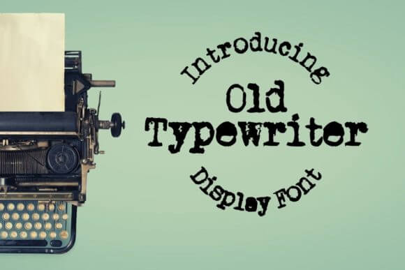
Old Typewriter hits with crooked rhythm, dry ink texture, and that stubborn analog feel people keep chasing with filters. We reach for it when a layout needs grit, not polish, because it makes quotes, labels, and headers feel found instead of freshly manufactured. If you want retro typography that looks a little noisy and a lot believable, this one earns its spot fast.
Best Fits For Old Typewriter
- Book Covers – Push memoirs, crime stories, and literary projects toward a tactile old-page mood.
- Cafe Menus – Give daily specials and printed menus a lived-in voice.
- Zines And Journals – Add imperfect type that feels honest.
- Packaging Labels – Sell handmade goods with rough character.
Loved For Soft Vintage Fonts Handwriting
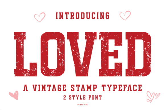
Loved leans sweet without turning syrupy, and that balance matters when you build a feminine brand or a handmade gift line. Its handwritten flow gives names and short phrases a gentle pulse, so designers can shape logo design, tags, and social headers that feel personal instead of canned. Cute, yes. Weak, no.
Where Loved Feels Right
- Boutique Logos – Create a warm first impression for small fashion and gift brands.
- Candle Labels – Add softness to product names and scent collections.
- Gift Cards – Make short phrases feel intimate and handmade.
- Beauty Posts – Dress up launches, promos, and seasonal visuals.
Summer Vintage For Playful Retro Lettering
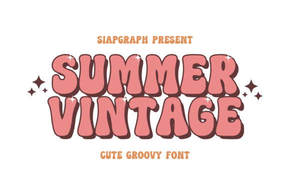
Summer Vintage brings that sun-faded, groovy swing people chase in 60s and 70s inspired art. The curves feel relaxed, the vibe feels warm, and short headlines look great fast, which makes it a strong pick for poster lettering, album graphics, tees, and travel-themed promos. It feels fun without acting childish.
Great Uses For Summer Vintage
- Music Posters – Push gig art toward a cheerful retro mood.
- T-Shirt Prints – Make short slogans pop with vintage energy.
- Beach Event Flyers – Set a relaxed tone before anyone reads the details.
- Food Truck Branding – Add warmth to menus and truck signage.
Vintage Charm For Elegant Vintage Font Style
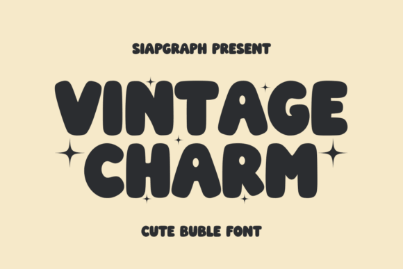
Vintage Charm looks polished, but it still keeps a little old-soul flair, which saves it from feeling stiff. We like it for brands that want elegance without cold luxury energy, since it builds brand identity across logos, signage, and quote graphics with almost zero fuss. Clean spacing helps a lot here.
Best Projects For Vintage Charm
- Boutique Branding – Give fashion and decor shops a graceful signature look.
- Salon Signage – Add style without losing readability.
- Quote Graphics – Dress up short lines for shareable content.
- Product Cards – Lift small inserts, tags, and thank-you notes.
Velvety Vintage With Rich Retro Curves
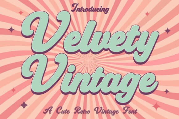
Velvety Vintage slides into upscale work with soft edges and a richer rhythm than most trendy retro scripts. If a box, label, or hero headline needs warmth plus a touch of glamour, this font handles packaging design beautifully and keeps the page from looking overworked. Honestly, it makes small brands look pricier.
Where Velvety Vintage Shines
- Chocolate Boxes – Wrap artisan products in a fuller, richer mood.
- Perfume Labels – Add softness to names and scent notes.
- Candle Packaging – Give handmade lines a premium feel.
- Fashion Lookbooks – Support refined headlines and section breaks.
Old Newspaper For Inked Vintage Fonts Design
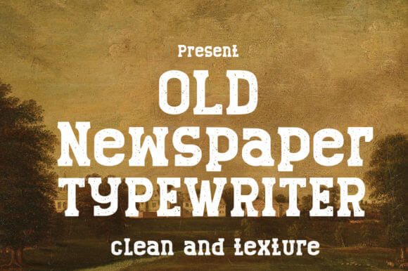
Old Newspaper gives you instant headline energy. The worn details echo archive clippings and pulp print, so layouts gain depth fast, and you do not need piles of textures to fake age. We use it for editorial layout, event posters, journal covers, and gritty ads when a polished serif would just feel fake.
Smart Uses For Old Newspaper
- Magazine Covers – Build loud headlines with old-print character.
- Event Flyers – Add urgency to local shows and pop-up promotions.
- Podcast Art – Give true crime or history series a printed edge.
- History-Themed Menus – Tie food concepts back to an older era.
Violetta For Romantic Vintage Script Letters
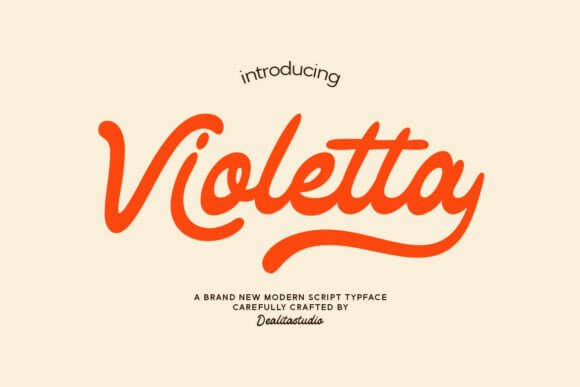
Violetta leans romantic, loose, and a bit dressy, yet it still reads clearly in names, subheads, and short taglines. That mix makes it handy for wedding stationery, floral branding, beauty packaging, and social promos that need softness with a grown-up finish. Some scripts overdo the drama. This one stays usable.
Best Matches For Violetta
- Wedding Invites – Give names and dates a graceful handwritten touch.
- Floral Shops – Pair bouquets and branding with gentle motion.
- Spa Branding – Create calm, feminine headers and offers.
- Boutique Thank-You Cards – Make every insert feel more personal.
Madista Vintage For Crafted Retro Branding
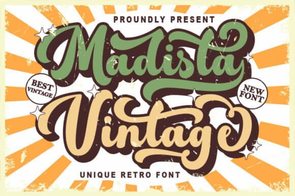
Madista Vintage feels hand-touched in the best way. It brings a crafty retro mood that suits homemade goods, lifestyle branding, and market-style promo pieces, and it gives craft branding more personality than the usual overused rustic fonts. If you sell charm, jam, soap, or stitched goods, yeah, look here first.
Where Madista Vintage Works
- Farmers Market Signs – Help handmade products stand out from generic displays.
- Soap Labels – Add warmth to scent names and wrapper text.
- Craft Stores – Support a friendly, homegrown visual style.
- Recipe Cards – Make kitchen printables feel nostalgic and inviting.
Grunge Project For Worn Vintage Font Ideas
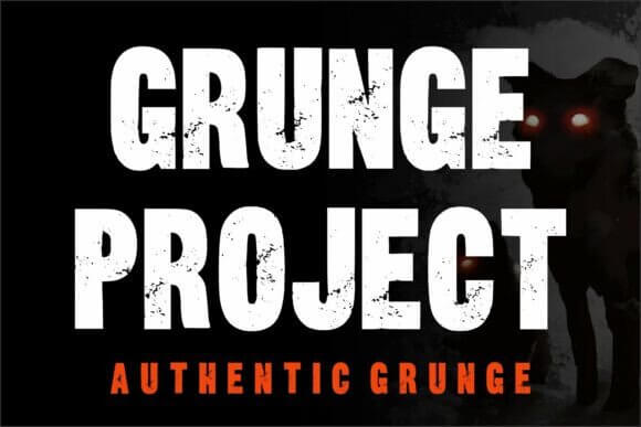
Grunge Project comes in loud and messy, which is exactly the point. The texture bites, the edges break, and headlines instantly feel alive, so designers can push album cover design, skate graphics, protest posters, or edgy merch without stacking ten distress effects on top. It looks rough, but it still holds shape.
Great Places For Grunge Project
- Band Posters – Drive raw energy into tour art and local gig promos.
- Skate Deck Graphics – Match rough visuals with loud type.
- Podcast Covers – Add edge to music, culture, or documentary shows.
- Street Event Flyers – Catch attention fast with broken texture.
Block Varsity For Bold Retro Team Lettering
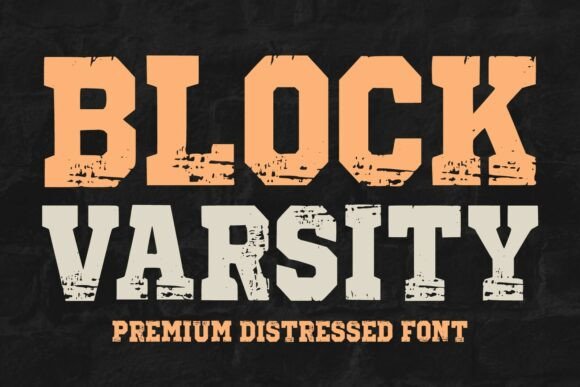
Block Varsity goes straight for old-school confidence. Big letters, sturdy geometry, and sports energy make it perfect when you want a retro team feel that still prints clean on shirts, banners, and badges. We would grab it for school merchandise, pep rally art, diner promos, or nostalgic logo sets in a heartbeat.
Best Uses For Block Varsity
- Team Jerseys – Keep names and numbers bold and readable.
- School Spirit Posters – Push game-day excitement with classic sports type.
- Diner Menus – Add Americana flair to burger spots and milkshake bars.
- Campus Events – Create banners and flyers with instant energy.
Retro Grunge For Loud Vintage Poster Type
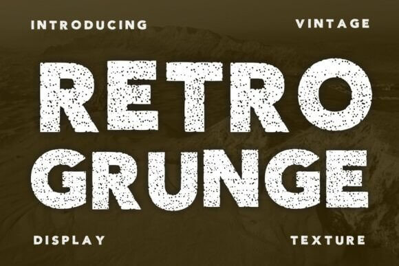
Retro Grunge mixes playful retro forms with rough texture, so it lands somewhere between cool and chaotic. That tension works great for streetwear graphics, throwback posters, sticker packs, and youth brands that hate polished perfection. If your layout feels too safe, this one can kick it awake . . . fast.
Where Retro Grunge Hits Hard
- Hoodie Prints – Push oversized text with a worn edge.
- Sticker Sheets – Make quick phrases feel louder and bolder.
- Sneaker Campaigns – Support youth-focused drops and collabs.
- Festival Flyers – Add movement and tension to promo art.
Rust Rough For Textured Vintage Font Design
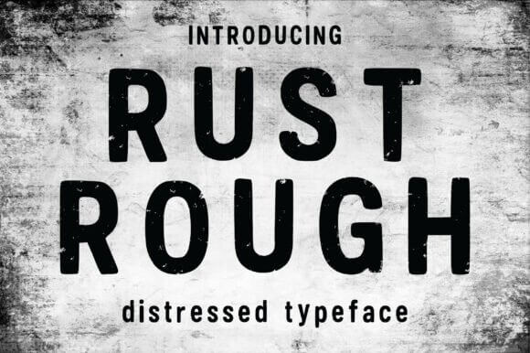
Rust Rough feels weathered, dry, and slightly industrial, like painted letters on an old metal sign that survived a few decades and then some. We like it for distressed branding, rugged packaging, workshop logos, and bold poster headers because it adds texture without burying the words. Simple idea, strong payoff.
Great Fits For Rust Rough
- Workshop Logos – Give maker brands a tougher visual voice.
- Beer Labels – Add grit to craft brews and seasonal releases.
- Outdoor Posters – Hold attention with rugged display type.
- Vintage Sign Replicas – Echo worn paint and old metal surfaces.
Pick The Mood Before The Font
We think the best vintage fonts never play dress-up for no reason. They solve a mood problem fast – they warm up clean branding, roughen polished packaging, or give a poster the bite it missed. Start with the feeling you want people to catch in one glance, then test two or three styles from this list in a real mockup. That shortcut saves hours, honestly.