Vintage fonts do a weird, brilliant thing – they make brand-new work feel trusted in about two seconds. A sharp serif, a dusty typewriter face, or loose handwriting can shift a logo, menu, label, or poster from flat to memorable fast. Designers still lean on retro typography because people read mood before they read words, and the mood lives in the letters.
We pulled 16 styles that cover the full spread: groovy stacked headlines, Western display fonts, soft script lettering, and worn classics for packaging or badge design. Some feel polished, some feel rough around the edges . . . better, honestly. If you need vintage fonts aesthetic ideas, smarter alphabet choices, or easy free options for branding graphics, invitations, and social posts, this lineup cuts the guesswork.
The content on this website was created with the help of AI.
Groovy Stacked For Bold 70s Vintage Fonts
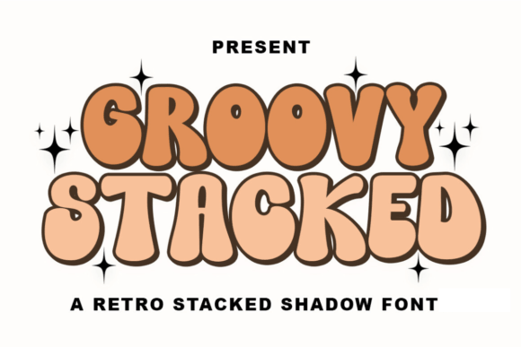
Groovy Stacked is pure fun, no apology. The layered shapes and bounce lean hard into vintage fonts aesthetic territory, so a plain headline suddenly feels alive. We think it kills in big formats and any 70s poster design that needs instant attitude. Tiny sizes, though – nope.
Where This Font Works Best
- Album Covers – Big titles with instant retro energy.
- Sticker Brands – Playful packaging that wants personality first.
- Party Flyers – Loud lettering for themed events and nights.
- Lounge Menus – Headers that feel relaxed and nostalgic.
Vintage Remington For Worn Typewriter Charm
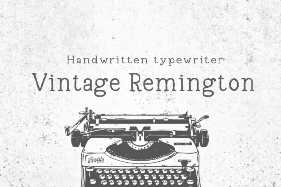
Vintage Remington brings that clipped, dusty typewriter mood people still love for journals, coffee labels, and bookish branding. It feels human because it is a little uneven, a little worn, and that texture sells the story. For typewriter logo ideas or editorial pull quotes, it gives vintage fonts a tougher edge without trying too hard.
Smart Fits For This Style
- Novel Jackets – Great for literary or archival vibes.
- Coffee Bags – Adds warmth to rustic product labels.
- Journal Covers – Makes stationery feel tactile and real.
- Zine Pull Quotes – Works well in gritty editorial layouts.
Scripto For Smooth Vintage Fonts Handwriting
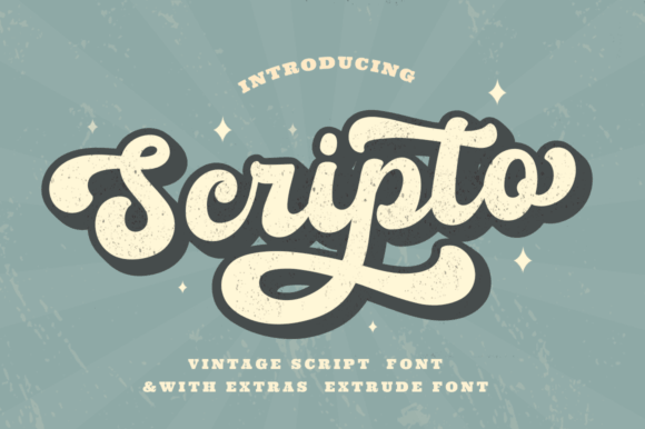
Scripto goes softer. The strokes feel loose and personal, almost like a note scribbled on good paper, which makes it great when retro type needs warmth instead of grit. If your project leans into script branding, handmade packaging, or romantic headers, this one behaves beautifully and still stays readable.
Projects That Suit It
- Candle Boxes – Soft script for cozy premium goods.
- Wedding Vows – Lovely for invites and keepsakes.
- Beauty Packaging – Adds elegance without feeling cold.
- Quote Reels – Smooth lettering for charming graphics.
Roadster Script For Retro Speed And Style
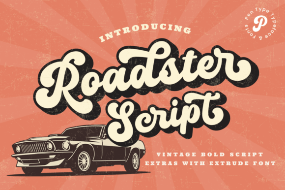
Roadster Script has motion baked into it. The slant, the loops, the clean swagger – it all points to classic garages, diners, race posters, and old-school merch. We like it for retro diner lettering because it feels polished but never stiff, which is a tricky balance and this one nails it.
Great Niches For This Look
- Diner Menus – Perfect for bold headers and specials.
- Garage Logos – Gives repair or custom shops instant flavor.
- Racing Posters – Adds speed to vintage event graphics.
- Retro Merch – Ideal for tees, caps, and patches.
Belvona Vintage For Classic Serif Branding
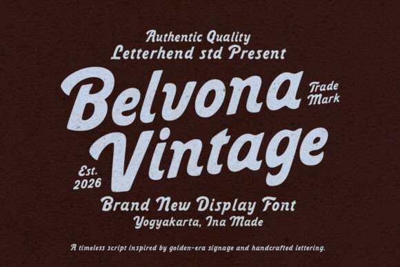
Belvona Vintage feels more refined than loud, which is useful when a retro look needs class and not costume. Its serif structure gives logos and packaging a stable backbone, then the vintage detailing adds charm around the edges. For a vintage serif logo or boutique label, this font looks expensive without getting fussy.
Best Uses For This Font
- Boutique Labels – Chic branding with a heritage feel.
- Wine Packaging – Elegant titles for premium bottles.
- Editorial Mastheads – Strong for cover lines and section names.
- Monogram Invitations – Refined lettering for formal events.
Autogate Duo For Layered Vintage Font Design
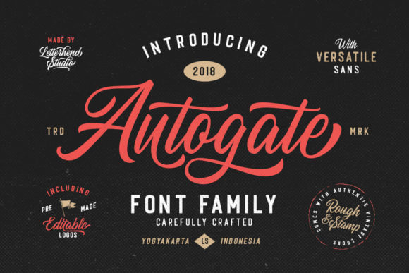
Autogate Duo does the heavy lifting for designers who want contrast fast. You get a built-in mix, so headlines and subheads already feel connected. For fast mockups, font pairing ideas, or layered badge work, that saves time and stops the endless scrolling spiral. Yep, we know that rabbit hole too well.
Where This Font Works Best
- Badge Systems – Easy hierarchy for layered emblems.
- Launch Graphics – Handy for promo art with multiple text levels.
- Box Fronts – Great on product names plus short descriptors.
- Event Tickets – Gives instant structure to busy layouts.
Loved Outline For Soft Retro Lettering
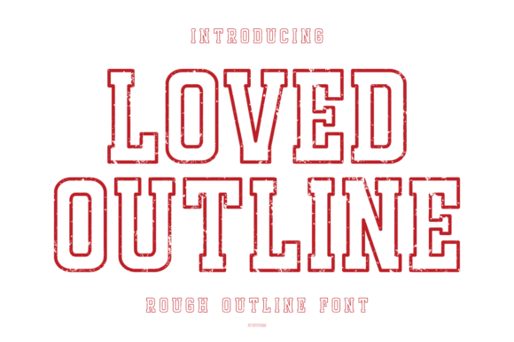
Loved Outline is lighter, sweeter, and honestly kind of addictive. The outlined letterforms create space inside the text, which gives layouts an airy retro twist instead of a dense blocky one. If you want playful outline text effects for apparel, cards, or cute branding, this font keeps things bright without tipping into cheesy.
Projects That Suit It
- Kidcore Apparel – Fun lettering that stays easy on the eyes.
- Greeting Cards – Sweet titles with room to decorate.
- Planner Stickers – Light outlines suit crafty extras.
- Sweet Shop Logos – Great for candy, bakes, and small treats.
Cowboys Vintage For Rugged Western Branding
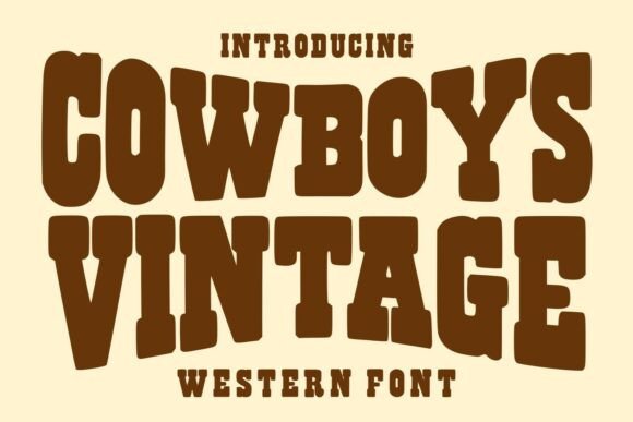
Cowboys Vintage is blunt in a good way. It carries that dusty sign-painter energy you want for ranch themes, market brands, and bold packaging, with enough detail to feel crafted instead of generic. For honest western logo design, this is the kind of font that does not whisper – it plants its boots on the layout.
Best Uses For This Font
- Ranch Labels – Strong for farm, leather, or feed brands.
- BBQ Menus – Adds grit to restaurant headings.
- Country Flyers – Perfect for fairs and live music nights.
- Whiskey Bottles – Vintage attitude that still feels premium.
Vintage Bloom For Feminine Retro Packaging
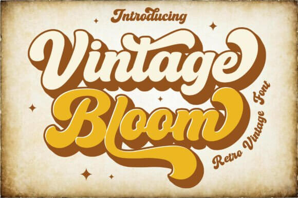
Vintage Bloom softens retro styling with a prettier, more decorative mood. It works well when you need vintage fonts for feminine packaging, floral projects, or lifestyle branding that still wants a little nostalgia in the air. For delicate botanical packaging and social graphics, it gives enough personality without hijacking the whole layout.
Smart Fits For This Style
- Floral Boxes – Lovely for blooms, gifts, and shop sets.
- Soap Wraps – Gentle lettering for handmade products.
- Wedding Signs – Soft retro charm for venue decor.
- Planner Covers – Decorative text for pretty stationery.
Vintage Father For Heritage Logo Design
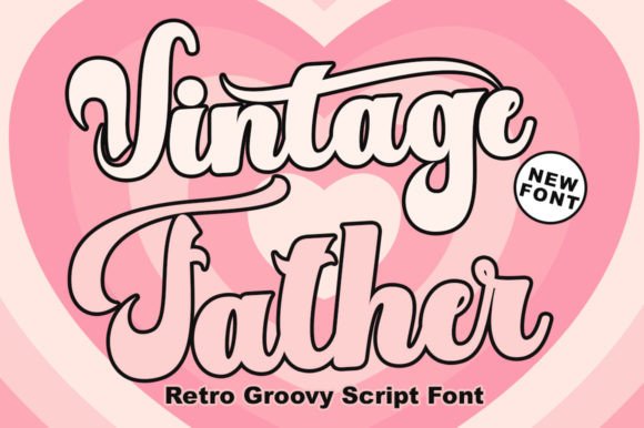
Vintage Father feels solid, familiar, and a bit proud. It suits badge logos, father-focused seasonal products, barbershop looks, or heritage-themed merch where the lettering needs weight and trust. We reach for it when heritage badge fonts make more sense than slick modern type, because polished is not always the point.
Great Niches For This Look
- Barbershop Marks – Old-school confidence for male grooming brands.
- Father’s Gifts – Great on mugs, tees, and cards.
- Workshop Plaques – Solid for garage or tool signage.
- Heritage Mugs – Adds weight to sentimental product lines.
Vintage Quincy For Clean Old School Headlines
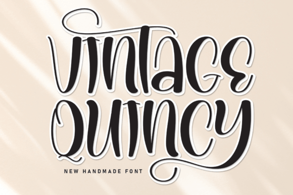
Vintage Quincy lands in that useful middle ground between decorative and clean. It reads well in bigger titles, keeps its vintage flavor, and does not drown the layout in texture. For brands chasing an editorial headline style or calmer retro packaging, this one feels tidy, confident, and easy to pair. Huge plus, honestly.
Where This Font Works Best
- Magazine Openers – Clear headings with a heritage tone.
- Café Headers – Nice for menus and window promos.
- Website Heroes – Big statements without visual clutter.
- Paper Goods – Smart for cards, wraps, and small inserts.
Centro Western For Ranch Ready Display Type
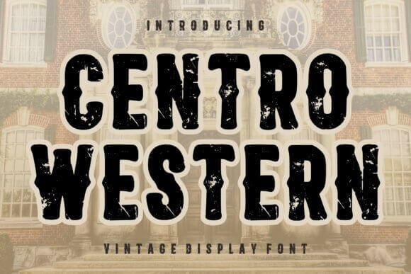
Centro Western looks like it walked straight off an old main street sign, which is exactly why it works. The shapes are dramatic, slightly ornate, and built for attention, so you do not need much else around them. If the brief screams saloon sign typography, country fair posters, or rustic branding, this font gets you there fast.
Projects That Suit It
- Saloon Boards – Strong impact for themed venues.
- Rodeo Ads – Decorative type that still reads clean.
- Farm Stores – Great for local goods and signage.
- Western Menus – Adds atmosphere to hospitality design.
Black Vintage For Moody Statement Posters
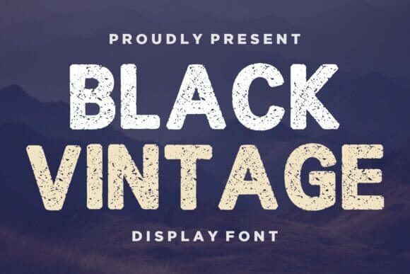
Black Vintage leans darker and moodier than the sunny retro stuff, and that is a gift. Use it when you want old-world grit, music-poster tension, or packaging that feels aged in a cool way, not fake. For punchy dark retro posters, this font brings texture and presence without turning every design into a costume piece.
Best Uses For This Font
- Vinyl Sleeves – Moody type for music-forward branding.
- Craft Beer Cans – Strong on dark labels and seasonal runs.
- Dark Flyers – Great for gigs, bars, and late-night events.
- Tattoo Shops – Worn style that still feels sharp.
Rought Vintage For Distressed Retro Texture
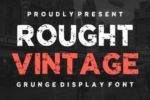
Rought Vintage does texture first, neatness second, and sometimes that is exactly the move. The worn edges help simple layouts feel touched by hand, so labels, stamps, and rustic graphics get instant depth. If you are building distressed label design or rough merch artwork, this font saves you from faking age with too many filters.
Smart Fits For This Style
- Jar Seals – Makes homemade goods feel authentic.
- Stamp Icons – Ideal for distressed brand marks.
- Trail Gear Tags – Rugged type for outdoor products.
- Rustic Boxes – Adds texture to plain packaging fast.
Vintage Round Up For Country Market Graphics

Vintage Round Up has that fairground, farmstand, small-town energy that people either get instantly or they do not. The character shapes feel friendly but sturdy, ideal for produce branding, seasonal events, or handmade goods. For memorable country market branding, it gives vintage fonts a practical, sale-ready vibe instead of empty decoration.
Great Niches For This Look
- Market Banners – Friendly lettering for local stalls.
- Jam Stickers – Sweet fit for handmade food jars.
- Harvest Posters – Strong on autumn or county events.
- Handmade Bars – Nice for artisan soap and bath goods.
Bronco Western For Strong Frontier Logos
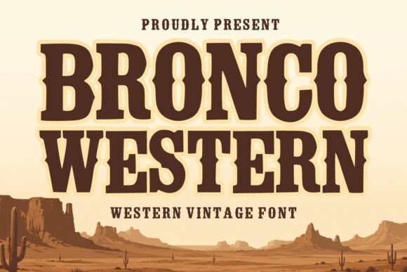
Bronco Western is strong, broad, and built to headline. It fits projects that need frontier flavor without slipping into parody, so apparel, outdoor brands, and event posters all benefit from its confident stance. For rugged frontier merchandise graphics, this is a smart closer if you want vintage font letters that feel tough and clear.
Where This Font Works Best
- Rodeo Apparel – Tough lettering for shirts and patches.
- Camp Badges – Bold type for outdoor identity systems.
- Souvenir Prints – Great for travel or heritage keepsakes.
- Outdoor Logos – Reliable fit for rugged retail brands.
Pick The Vintage Font That Actually Fits The Job
Some vintage fonts flirt with nostalgia. Others punch straight through the screen. That is why picking by mood alone can backfire – a sweet script will not fix a rugged label, and a Western display face can bulldoze a soft brand in seconds. Start with the project, then the audience, then the letters. Grab a few favorites above, test them in real layouts, and keep the one that still looks right after the novelty wears off.