Vintage fonts aren’t “just pretty letters” – they steer perception fast. We’ve seen one headline swap lift click-through by 10–20% on simple promo creatives, because the right retro typeface makes people feel something before they read a word. In this list we grabbed 18 vintage fonts with different vibes: groovy display shapes, distressed sans, stencil grit, western lettering, and athletic throwbacks. Use them for brand marks, menu titles, posters, labels, merch . . . then mix with clean body text and you’re set.
The content on this website was created with the help of AI.
Magical Vintage – Display Lettering
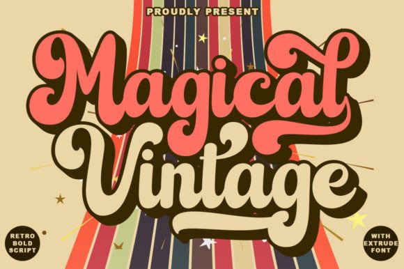
This one screams “record shop window” in the best way. Magical Vintage – sits in that sweet spot where vintage fonts feel playful, not childish, and the curves keep your layouts from looking stiff. We like it when you need retro typography that reads loud even at small sizes.
Where This Font Looks Best
- Logo Sketches – Fast concepts for boutique brands and side-hustles.
- Packaging Front Labels – Punchy product names that pop on shelves.
- Poster Headlines – Big shapes that hold attention from across the room.
- Social Templates – Reels covers, quote cards, promo tiles.
Austin Vintage Classic Serif Display
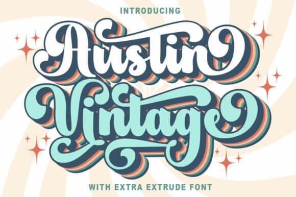
Austin Vintage leans classy, like old editorial titles and heritage labels. It’s a solid pick when you want vintage fonts aesthetic energy without going full circus poster, and the letterforms stay readable when you tighten tracking. We’d pair it with a plain grotesk body font and call it a day.
Where This Font Fits Cleanly
- Beauty Branding – Lotion labels, haircare, clean product lines.
- Editorial Covers – Magazine-style titles and section headers.
- Wedding Stationery – Programs, menus, table cards with restraint.
- Website Hero Text – One strong headline, no clutter.
Vintage Grunge – Distressed Type Set
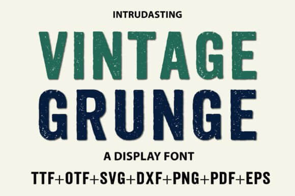
If your design feels too “new”, this fixes it fast. Vintage Grunge brings scuffs and worn edges that fake real ink wear, and it plays nice with photos, textures, even messy collages. Use it for distressed lettering when clean vector type looks kinda fake.
Where The Grit Pays Off
- Streetwear Merch – Tees, tags, drop announcements.
- Music Artwork – Singles, playlists, gig posters.
- Craft Labels – Handmade candles, soaps, jars.
- Event Flyers – Underground vibes with readable text.
Retro Vintage – Bold Throwback Display
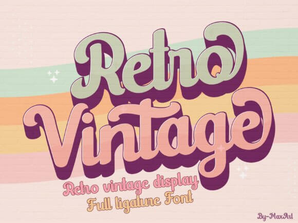
Retro Vintage has that confident, chunky rhythm you see in mid-century ads. It’s loud, but not rude, and it gives your layouts an instant “designed” look even if you’re moving fast. For vintage fonts design work, this is a cheat code for poster typography.
Where It Hits Hard
- Food Promos – Menu specials, café boards, pop-up signs.
- Retro Product Launches – Limited editions and seasonal drops.
- Banner Headers – Big readable titles for landing pages.
- Sticker Packs – Bold phrases that stay legible.
Vintage Noise Textured Print Effect Font
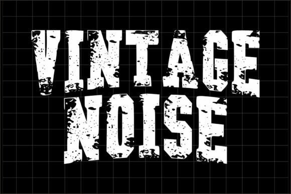
Vintage Noise adds that grainy print wobble that makes digital work feel tactile. The texture reads like old newspaper ink and it’s perfect when you want vintage font letters to look “found” instead of freshly exported. We’d use it with minimal colors and let print texture do the talking.
Where This Texture Makes Sense
- Newspaper-Style Graphics – Headlines, pull quotes, mock ads.
- Brand Collateral – Thank-you cards, inserts, small flyers.
- Album Covers – Lo-fi visuals with real mood.
- Photo Overlays – Titles on top of grainy imagery.
Vintage Essence Retro Script And Display Mix
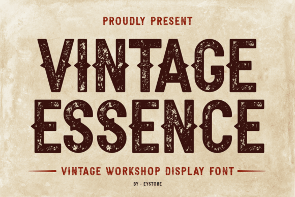
Vintage Essence feels like a sign painter had coffee and decided to show off. It’s smooth, slightly dramatic, and it helps you build that layered “headline + accent” look people save for later. If you want script lettering without the wedding-only vibe, this one behaves.
Where It Feels Natural
- Signature Brand Marks – Boutique studios, makers, creators.
- Product Names – Small-batch food, skincare, candles.
- Lookbook Titles – Collections, seasonal edits, style guides.
- Quote Graphics – One phrase, lots of attitude.
Gap Sporty Vintage Athletic Lettering
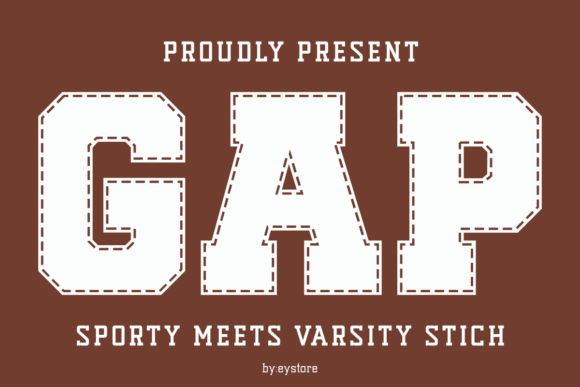
Gap Sporty brings varsity energy without looking like a cheap knockoff. The shapes are bold, the vibe is nostalgic, and it nails that “camp sweatshirt” feel for modern layouts. For athletic branding and team-style merch, it’s an easy yes IMO.
Where It Wins
- Club Merch – Gym drops, running clubs, dance teams.
- School Events – Fundraisers, sports day posters, tickets.
- Apparel Graphics – Chest prints, sleeve hits, patches.
- Badge Logos – Circles, shields, classic team marks.
Stencil Gruge Industrial Distressed Stencil
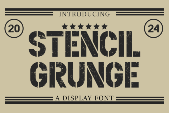
Stencil Gruge looks like it survived a few shipping crates and came out cooler. It’s sharp, dirty, and perfect when you want vintage fonts with a factory vibe, not a flower-shop vibe. Drop it on dark backgrounds and lean into stencil type contrast.
Where It Works Surprisingly Well
- Workwear Labels – Utility brands, rugged packaging.
- Workshop Signage – Tool walls, garage posters, studio labels.
- Gaming Posters – Techy grit without unreadable chaos.
- Shipping-Style Graphics – Stamps, codes, crate markings.
Western Goldrush Old West Display Letters
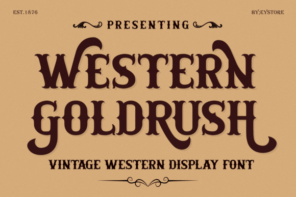
Western Goldrush goes full saloon, but it stays usable for modern branding when you keep the palette tight. It’s ideal for that “heritage” mood people love right now, and the shapes feel bold without getting goofy. For western lettering, it’s clean, direct, done.
Where The Western Theme Sells
- BBQ And Smokehouse Menus – Headings, specials, combos.
- Country Markets – Booth signs, jar labels, price tags.
- Vintage Posters – Events, fairs, themed nights.
- Brand Marks – Ranch-style logos and badges.
Surprise Condensed Texture Narrow Retro Type
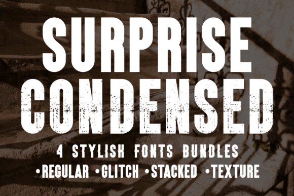
This condensed texture font saves space and still feels loud, which is honestly rare. It’s great when your layout has tight columns or stacked copy, yet you still want vintage fonts energy and a bit of grit. Think condensed display for headers that can’t sprawl.
Where It’s A Smart Fit
- Label Copy – Side panels, ingredients, small headings.
- Poster Subheads – Secondary titles under big hero text.
- Book Covers – Author names, series marks, taglines.
- UI Promo Cards – Compact ads and announcement tiles.
Varsity Grunge – College Distressed Block
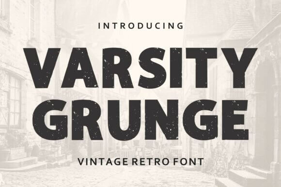
Varsity Grunge looks like an old team hoodie that’s been washed a hundred times, still cool. It hits that nostalgia button hard, so your design feels familiar before anyone even reads it. Use it for college typography when clean varsity fonts feel too “stock”.
Where It Feels Like Home
- Team Apparel – Numbered backs, slogans, mascots.
- Community Events – Charity games, club promos, posters.
- Vintage-Inspired Logos – Badges with worn edges.
- Scrapbook Projects – Memory pages, photo captions, titles.
Stamped Retro Rubber Stamp Typeface
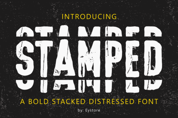
Stamped gives you that imperfect ink hit, like someone actually pressed a stamp onto paper and didn’t care about alignment. It’s a quick way to add authenticity to vintage fonts layouts, especially on kraft textures or minimal labels. Save it for accents and stamped logos style marks.
Where It Adds Instant “Realness”
- Packaging Seals – “Made in…”, batch numbers, quality marks.
- Shipping Inserts – Thank-you notes and small brand cards.
- Craft Fairs – Price tags, booth signage, stickers.
- Document Mockups – Certificates, approvals, vintage forms.
Distressed Bold Sans Modern Retro Workhorse
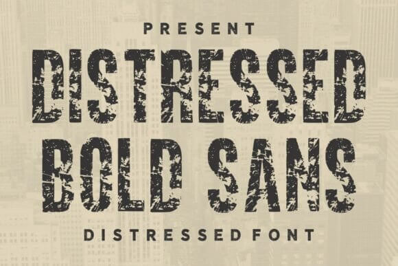
Distressed Bold Sans is the “I need it to read from far away” choice. You get strong shapes, subtle wear, and a modern edge, so it doesn’t look like costume type. For bold sans serif lovers who still want vintage fonts grit, yep, this is it.
Where It Stays Readable
- Storefront Signs – Windows, boards, pop-up banners.
- Product Headers – Big names on labels and boxes.
- Promo Headlines – Sales, launches, announcements.
- Thumbnail Titles – Video covers, mini posters, cards.
Cartoon Distress Playful Retro Display Font
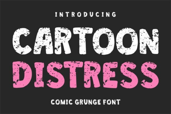
Cartoon Distress is fun, a little chaotic, and it doesn’t apologize for it. It’s awesome when your project needs humor, retro warmth, and readable chunky forms all at once. Use it for retro cartoons vibes, then keep your color palette simple so it doesn’t go off the rails.
Where It Brings The Smile
- Kids Products – Snacks, crafts, party printables.
- Sticker Designs – Catchphrases, cute icons, short words.
- Pop-Up Events – Fun signage and playful promos.
- Social Quotes – Loud titles over simple backgrounds.
Western College Vintage Team Serif
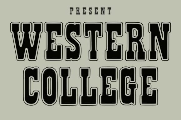
Western College mixes two strong aesthetics, and it weirdly works. You get a campus vibe with a hint of frontier attitude, which makes branding feel themed without feeling like cosplay. It’s a nice option for badge logo layouts where you want personality baked in.
Where The Hybrid Style Fits
- Rodeo And Club Events – Flyers, tickets, merch.
- Coffee Roasters – Limited blends, stamp-style labels.
- Outdoor Brands – Patches, badges, product tags.
- Sports Bars – Menu headings, chalkboard promos.
Modern Distress – Clean Type With Wear
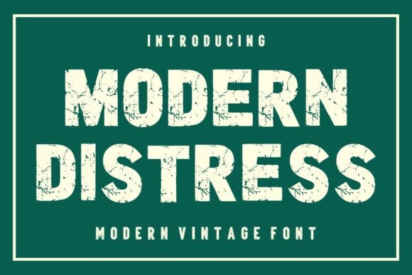
Modern Distress keeps the structure clean, then roughs it up just enough. That balance makes it easy to use across brand systems where you need consistency but still want vintage fonts charm. It’s great for modern branding with a retro wink, not a full costume.
Where It Plays Nice With Systems
- Brand Kits – Headings, subheads, label titles.
- Packaging Series – Multiple SKUs with one type family feel.
- Website Sections – Feature blocks and callouts.
- Ad Creatives – Reusable templates that stay cohesive.
North West Vintage Display With Rugged Mood
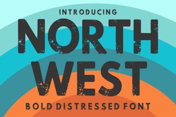
North West feels outdoorsy without turning into a cliché mountain logo. It has weight, texture, and a confident silhouette that works on badges and signage, and it pairs well with simple icons. Add it when you want heritage branding energy that still feels current.
Where It Feels “Built”
- Outdoor Products – Gear tags, labels, packaging stamps.
- Cafés And Roasters – Bag labels, menu headers, mugs.
- Workshop Brands – Wood shops, ceramics, makers.
- Tour Posters – Rustic events, trails, local markets.
Athletic Vintage – Retro Sports Display
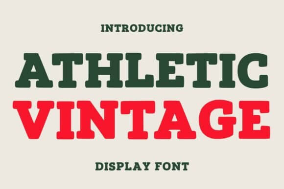
Athletic Vintage is classic sports signage, but with smoother curves so it doesn’t feel stuck in 2006. It works great for big words, short phrases, numbers, and team-style layouts. If you’re building vintage fonts alphabet retro looks for merch, this gives you sports lettering with instant clarity.
Where It’s A No-Brainer
- Team Numbers – Jerseys, posters, tournament brackets.
- Fitness Promotions – Challenges, gym events, class titles.
- Merch Drops – Hoodies, tees, caps, patches.
- Community Clubs – Badges, banners, announcement graphics.
Quick Wrap-Up And A Tiny Dare
Vintage fonts work best when you stop forcing them to do everything. Pick one hero face for the headline, keep body text clean, and let texture or shape carry the mood. Want a faster workflow? Save 3 favorites from this list, build one reusable template, and test it across a poster, a label, and a logo draft.