Vintage fonts aren’t “just type” . . . they’re mood, era, and intent. People decide if a design feels trustworthy in under a second, and your letterforms do a lot of that heavy lifting, fast. In this list we pulled 12 vintage font style options, from glam scripts to typewriter grit, so you can mock up posters, labels, and vintage fonts alphabet layouts without spiraling into 47 open tabs. Grab one, test your kerning, and if it feels a little too perfect, good, distress it.
The content on this website was created with the help of AI.
Barbie Vintage Display Lettering For Cute Retro
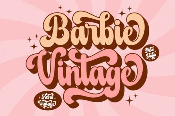
This one screams glossy pop nostalgia, with bouncy curves that read loud even at small sizes, so your headline doesn’t turn into a blur. We use it when a layout needs instant charm and a wink, the kind that makes retro typography poster work feel effortless, almost unfair.
Where This Font Looks Right
- Beauty Brand Logos – Soft, flirty wordmarks that stay readable.
- Sticker Packs – Cute titles that pop on busy backgrounds.
- Merch Headlines – Tees, totes, and caps with loud personality.
- Social Cover Art – Punchy titles for reels, playlists, or drops.
Letter Vintage Serif Pack For Classic Letters
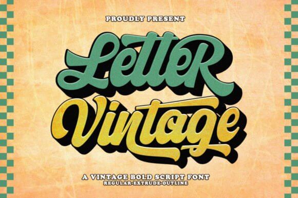
Letter Vintage leans classic, the kind of serif you can set and forget, because it behaves in layouts and doesn’t beg for attention. If you’re building a clean set of vintage fonts alphabet assets for templates, this gives you a steady baseline and tidy proportions.
Where This Font Looks Right
- Product Labels – Calm hierarchy for ingredients and names.
- Book Covers – Old-school titling without being dusty.
- Business Cards – Simple elegance, no overthinking.
- Website Headers – Editorial vibes, still readable on mobile.
Vintage Christmas – Festive Retro Font Bundle
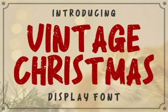
Seasonal sets can get cheesy fast, but this bundle gives you range, from quaint signage to bold storefront energy, so you can dodge the default holiday look. Use it for a vintage font poster that feels like a thrifted print, not a template.
Where This Font Looks Right
- Gift Tags – Small text that still feels special.
- Holiday Menus – Warm headers that guide the eye.
- Craft Fair Signage – Handmade mood, clear pricing.
- Email Hero Titles – Festive but still legible.
Romance Vintage Script For Elegant Retro Titles
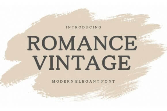
Romance Vintage goes full swoon, with a handwritten rhythm that feels human instead of robotic, and that’s rare. Pair it with a quiet serif and you get a vintage fonts handwriting combo that looks expensive, even if you’re designing on a laptop at 1 a.m.
Where This Font Looks Right
- Wedding Invites – Names and headings that feel intimate.
- Skincare Packaging – Soft luxury without shouting.
- Lookbook Covers – Romantic titles with real movement.
- Quote Prints – Emotional lines that don’t feel corny.
Autumn Vintage – Warm Retro Lettering Set
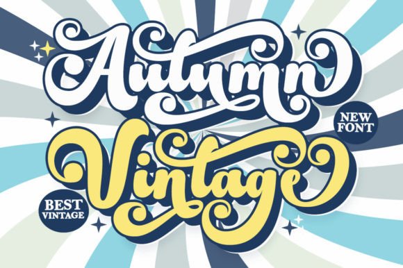
This set feels like cider, kraft paper, and storefront windows with hand-painted prices, so it nails cozy without trying too hard. If you chase that vintage fonts ideas mood for seasonal promos, this helps you land it fast, then move on.
Where This Font Looks Right
- Farmers Market Boards – Friendly titles with charm.
- Candle Labels – Cozy naming that feels handmade.
- Autumn Event Flyers – Big headers with warm energy.
- Recipe Cards – Nostalgic typography that stays clean.
Daily Mail Magazine Newspaper-Style Vintage Type
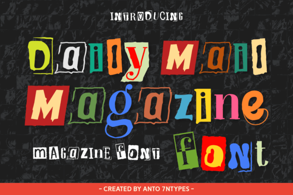
Daily Mail Magazine leans editorial, with that old print confidence where headlines feel sharp and spacing matters, a lot. Use it for vintage editorial design when you want a “real publication” vibe, not a fake-news gag.
Where This Font Looks Right
- Magazine Mastheads – Strong top-of-page identity.
- Blog Section Titles – Clean hierarchy for scanning.
- Product Story Cards – Heritage copy that feels legit.
- Event Programs – Classic print mood, clear structure.
Vintage Typewriter – Distressed Mono Letters
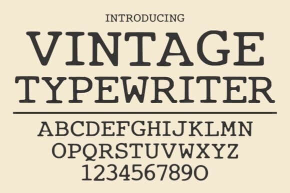
Typewriter styles can feel gimmicky, but this one carries believable wear, so it reads like scanned paper instead of a filter slapped on top. Build a gritty vintage fonts letters layout with uneven ink, then keep the rest of the design quiet, trust us.
Where This Font Looks Right
- Journal Covers – Personal, imperfect, real.
- Mock “Document” Props – Films, games, escape rooms.
- Hang Tags – Rustic product notes with texture.
- Album Tracklists – Lo-fi typography that feels raw.
Beach Retro – Groovy Display For Sunny Branding
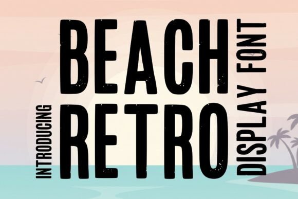
This is the fun one, chunky curves, easy rhythm, and it fills space like a sign painter had a great day. For retro branding inspiration, put it on a simple color block, add a thin outline, done . . . stop tweaking.
Where This Font Looks Right
- Swimwear Tags – Bold names that feel upbeat.
- Ice Cream Menus – Friendly titles that sell flavor.
- Beach Event Posters – Groovy headers with movement.
- Surf Shop Stickers – Big letterforms, quick readability.
Beach Vintage – Retro Script For Laid-Back Logos
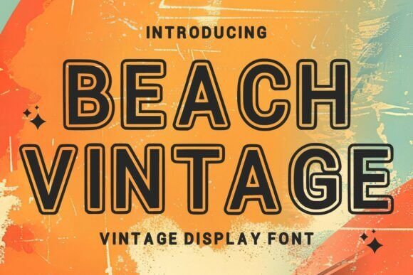
Beach Vintage 5 goes smoother and more casual than Beach Retro 2, so it works when you want chill, not shouty. We like it for a vintage font logo mark that still feels hand-touched, with enough personality to stand alone.
Where This Font Looks Right
- Resort Signage – Relaxed titles that feel premium.
- Drink Labels – Cocktail names with easy flow.
- Travel Postcards – Script that sells the vibe.
- Small Business Wordmarks – Friendly identity in one line.
Texas Distress Western Display With Rough Texture
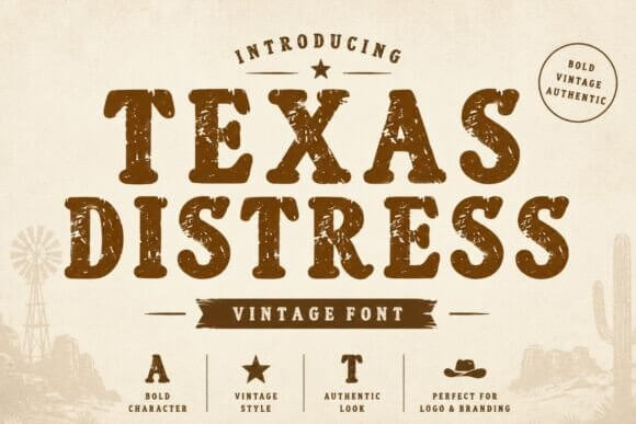
This one brings grit, like stamped ink on cardboard, so it fits Americana, rodeo, and rugged product stories without feeling like cosplay. If you need retro font design with edge, set it big, give it breathing room, and let the distress do its job.
Where This Font Looks Right
- BBQ Sauce Labels – Bold shelf impact, rustic tone.
- Country Market Posters – Strong titles for prices and dates.
- Band Merch – Rough type that feels earned.
- Event Badges – Punchy names, clear from a distance.
Heritage – Classic Serif For Old-Money Branding
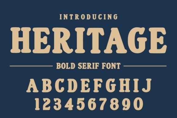
Heritage 28 feels tailored, like pressed paper and careful print, so it sells trust fast. For old money typography, use tight tracking in caps, then pair with a simple script for contrast, and yeah, it looks pricey.
Where This Font Looks Right
- Jewelry Branding – Quiet luxury with sharp forms.
- Legal Or Finance Headers – Authority without shouting.
- Wine Packaging – Heritage vibe with clean readability.
- Hotel Stationery – Monograms, menus, room cards.
Damage Vintage Grunge Display For Worn Posters
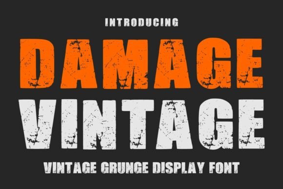
Damage Vintage goes full worn-in, like a flyer that survived rain, sun, and someone’s messy backpack, and honestly that’s the point. When you want grunge vintage letters without building texture by hand, this gets you there in one click.
Where This Font Looks Right
- Gig Posters – Loud titles with lived-in grit.
- Streetwear Drops – Raw typography that feels real.
- Retro Game Covers – Distress that adds story.
- Workshop Flyers – DIY energy with strong contrast.
Quick Wrap-Up And What To Try Next
Vintage fonts work when you treat them like materials, not decorations, so test size, spacing, and print texture before you commit. Pick one display face, one calm supporting font, and build a tiny “system” you can reuse.