Vintage fonts aren’t “just cute” – they change how people read, trust, and remember a brand. Nielsen Norman Group-style readability research keeps circling the same point: users scan first, decide fast, then bounce… so your headlines need to hit instantly. In this list we pulled 16 vintage fonts with real range – bold display faces, editorial serifs, and handwriting scripts – so you can build a consistent vibe across a logo, a poster, a label, even a whole vintage fonts alphabet look without Frankensteining ten different typefaces. Pick one, test it in all-caps and in small sizes, then commit.
Creative Vintage – Retro Display Lettering For Headlines
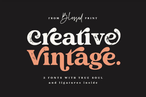
This one screams “handmade signboard” without getting messy, so your words still land clean. We like it when you need punchy titles, short hooks, big personality. Also, it plays nice with retro typography layouts if you keep tracking slightly tight.
Where This Font Fits Best
- Logos And Branding – Bold wordmarks that don’t feel generic.
- Packaging And Labels – Front-of-pack names that pop fast.
- Poster Headlines – High-contrast titles for quick scanning.
- Merch Graphics – Tees, totes, stickers, the fun stuff.
Retro Vintage Fun Collection – Groovy Font Set
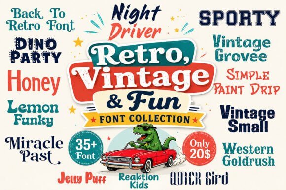
If you want that bouncy, happy throwback energy, this collection does the job with less fuss. Mix weights sparingly and you’ll avoid the “kid menu” vibe. It’s a solid shortcut for vintage fonts alphabet experiments where you need letters to stay readable.
Where This Font Fits Best
- Retro Social Graphics – Quotes, promos, mini announcements.
- Event Flyers – Markets, pop-ups, dance nights.
- Sticker Packs – Cute phrases with a nostalgic hit.
- Brand Taglines – Short lines under a clean logo.
Modern Vintage – Clean Retro Serif For Design Systems
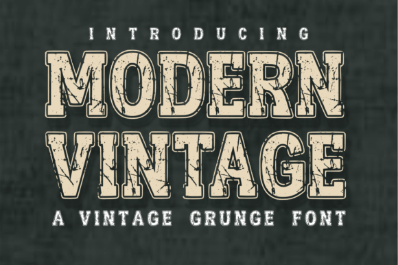
This is the “I want vintage, but I also want my site to feel expensive” option. The shapes look controlled, a little editorial, and they hold up in longer headings. Pair it with a neutral sans and you get that old money fonts mood without trying too hard.
Where This Font Fits Best
- Beauty Branding – Minimal packaging with premium type.
- Lookbooks – Chapter titles, spreads, pull quotes.
- Web Headers – Hero lines that feel styled, not loud.
- Product Cards – Names, variants, short descriptors.
Alabasta Vintage – Classic Serif With Editorial Bite
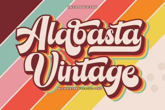
Alabasta leans classy, a little dramatic, and honestly it makes even boring words look intentional. Use it when you want strong contrast and that old print vibe without going full gothic. It’s a smart pick for vintage font style branding where spacing matters more than effects.
Where This Font Fits Best
- Magazine Titles – Covers, sections, feature headers.
- Wine And Spirits – Labels that feel collected.
- Invitation Suites – Names, dates, formal headings.
- Brand Guidelines – A primary serif with authority.
Cinema Movie Duo – Vintage Movie Poster Font Pair
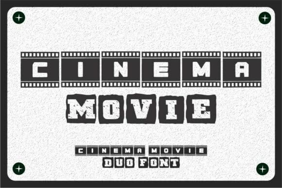
This duo feels like ticket stubs, old theaters, buttery popcorn – you get the idea. The pairing saves time because you can set titles and subheads without hunting for a match. Grab it when you need a font for poster layouts that look “designed” in five minutes.
Where This Font Fits Best
- Film Night Flyers – Big titles, smaller details.
- Podcast Covers – Retro storytelling vibes.
- Menu Specials – The “feature presentation” effect.
- Merch Drops – Limited editions with drama.
Vintage College – Varsity Letters With Retro Weight
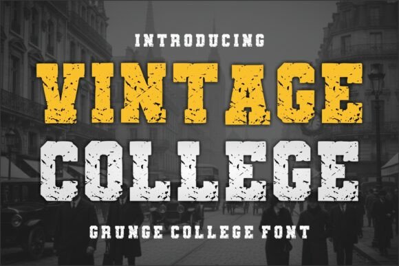
College fonts can look cheesy fast, but this one stays crisp and wearable. It gives you that team jersey confidence without the overdone clichés, unless you push it too far… don’t. Works great for a bold restaurant logo if your concept leans diner, sports bar, or campus-cute.
Where This Font Fits Best
- Apparel And Embroidery – Caps, sweatshirts, patches.
- Sports Branding – Team names and mascots.
- Cafe Signage – Chalkboard menus with structure.
- School Events – Banners, tickets, programs.
Editorial Collection Duo – Magazine Serif + Sans Pair
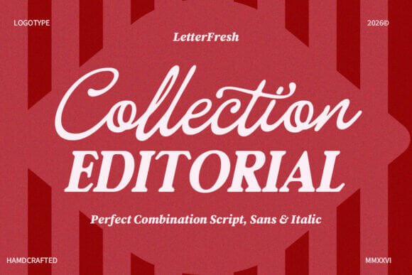
Two fonts that already agree with each other – love that, because design brain gets tired. You can set elegant headlines with the serif, then keep body bits clean with the sans, no weird clashing. It’s an easy “yes” for vintage magazine font styling across posts, covers, and brand decks.
Where This Font Fits Best
- Editorial Layouts – Sections, captions, quotes.
- Brand Presentations – Titles plus readable details.
- Website Typography – Headers and UI labels together.
- Product Story Cards – Ingredients, origin notes, features.
Stayhill – Vintage Handwriting Script With Attitude
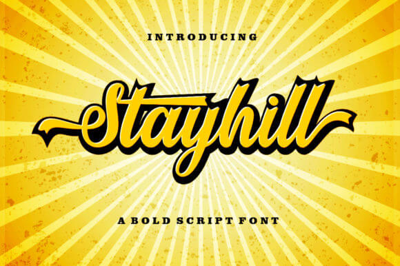
Stayhill feels like a real pen, not that stiff “fake calligraphy” thing. Keep it for short bursts – names, labels, one-liners – because long paragraphs in script are a headache. It nails the signature style font look when you want personal, not precious.
Where This Font Fits Best
- Beauty Labels – Scent names, limited editions.
- Creator Logos – Photographers, stylists, makers.
- Wedding Details – Place cards, favors, tags.
- Quote Graphics – Short lines with a human feel.
Retro Shade – 70s Shadow Display For Big Type
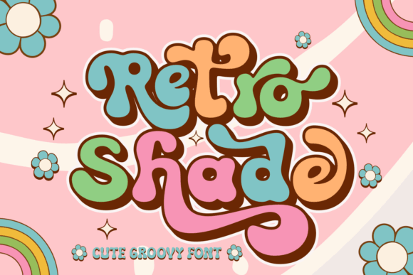
This is pure groove – thick curves, shaded depth, big “summer festival” energy. Don’t shrink it too much or you’ll lose the magic, seriously. For modern throwback work, this 70s retro font carries an entire design by itself.
Where This Font Fits Best
- Poster Headlines – Concerts, parties, launches.
- Playlist Covers – Retro themes and moods.
- Packaging Front Panels – One big product name.
- Wall Art Prints – Bold sayings, simple palettes.
Rangen – Rustic Vintage Display With Western Flavor
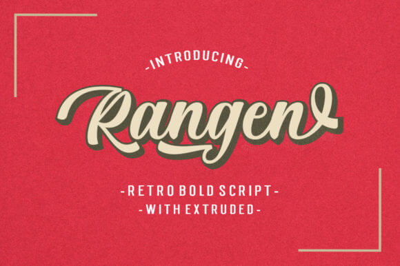
Rangen brings that dusty authenticity – like a stamp on kraft paper, but sharper. It’s not delicate, it’s not trying to be, and that’s the charm. Use it for country market branding when you want “local” to feel real, not cosplay.
Where This Font Fits Best
- Farmstand Branding – Signs, price cards, labels.
- BBQ And Grill Spots – Menus and merch.
- Craft Packaging – Soap, candles, small batch goods.
- Stamp-Style Logos – Badges and seals.
Vintage Bold – Heavy Retro Headline Font For Impact
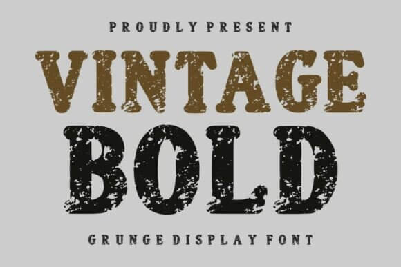
Some vintage fonts whisper. This one shouts, in a good way, like a storefront sign you can read from across the street. Keep backgrounds simple and let the forms do the work. It’s a reliable display font when you need clarity plus vibe.
Where This Font Fits Best
- Storefront Signage – Clear names, strong presence.
- Product Launch Graphics – Bold titles for promos.
- Thumbnails – Text that survives tiny sizes.
- Sticker Typography – Short words that slap.
Vintage Roses – Decorative Type With Floral Charm
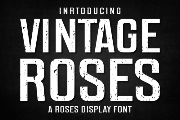
This one leans romantic, but you can steer it modern with lots of white space and a calm palette. It shines in short names and front-facing titles, not long copy. Think of it as your “special ingredient” for vintage lettering fonts that feel soft but still designed.
Where This Font Fits Best
- Wedding Stationery – Names, monograms, headings.
- Gift Packaging – Tags and wrap labels.
- Skincare Branding – Limited collections, scent lines.
- Decor Prints – Floral quotes and frames.
Vintage Magazine – Chic Serif For Retro Editorial Pages
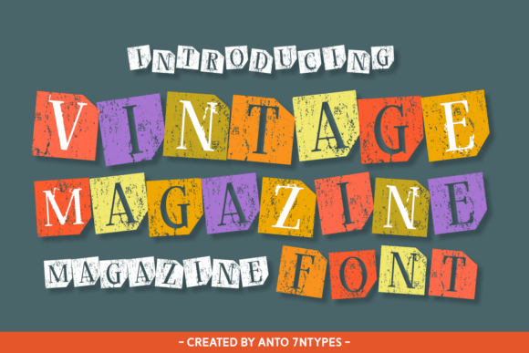
Clean, stylish, a little dramatic at the edges – this is the serif you use when you want “editorial” without being icy. It handles uppercase headlines really well, which surprised us. Great for vintage editorial design when your layout needs structure, not noise.
Where This Font Fits Best
- Magazine Covers – Titles and feature headings.
- Brand Story Pages – Mission statements, founders’ notes.
- Product Catalogs – Sections and collections.
- Minimal Logos – Serif wordmarks with confidence.
Brick Vintage – Solid Retro Slab With Street Texture
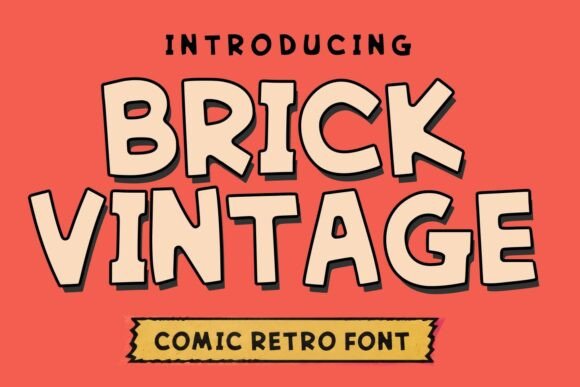
Brick feels sturdy, like painted lettering on old brick walls, and it loves contrasty color combos. Don’t over-style it with extra grunge – it already has weight. Use it for badge marks and stamped logos where the type needs to look built, not typed.
Where This Font Fits Best
- Craft Beer Labels – Bold names, rugged tone.
- Streetwear Graphics – Big type with edge.
- Badges And Seals – Circular marks, icons, stamps.
- Outdoor Events – Posters and wayfinding signs.
Capital Forge – Vintage Roman Caps For Premium Logos
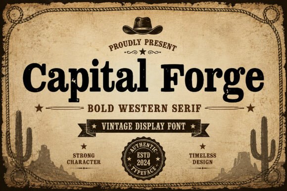
Capital Forge is pure authority – carved-stone energy, sharp corners, zero fluff. If your brand leans heritage, this does the heavy lifting with just a few letters. It’s also a strong base for classic monogram styles when you want initials to feel formal, not fussy.
Where This Font Fits Best
- Luxury Branding – Jewelry, fragrance, heritage goods.
- Monograms – Initials for seals and crests.
- Certificates – Awards, authenticity cards.
- Book Covers – Titles that feel timeless.
Distress Vintage – Worn Print Font For Retro Texture
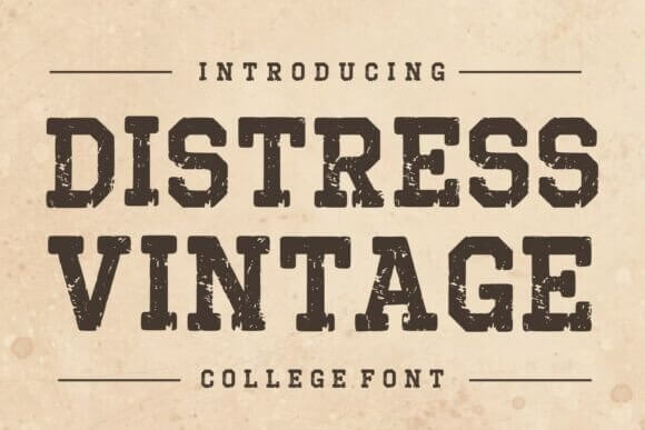
This font already looks lived-in, like it survived a few decades in a drawer. Use it when perfection feels wrong, like you want texture but you don’t want to fake it with overlays. It’s a practical choice for retro type design on posters, labels, and rugged brand marks.
Where This Font Fits Best
- Vintage Posters – Gig flyers, showbills, promos.
- Product Labels – Coffee, spices, pantry goods.
- Badge Logos – Outdoor, workshop, maker brands.
- Packaging Sleeves – Kraft paper and ink textures.
Quick Wrap-Up: Picking Vintage Fonts Without Overthinking
Start with where the font must survive – tiny labels, huge posters, or a clean logo. Then test a full “Aa Bb 123” line, because pretty samples lie. If you want, grab two: one loud display face and one calm text companion, and your whole system suddenly looks planned instead of… chaotic.