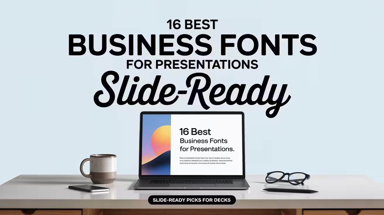
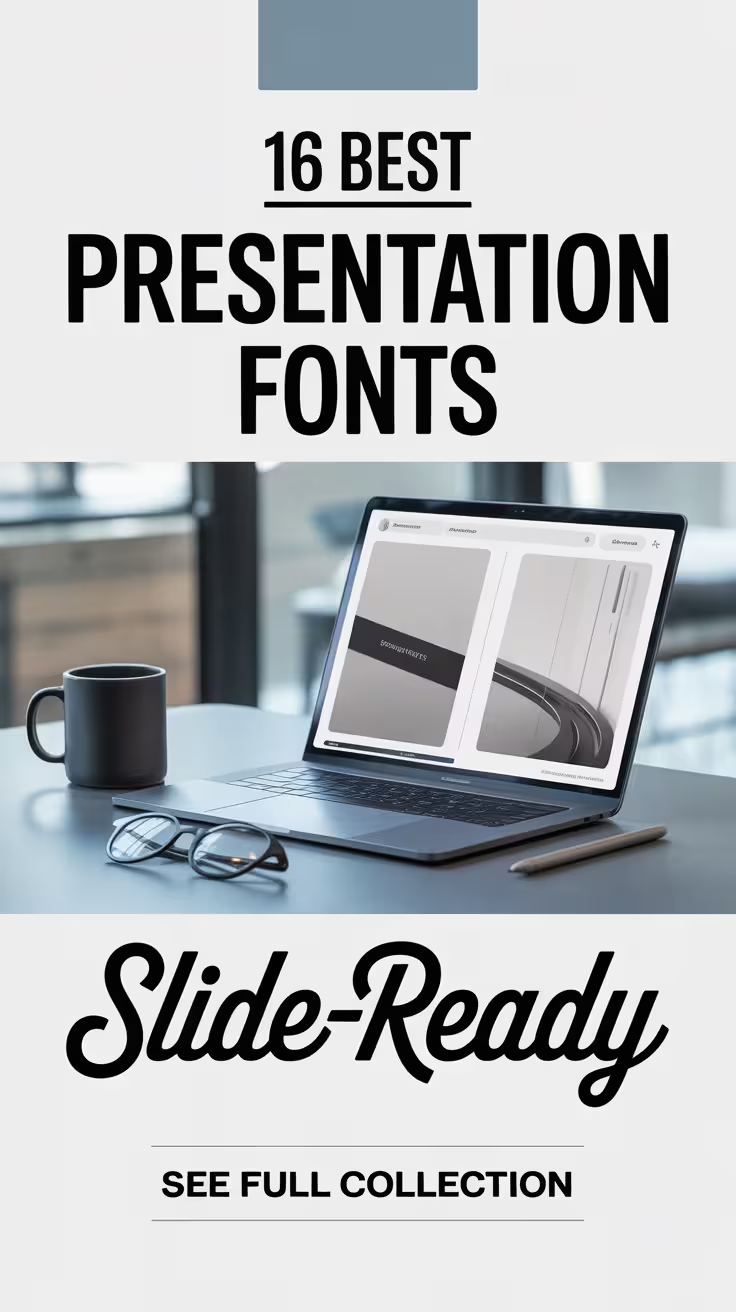
We see it all the time – people spend hours polishing a deck, then sabotage it with “default” type. Slide typography matters because your audience reads before they listen, and the wrong letterforms quietly drain trust, clarity, and energy. These presentation fonts help you control hierarchy (headline vs body), keep spacing clean, and make your message feel intentional, even on tiny laptop screens.
Below you’ll find 16 downloads that cover playful, corporate, handwritten, and bold display vibes, plus a couple that behave nicely for longer bullet lists. Use them for PowerPoint, Google Slides, keynote-style decks, course lessons, product storytelling – all that good stuff. Pick one for titles, one for body, and stop fighting your slides.
Funny Pirates Presentation Display Font
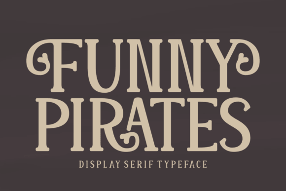
This one brings chaos in a good way. If your slide needs a wink, a story beat, or a “wait, what?” opener, Funny Pirates nails that cartoon swagger without turning into unreadable mush.
We’d pair it with a calm sans for body text, and keep it to headlines only – creative workshop slides love this energy.
Where This Font Fits Best
- Kids Activities – title slides, lesson headers, playful callouts
- Party Businesses – packages, themed offers, event decks
- Content Creators – intro slides, series covers, highlight frames
- Storytelling Decks – chapter breaks and big section titles
Simple House Font For Clean Slide Headlines
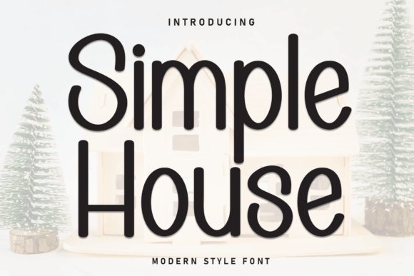
Simple House feels tidy, light, and kinda architectural. It keeps your slide deck from screaming, which honestly helps when your charts already do enough shouting.
Use it when you want “clean but not boring,” and save it for headings – minimal slide design pairs beautifully with thin strokes.
Where This Font Fits Best
- Real Estate – listings, market snapshots, agent intros
- Home Brands – product lines, lookbooks, before/after decks
- Wellness Coaches – calm lessons, routines, simple frameworks
- Portfolio Decks – section titles that stay out of the way
Strawberry Chocolate Cute Font For Slides
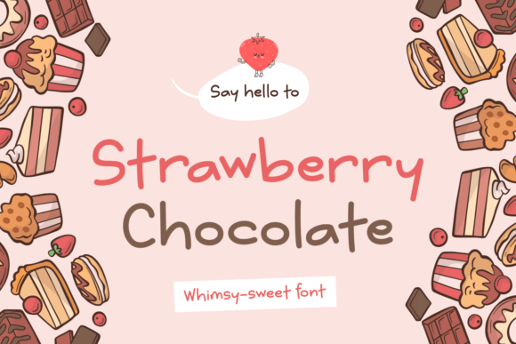
This font looks like frosting. It’s soft, rounded, and friendly, so your presentation instantly feels more personal, less corporate, more “come hang out.”
Keep contrast high and don’t cram lines too tight – it shines on short phrases and labels, not essays. Great for brand mood boards where vibe matters more than metrics.
Where This Font Fits Best
- Bakeries – menu slides, seasonal launches, price lists
- Beauty Shops – service decks, promo slides, intro screens
- Handmade Sellers – story slides, packaging notes, mini catalogs
- Community Events – invites, schedules, workshop intros
Kialova Modern Serif For Presentation Titles
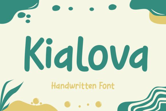
Kialova gives you that editorial, polished feel without trying too hard. You know the decks where every slide looks like a magazine cover? Yeah, this goes in that direction.
Use it for hero headlines, then drop a neutral sans under it for body copy – luxury branding typography starts with contrast like this.
Where This Font Fits Best
- Fashion – lookbooks, launches, buyer presentations
- Consulting – title slides, section dividers, quote slides
- Wedding Pros – mood decks, packages, timelines
- Photography – portfolio intros and collection names
Romiro Bold Font For Confident Slide Headers
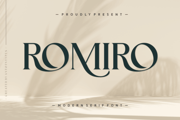
Romiro looks sturdy. It plants your headline, frames your message, and makes even a simple slide feel like it has a point.
If you do a lot of “problem / solution” layouts, this kind of weight helps. We like it for pitch deck headlines where you can’t afford weak hierarchy.
Where This Font Fits Best
- Startups – traction slides, positioning, core story
- Agencies – case studies and results decks
- Internal Updates – quarterly recaps, planning sessions
- Product Teams – roadmap decks and demo scripts
Boddrex Display Typeface For Loud Slide Moments
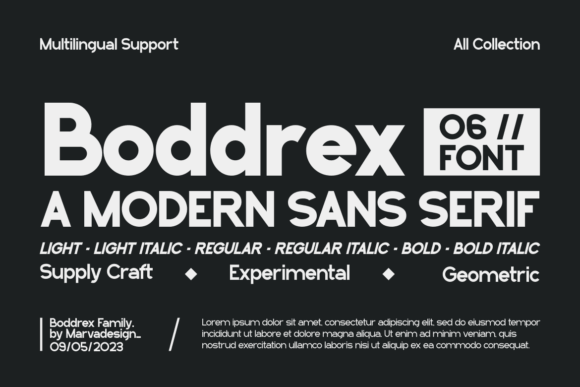
Boddrex goes big, fast. It’s the font you use when a slide needs to hit like a headline on a poster, and you’re not in the mood to whisper.
Keep it away from long bullet lists, FYI. It works best as a “moment” font for slide section dividers.
Where This Font Fits Best
- Sales Decks – big claims, offers, outcomes
- Event Talks – title slides, punchy transitions
- Social Campaign Briefs – hero lines and taglines
- Youth Programs – energy, impact, bold messaging
Sport Varsity – Athletic Font For Presentations
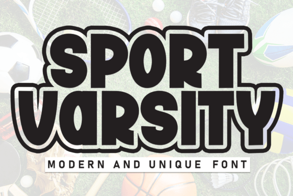
This font screams scoreboard. If your deck covers teams, training, fundraising, or school spirit stuff, Sport Varsity 2 just fits, no debate.
Use it for titles and numbers, then switch to a plain sans for details. It upgrades sports coaching presentations in about five seconds.
Where This Font Fits Best
- Schools – pep rally slides, club intros, announcements
- Gyms – class schedules, program breakdowns
- Sports Teams – stats decks, sponsor pitches
- Fundraisers – event slides, donation goals
Novus Sans Clean Typeface For Presentation Fonts
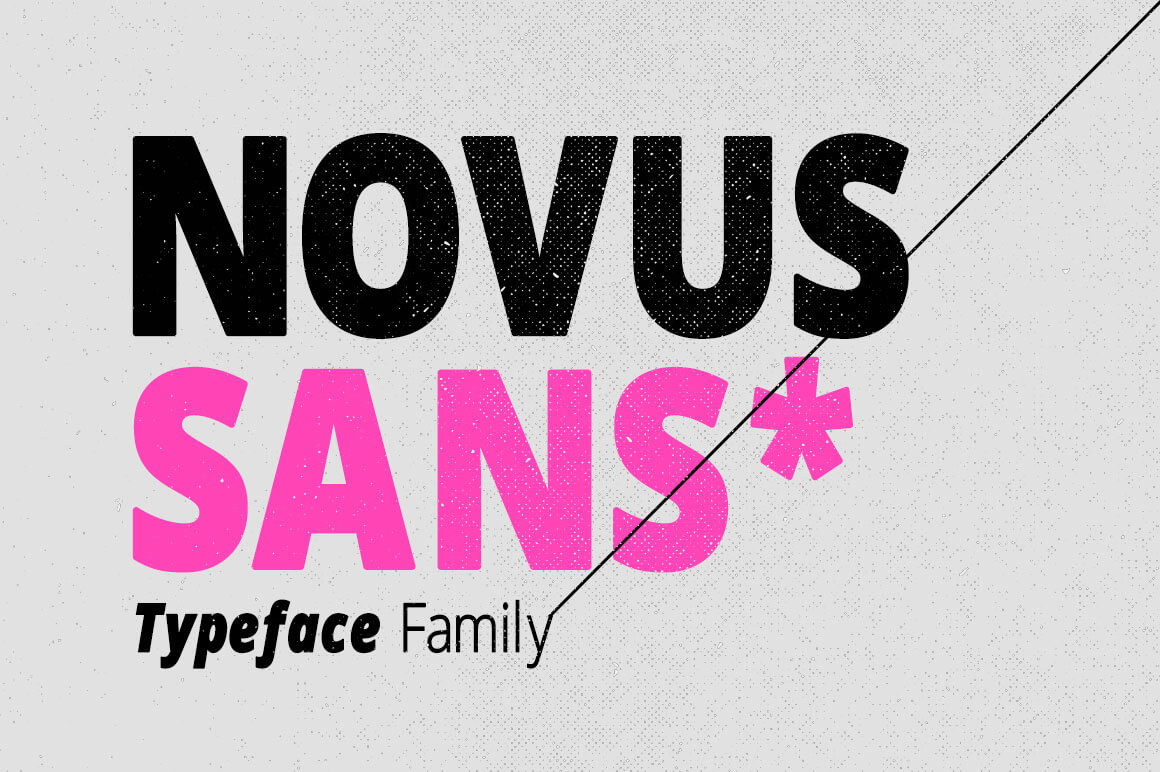
Novus Sans behaves. It reads well on projectors, it doesn’t get weird at small sizes, and it keeps your deck feeling modern without trying to be trendy.
We’d use it as the body font in a two-font system, especially for readable slide body text with lots of bullets.
Where This Font Fits Best
- Corporate Training – manuals, learning decks, SOP slides
- Product Demos – UI callouts and feature lists
- Nonprofits – impact reports and story slides
- Education – lectures, worksheets, recap slides
Presentation – Font For Deck-First Typography
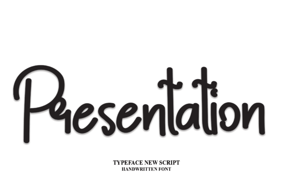
The name doesn’t lie – this one feels built for slides. It looks clean, balanced, and it keeps spacing from getting awkward when you scale text up and down across layouts.
If you need one font to cover titles and short body blocks, start here. It supports professional slide typography without looking stiff.
Where This Font Fits Best
- Client Proposals – clear structure, calm tone
- Marketing Plans – frameworks, timelines, rollout slides
- Webinars – agenda slides and recap screens
- Team Meetings – updates that stay readable
Sakeso Modern Font For Stylish Presentation Slides
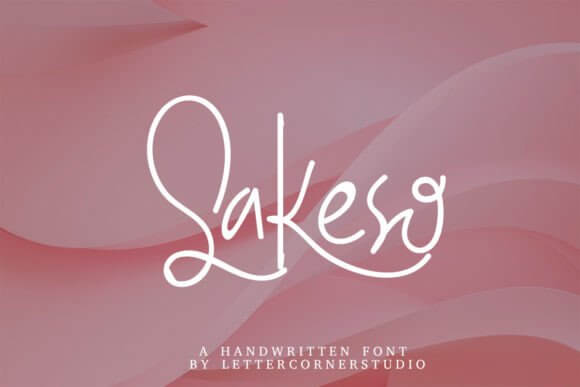
Sakeso feels sleek and a little artsy, like a brand deck that actually has taste. It gives you style without messing up readability, which is rare, and kind of the whole game.
Use generous line spacing and let it breathe. It supports aesthetic presentation templates where visuals and type share the spotlight.
Where This Font Fits Best
- Creative Studios – portfolio decks and case studies
- Skincare – product stories, ingredient highlights
- Design Proposals – concept slides and direction boards
- Personal Brands – intro decks and media kits
Aromaly Handwritten Font For Warm Presentations
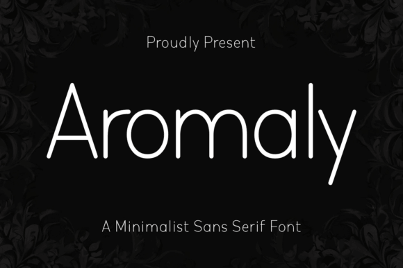
Aromaly feels human. It’s the kind of handwritten font that works when you want your audience to relax a little, like you’re talking to them, not presenting at them.
Keep it for headings, quotes, and short labels. It’s perfect for course slide design where warmth keeps attention.
Where This Font Fits Best
- Online Courses – module titles, quotes, prompts
- Coaching – worksheets, mindset slides, exercises
- Community Groups – announcements and recaps
- Workshops – playful instruction slides
Wind Down – Soft Font For Calm Slide Decks
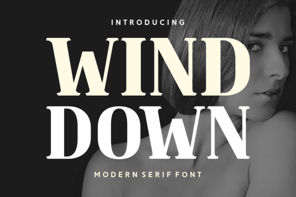
Wind Down 2 looks relaxed, like a deep breath in font form. If your deck covers self-care, journaling, or anything “slow living,” this matches the message.
Use soft colors, avoid harsh black, and let the type do the soothing. It nails wellness brand slides without getting cheesy.
Where This Font Fits Best
- Meditation – class decks, guided session slides
- Therapy Practices – gentle education and resources
- Yoga Studios – schedules, workshops, retreats
- Journaling Products – story decks and prompts
Summer Sticker – Fun Font For Bright Slides
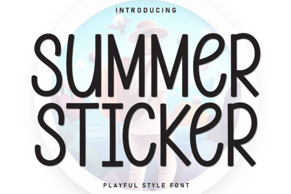
This font looks like a sticker pack exploded onto your screen, and yeah, that’s the point. It’s bold, bubbly, and it makes “announcements” feel like a mini celebration.
Use it sparingly so it stays special. It works great for event presentation slides and quick promos.
Where This Font Fits Best
- Seasonal Campaigns – launches, promos, countdown decks
- Community Events – schedules and stage slides
- Retail – offer highlights and product shoutouts
- Schools – summer programs and announcements
Whiteboard – Font For Sketchy Presentation Notes
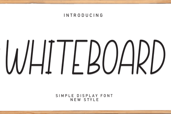
Whiteboard 11 mimics that marker-on-board vibe, so your deck feels like a live explanation, not a polished brochure. It’s casual, direct, and great for teaching.
Pair it with icons and simple diagrams and you’re set. It supports training deck typography when you want clarity over gloss.
Where This Font Fits Best
- Business Training – process slides and how-tos
- Education – lessons, practice problems, examples
- Onboarding – walkthroughs and internal guides
- Workshops – live demos and step-by-steps
Dream Land Whimsical Font For Story Slides
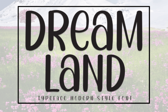
Dream Land feels dreamy without being messy. It’s a sweet pick when your presentation needs imagination – launches, storytelling, kids topics, creative proposals.
Use it on title slides and chapter pages, then switch to something calmer for detail. Perfect for storytelling slide decks that need charm.
Where This Font Fits Best
- Children’s Brands – intros, values, product stories
- Authors – book pitches and concept decks
- Creative Campaigns – narratives and big ideas
- Personal Projects – vision boards and plans
Tegno Contemporary Font For Sharp Presentations
Tegno looks modern and precise, the kind of font that makes a deck feel “designed by someone who cares.” It plays nicely with grids, charts, and tight UI-like layouts.
If you want clean confidence, Tegno does it. We use it a lot for corporate presentation design when the content needs to feel serious, not sleepy.
Where This Font Fits Best
- SaaS – product value props and feature breakdowns
- Finance – reports, forecasts, board decks
- Operations – dashboards and KPI slides
- Tech Conferences – speaker decks and demo slides
Quick Wrap And A Real Tip
Great presentation fonts don’t “decorate” your slides, they organize them. Pick one headline font (personality) and one body font (readability), then keep sizes consistent across the deck. If you want help designing the whole thing so it actually lands, we’re into that – and these downloads give you a solid starting kit.