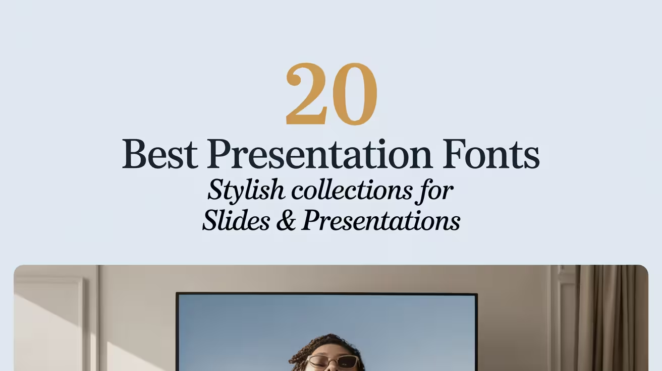
Presentation fonts can make or break a deck faster than bad data. We’ve seen teams spend 12 hours on layouts, then toss in a random default font and wonder why the slides feel “off”… it’s the type. Below are 20 fonts that play nice with hierarchy, spacing, and brand vibes, from clean display looks to warm handwritten styles that still read well on projectors. Expect better headings, calmer body text, and fewer “why does this look cheap?” moments.
Cherly Script – Polished Presentation Font
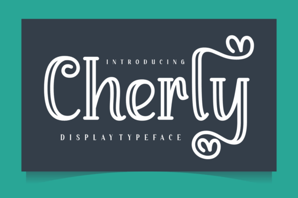
Cherly brings that tidy, confident script energy that makes a title slide feel planned, not slapped together at 1 a.m. We like it for big headlines and short quotes, and it pairs well when you keep the rest of the deck quiet and let slide deck typography do the flexing.
Great Places To Use This Font
- Pitch Deck Covers – bold first impression, fast.
- Beauty Branding – soft, premium vibe.
- Quote Slides – readable, emotional emphasis.
- Workshop Titles – friendly, not childish.
Mona Home – Cozy Display Presentation Font
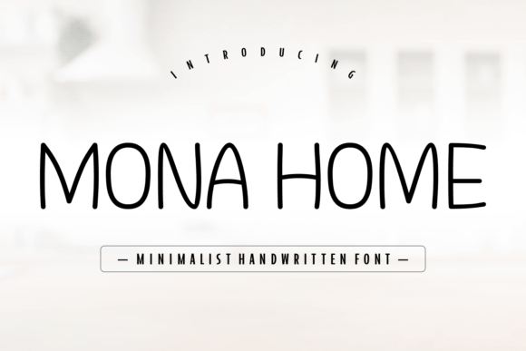
Mona Home feels like the “nice label on a jar” version of presentation fonts – welcoming, rounded, and a little playful without going full cartoon. Use it for section headers, light educational decks, or lifestyle slides where brand moodboard visuals need a typeface that doesn’t fight them.
Projects That Love This Look
- Home Decor Slides – soft titles and callouts.
- Recipe Cards – cute, readable headings.
- Coaching Decks – warm, human tone.
- Product Launch Slides – friendly positioning.
August Stories – Editorial Presentation Font
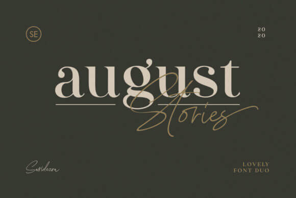
August Stories gives you that magazine-headline flavor, the kind that makes a slide feel like a designed page instead of a template. Keep tracking slightly open, let it breathe, and use it when visual hierarchy matters more than “cute” vibes.
Where This Font Performs Best
- Case Study Decks – polished section titles.
- Portfolio Slides – editorial, clean framing.
- Lookbooks – premium storytelling.
- Event Keynotes – strong openers.
Lovrica – Romantic Presentation Font For Titles
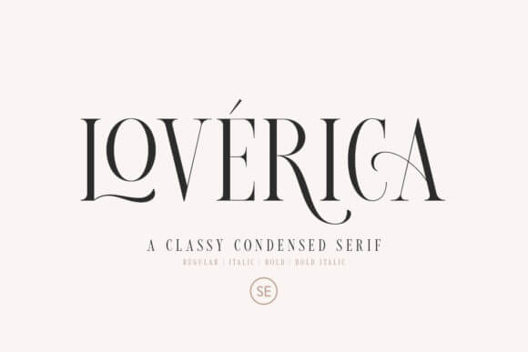
Lovrica leans elegant and flirty, so don’t force it into a hardcore corporate QBR deck… it’ll feel weird. But for personal brands, wedding pros, and feminine product slides, it’s a gorgeous headline font that supports presentation branding without screaming for attention.
Smart Ways To Use It
- Wedding Vendor Decks – refined headings.
- Skincare Presentations – soft luxury tone.
- Instagram Strategy Slides – stylish titles.
- Digital Media Kits – elegant sections.
Rainfolk – Friendly Handwritten Presentation Font
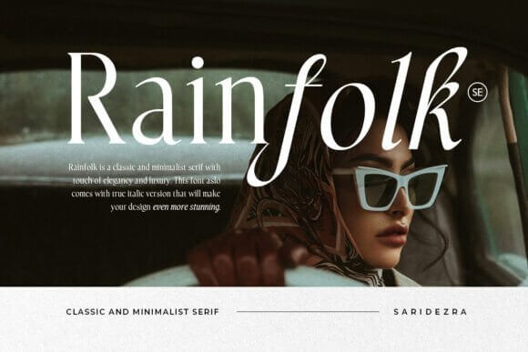
Rainfolk looks like neat marker lettering, and that’s the point – it feels human, quick, and approachable, perfect for “here’s the idea” slides. Keep it to short lines and accents, and let workshop slide design do the talking with icons and spacing.
Use It For These Projects
- Training Decks – friendly callouts.
- Teacher Slides – clear, warm headings.
- Creative Briefs – informal tone.
- Social Content Plans – handwritten flair.
Tropica Gardens – Bold Display Presentation Font
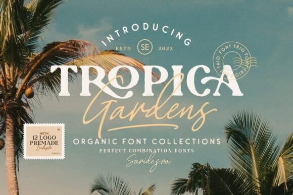
Tropica Gardens is loud in a fun way, like a poster headline that wandered into your slide deck and said “we’re not boring today.” Use it when the brand can handle personality, and keep body text neutral so type pairing stays balanced.
Best Fits For This Style
- Summer Campaign Decks – bright titles.
- Travel Proposals – energetic mood.
- Food Brand Slides – punchy sections.
- Event Posters – big, bold headers.
Ciesla – Minimal Serif For Presentation Fonts
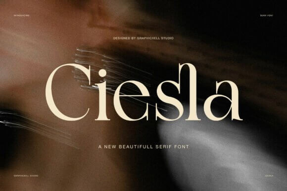
Ciesla feels crisp and adult, the kind of serif that signals taste without getting fussy. If your deck has lots of whitespace, clean charts, and restrained color, this is a strong heading choice that boosts editorial slide layout vibes instantly.
Where It Works Without Trying
- Consulting Decks – calm authority.
- Agency Credentials – modern elegance.
- Investor Updates – sharp headlines.
- Annual Reports – structured typography.
Handmade – Playful Presentation Font With Charm
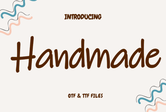
Handmade looks crafty but still controlled, so you can use it for headers without turning the whole deck into a scrapbook. It’s great when you want “approachable expert” energy, and it plays nice with presentation template design that uses doodles or sticker icons.
Use Cases That Make Sense
- Etsy Shop Slides – handmade brand vibe.
- DIY Tutorials – fun section labels.
- Kids Activity Guides – friendly headings.
- Community Decks – warm messaging.
Fresh Lemonade – Bright Display Presentation Font
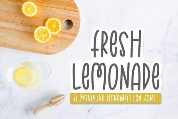
Fresh Lemonade has a sweet, bouncy feel that makes simple slides feel like a campaign, not a report. We’d keep it for headers and short punchlines, then anchor everything with clean sans text so deck readability stays solid on small screens.
Where It Pops The Most
- Marketing Concepts – playful titles.
- Brand Launch Plans – upbeat mood.
- Small Biz Workshops – friendly tone.
- Social Ads Briefs – energetic headers.
Winter Princess – Elegant Script Presentation Font
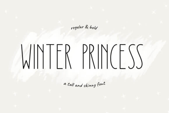
Winter Princess is that airy, swirly script people reach for when they want “luxury” fast. Use it sparingly – one gorgeous title per section is enough – then support it with clean grids and typography scale that keeps your deck from feeling chaotic.
Best Matching Niches
- Bridal Presentations – romantic headers.
- Salon Price Decks – luxe feel.
- Seasonal Campaigns – winter elegance.
- Gift Guides – soft titles.
Wiskys Wonderful – Quirky Presentation Display Font
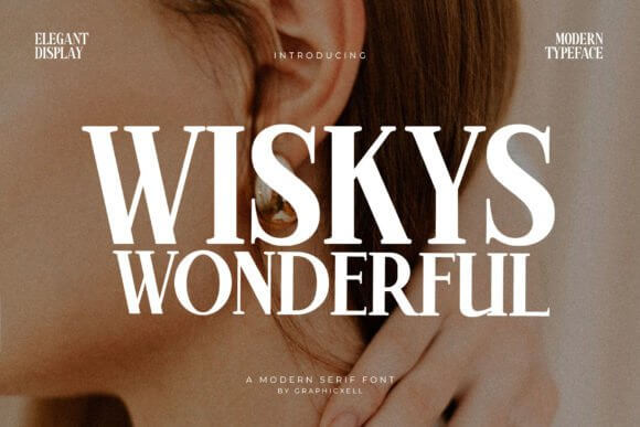
Wiskys Wonderful feels hand-drawn and a little cheeky, which can be magic for creative decks and storytelling slides. Keep contrast high, don’t cram lines, and use it to add spice to headline typography when the content risks feeling too corporate.
Where The Quirk Works
- Creative Proposals – playful chapters.
- Kids Brands – fun headlines.
- Podcast Decks – personality-first titles.
- Campaign Storyboards – hand-made vibe.
Zenitha – Clean Modern Presentation Font
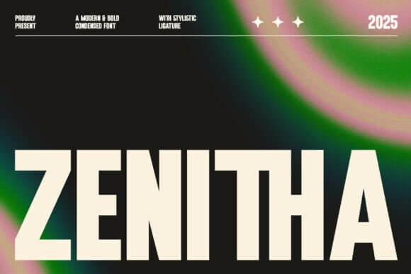
Zenitha lands in that sweet spot: modern, simple, and not soulless. It’s a safe pick for decks with lots of numbers, UI mockups, or product screenshots, where corporate slide design still needs a bit of style.
Use It In These Deck Types
- SaaS Pitch Decks – clean sections.
- Product Roadmaps – clear headings.
- UX Case Studies – modern tone.
- Webinar Slides – readable structure.
Superhits – Bold Sans Presentation Font For Impact
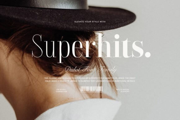
Superhits is built for loud headers and confident statements, the kind you put above a stat that needs to land. Keep line length short and use generous margins, because bold fonts need space, and slide layout grid discipline keeps it looking expensive.
Best Places To Drop It
- Sales Decks – punchy benefits.
- Startup Pitches – bold claims (back them up).
- Campaign Reports – big KPI slides.
- Conference Slides – stage-ready titles.
Saifha – Elegant Serif Presentation Font For Brands
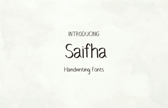
Saifha gives refined serif energy without looking like a law firm by default, which is a win. Use it for brand story slides, section dividers, and mood-setting titles, then balance it with clean sans body copy for brand identity design consistency.
Where Saifha Fits Cleanly
- Luxury Products – premium titles.
- Fashion Decks – editorial vibe.
- Creative Studios – tasteful identity.
- Media Kits – polished sections.
Academic – Professional Presentation Font For Clarity
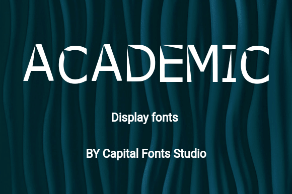
Academic feels structured and “smart” without turning your slides into a textbook wall of text. If you present research, proposals, or training content, this one keeps things readable while still supporting information design with strong headings and steady rhythm.
Best Uses For Academic
- Training Materials – clean sections.
- Research Decks – credible tone.
- HR Presentations – clear structure.
- Policy Slides – readable hierarchy.
Presentation – Straightforward Font For Slide Systems
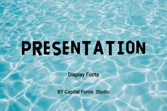
The name says it, and yeah, it delivers: Presentation is built for decks that need to stay consistent across 30+ slides. Use it to create a repeatable type system, then lock styles for titles, subtitles, and captions so design system rules do the heavy lifting.
Where It’s A Safe Bet
- Team Templates – consistent typography.
- Monthly Reporting – clean structure.
- Client Updates – steady readability.
- Operations Decks – no-nonsense slides.
American Wonders – Vintage Presentation Display Font
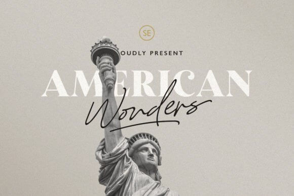
American Wonders gives throwback poster energy, perfect when your deck needs theme and attitude, not sterile minimalism. Use it for cover slides and big chapter breaks, and keep your charts in a modern font so storytelling slides stay legible.
Where The Retro Look Wins
- Event Decks – themed titles.
- Restaurant Concepts – vintage tone.
- Tourism Slides – Americana vibe.
- Brand Story Decks – bold chapter pages.
Sellon – Smooth Serif Presentation Font For Luxury
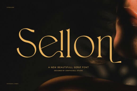
Sellon looks high-end without trying too hard, which is rare because luxury fonts often get dramatic and messy. Use it for brand narratives and product positioning slides, then build spacing and alignment around it for premium branding polish.
Best Matches For Sellon
- Jewelry Slides – refined titles.
- Fragrance Decks – elegant mood.
- Lookbooks – editorial headings.
- Luxury Services – premium tone.
Pansy – Cute Display Presentation Font With Style
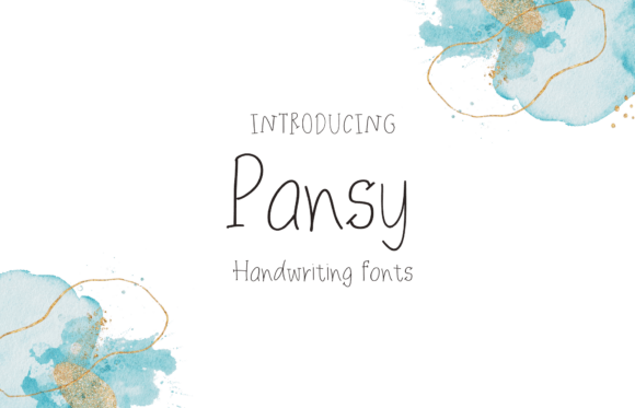
Pansy is cute, but it still feels designed, not childish, and that’s the line most “cute” fonts cross by accident. Use it for short headers, stickers, and fun labels, and let creative presentation layout choices keep it sharp.
Where Pansy Feels Natural
- Beauty Tutorials – playful sections.
- Small Shop Decks – friendly titles.
- Creator Media Kits – cute headers.
- Event Plans – fun labels.
Patagonia – Modern Serif Presentation Font For Stories
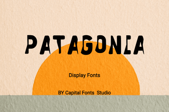
Patagonia feels grounded and modern, a serif that works for narrative decks where you need warmth plus clarity. Use it for headings and pull quotes, then pair with a simple sans for body copy so presentation design stays readable and calm.
Where Patagonia Works Beautifully
- Brand Storytelling – warm chapters.
- Nonprofit Decks – human tone.
- Strategy Presentations – refined titles.
- Portfolio Slides – modern editorial feel.
Quick Wrap-Up And A Tiny Nudge
Good presentation fonts don’t just “look nice” – they make your message easier to scan, trust, and remember. Pick 1 headline font, 1 body font, keep spacing generous, and stay consistent across slides. Want the fast route . . . grab a few from this list and build a mini type system today.