Presentation fonts can save a deck faster than a “better” template, no joke. We see teams obsess over icons, then ship slides with weak hierarchy, mushy spacing, and body text that reads like a legal disclaimer . . . and people tune out.
This list focuses on clean contrast, readable shapes, and headline energy for PowerPoint and Google Slides, plus a few expressive options when the brand allows it. Mix one display face with one workhorse, watch kerning, keep line length sane, and you’ll stop fighting your own slides.
Novale Font – Modern Serif For Confident Slides
Novale gives you crisp serif authority without looking dusty, so titles feel “boardroom” but still stylish. We like it when you need slide hierarchy that reads from the back of the room.
Where To Use Novale
- Investor Update Decks – Keep section headers sharp and sober.
- Brand Story Slides – Add a premium, editorial vibe.
- Conference Keynotes – Big titles that hold attention.
- Agency Case Studies – Make results pages feel credible.
Wonderful Future – Rounded Display For Friendly Decks
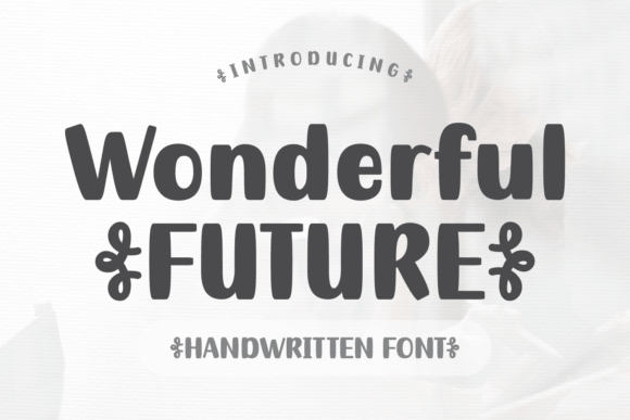
Wonderful Future feels upbeat and a little retro-cute, great for headings that shouldn’t scare anyone. Use it when your deck personality needs warmth, not stiffness.
Where To Use Wonderful Future
- Workshop Deck Covers – Instant friendly first impression.
- Teacher Lesson Slides – Fun titles without chaos.
- Product Feature Callouts – Short bursts of emphasis.
- Community Event Flyers – Big type that feels welcoming.
Blushing Rose – Script Accent For Elegant Presentations
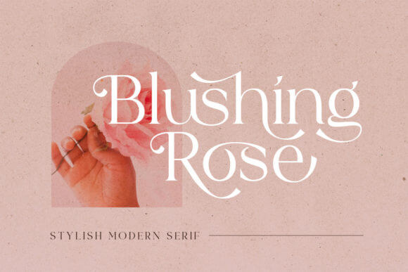
Blushing Rose works best as a “one line only” hero, like a signature on a cover slide. Pair it with a clean sans and you get romantic headline styling without turning the whole deck into a wedding invite.
Where To Use Blushing Rose
- Beauty Brand Pitch Slides – Soft, luxe headline moments.
- Lookbook Presentations – Add a boutique feel to chapters.
- Portfolio Covers – A personal, crafted touch.
- Launch Announcement Slides – One tasteful accent word.
School Chalk – Handwritten Texture For Teaching Slides
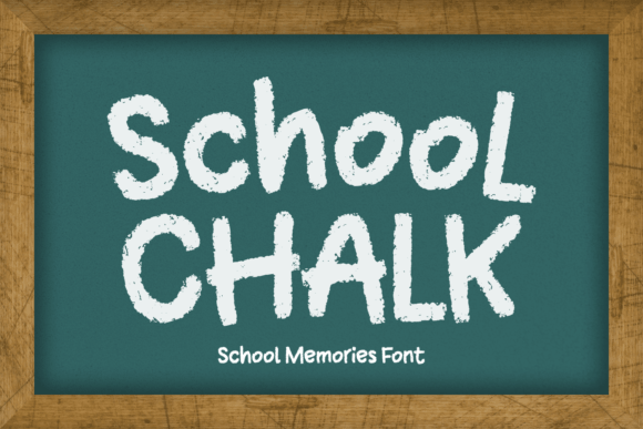
School Chalk nails that real chalkboard vibe, imperfect in the right way, and way more legible than most “hand” fonts. It’s a solid pick for classroom slide design and playful explainers.
Where To Use School Chalk
- Homeschool Lesson Decks – Friendly, clear headings.
- Training Quizzes – Make questions feel less sterile.
- Kids Club Announcements – Fun without neon overload.
- DIY Tutorial Slides – A casual, human tone.
TRT Naron Sans – Clean Sans For Data-Heavy Slides
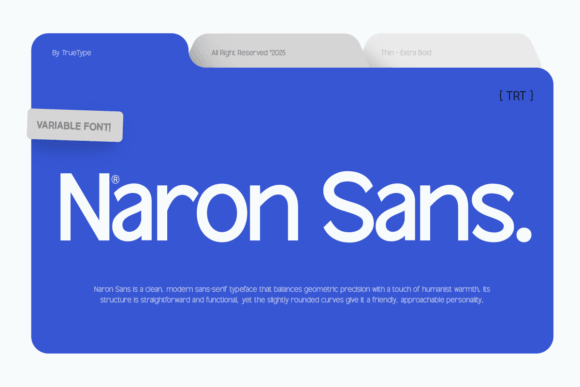
TRT Naron Sans stays quiet, which is the whole point when charts and numbers do the talking. We reach for it when dashboard typography must look calm and controlled.
Where To Use TRT Naron Sans
- SaaS KPI Slides – Clean labels and axis text.
- Quarterly Business Reviews – Reliable body copy.
- UX Research Readouts – Long text that doesn’t fatigue.
- Operations Playbooks – System-like clarity.
TRT Structa Pro – Geometric Sans For Sharp Layouts
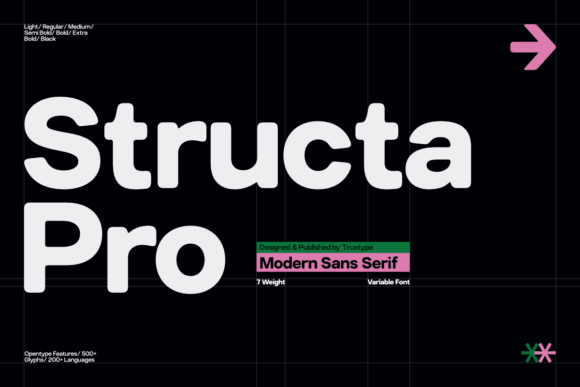
TRT Structa Pro looks engineered, with that straight-backed geometric feel that makes grids behave. If your deck uses lots of icons, it boosts modern slide layout fast.
Where To Use TRT Structa Pro
- Startup Pitch Decks – Tech-forward section headers.
- Product Roadmaps – Crisp timelines and labels.
- UI Kit Presentations – Matches clean components.
- Agency Strategy Slides – Strong, minimal headlines.
Belvina – Fashion Serif For Editorial-Style Slides
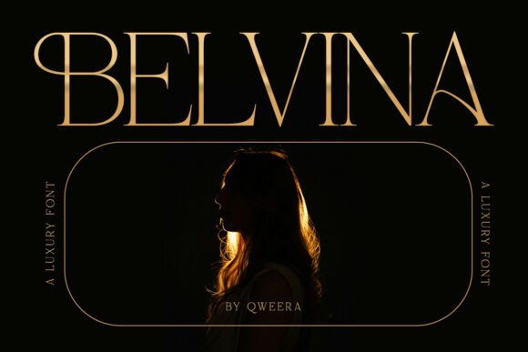
Belvina brings that magazine-cover drama, so one headline can carry the whole slide. Use it sparingly and you get editorial presentation style without visual shouting.
Where To Use Belvina
- Fashion Pitch Slides – Luxe chapter openers.
- Creative Direction Decks – Moodboard titles that pop.
- Brand Guidelines Covers – High-end first page.
- Photography Portfolios – Elegant section dividers.
TRT Ontika – Versatile Sans For Everyday Presentations
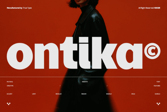
TRT Ontika balances personality with restraint, so you can run it for titles and body in the same deck and it still feels designed. It’s our safe bet for presentation readability.
Where To Use TRT Ontika
- Team All-Hands Decks – Clear, friendly tone.
- Client Proposal Slides – Professional without cold vibes.
- Marketing Plan Presentations – Easy scanning on bullets.
- Internal Training Modules – Long-form slides that hold up.
Happy Ground – Soft Display For Playful Slide Headlines
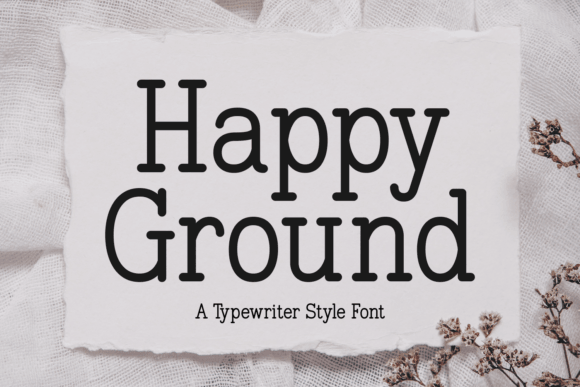
Happy Ground feels bouncy and handmade, perfect for big punchy headings and short labels. When your deck needs cute slide headings, this one shows up and does the job.
Where To Use Happy Ground
- Kids Product Decks – Bright, friendly energy.
- Craft Workshop Slides – Playful section titles.
- Social Content Reports – Fun callout cards.
- Seasonal Promo Slides – Lighthearted big type.
Northem – Modern Sans For Bold, Minimal Decks
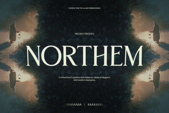
Northem leans bold and clean, the kind of sans that makes one-word slides look intentional, not lazy. Try it when minimal deck design needs a strong spine.
Where To Use Northem
- Brand Reveal Decks – Big, confident headlines.
- Startup Demo Days – Punchy title slides.
- Creative Studio Portfolios – Modern, simple sections.
- One-Page Strategy Slides – Strong hierarchy fast.
Gussion – Bold Display Serif For Statement Slides
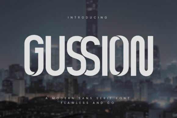
Gussion goes loud in a classy way, so it shines on covers, chapter breaks, and quotable slides. It’s made for statement typography, not tiny footnotes, FYI.
Where To Use Gussion
- Campaign Concept Decks – Big theme headlines.
- Quote Slides – Make one sentence hit harder.
- Poster-Style Slides – Editorial drama on screen.
- Event Opening Slides – Strong, memorable title cards.
Markan – Refined Serif For Polished Presentations
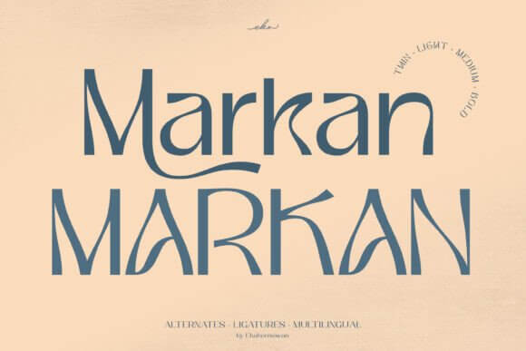
Markan feels balanced and grown-up, great when you want elegance but still need speed and clarity on slides. It supports professional slide branding with less fuss than most fancy serifs.
Where To Use Markan
- Consulting Proposal Decks – Clean, premium tone.
- Real Estate Presentations – Sophisticated section headers.
- Wellness Brand Decks – Calm, trustworthy typography.
- Course Sales Webinars – Polished, readable titles.
Quick Wrap-Up For Picking Presentation Fonts
Pick one strong headline font, one easy body font, then stop mixing five vibes in one deck . . . it never ends well. If you want, grab a couple from this list and test them on your worst slide first, the messy one, because that’s where good typography proves it’s real.