Retro font ideas aren’t just “cute” – they change the vibe of an entire layout, fast. Designers use nostalgic type to trigger recognition (hello 70s curves, 90s arcade blocks), boost recall, and make even plain packaging feel like a collectible. We pulled 15 retro typefaces you can download free, then mapped them to real use cases: logo design, poster headlines, label systems, social templates, and merch. FYI, the trick isn’t grabbing the loudest font . . . it’s picking the one that stays readable when you shrink it, stretch it, stack it, and toss it on a messy background.
Retro Vintage For Classic Display Typography
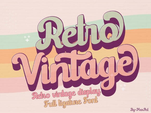
Retro Vintage leans into thick curves and cozy nostalgia, the kind you’d slap on a diner sign and feel weirdly proud. We like it for vintage typography when you need instant “throwback” without turning the whole design into a costume.
Great Spots To Use This Font
- Logo Marks – bold wordmarks that still feel friendly.
- Sticker Packs – chunky letters that print clean.
- Product Labels – retro flavor for jars, candles, coffee.
- Poster Headlines – readable from across the room.
- Merch – tees, totes, embroidered patches.
Retro Pizza Regular Font For Playful Menus
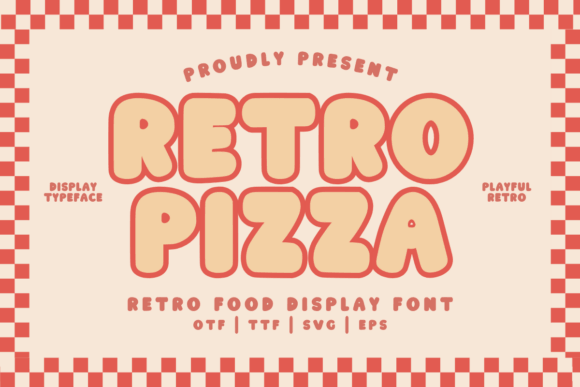
This one screams comfort food, checkered floors, neon open signs, the whole vibe. Use it for menu typography where you want charm, not luxury, and you still need fast readability on flyers and promo tiles.
Where This Font Works Best
- Restaurant Branding – casual, approachable identity.
- Menus – specials, combo boards, table tents.
- Delivery Promos – quick social graphics that pop.
- Food Packaging – pizza boxes, wraps, labels.
Retro Groovy For 70s-Style Lettering
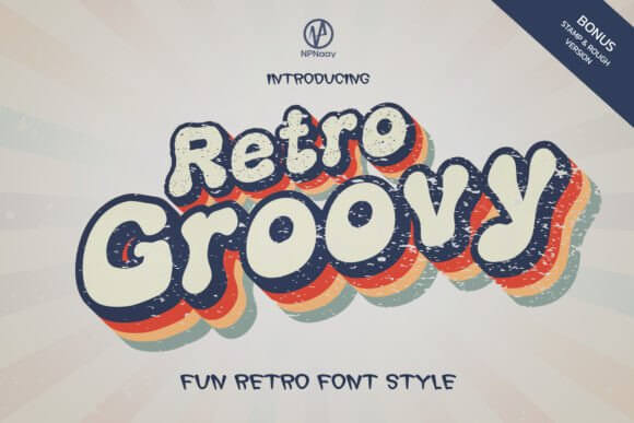
Retro Groovy goes full swirl, but it doesn’t get mushy when you stack lines or stretch a headline wide. We reach for it in retro poster design when the layout needs movement, like the letters are dancing a little.
Best Uses For A Groovy Display Font
- Event Posters – concerts, markets, pop-ups.
- Album Covers – bold title treatments.
- Social Templates – story headers, quote cards.
- Beauty Branding – playful product drops.
- Wall Prints – punchy typographic art.
Lucky Chunks For Bold Retro Bubble Type
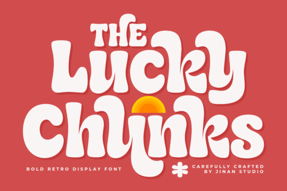
Lucky Chunks feels like candy-coated lettering, loud in a good way, and super forgiving for beginners. If you want bubbly retro font energy on stickers, kid brands, or punchy headlines, this is the easy win.
Projects That Love Chunky Letters
- Kids Products – toys, snacks, learning kits.
- Stickers – bold outlines, high legibility.
- Giveaway Graphics – announcements, countdowns.
- Craft Packaging – handmade goods with attitude.
Retro And Chips For Snacky, Quirky Branding
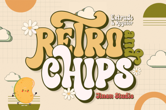
Retro And Chips has that cheeky corner-store vibe, like a label you’d keep just because it looks cool. We use it for packaging design when the product needs personality on shelf, not perfection.
Where It Fits Like A Glove
- Snack Brands – chips, candy, soda labels.
- Streetwear – drop titles, badge graphics.
- Promo Flyers – quick, loud, readable.
- Gift Boxes – playful custom tags.
Logtown For Retro Western Wood-Type Vibes
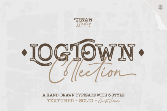
Logtown brings rough timber energy, like old stamped signage, and it doesn’t apologize for it. If you want retro western font flavor for a badge logo or a bold header, this one plays nice with textures and grain.
Use It In These Niches
- Coffee Brands – rustic bags, stamp logos.
- Outdoor Goods – patches, labels, signage.
- Bar Branding – menus, chalkboard-style promos.
- Craft Beer – can typography and badges.
- Event Badges – fairs, rodeo themes, markets.
Okay Retro For Clean Modern-Retro Headlines
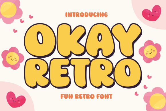
Okay Retro sits in that sweet spot: nostalgic shape language, modern spacing, fewer weird quirks. We grab it for retro font modern layouts where you want a throwback nod but still keep the grid tidy.
Smart Places To Drop It In
- Brand Systems – clean headers across templates.
- Blog Graphics – series titles and cover tiles.
- Beauty Labels – modern-retro naming.
- Slide Decks – bold section headers.
Trusty Retro For Confident Bold Display Type
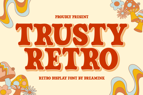
Trusty Retro feels sturdy, like old-school print work that survived a decade in a drawer and still looks great. It nails retro font bold moments where you need impact without the cartoon vibe.
Where It Performs Best
- Apparel – chest prints, sleeve hits.
- Sports-Inspired Logos – club marks and badges.
- Ad Headlines – clean, heavy, readable.
- Signage – storefront, pop-up booths.
Retro Brown For Warm Vintage Aesthetic
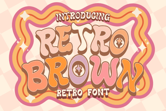
Retro Brown gives you that warm, slightly earthy nostalgia that looks expensive with the right color palette. We like it for retro font aesthetic branding when you pair it with simple sans body text and let the headline do the talking.
Best Project Matches
- Candle Labels – cozy product naming.
- Skincare – vintage-inspired drops.
- Home Decor – prints and signage.
- Market Booths – headers on price boards.
- Seasonal Campaigns – warm promos, autumn vibes.
Retro Western For Big Badge Logo Letters
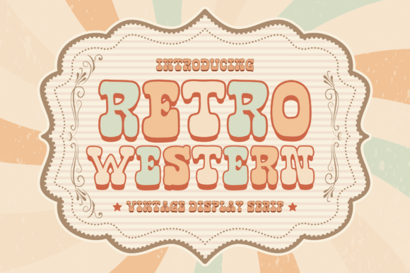
This is the “boots-on-the-ground” option: sharp angles, strong presence, zero fluff. Use it when you need retro font logo energy for badges, stamps, and big titles that should look carved, stamped, or branded.
Where To Use It Without Overthinking
- Badge Logos – circular marks and crests.
- Barber Shops – signage and price lists.
- BBQ Brands – sauces, rubs, food trucks.
- Music Posters – country, rockabilly themes.
Home Retro For Friendly Rounded Branding
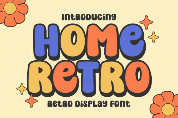
Home Retro feels welcoming, like handwritten warmth but still structured enough for brand work. It’s a solid pick for small business branding when you want “approachable” on day one.
Good Fits For This Style
- Boutiques – storefront headers, tags.
- Bakeries – boxes, menu boards.
- Handmade Shops – labels, thank-you cards.
- Workshops – class flyers and banners.
- Community Events – simple, friendly posters.
Retro Bubble For Loud, Cute Titles
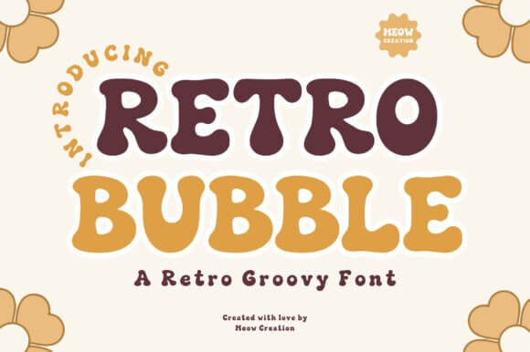
Retro Bubble goes big and playful, and yes, it steals attention from everything else on the page. That’s the point. Drop it when you need retro title font drama on posters, thumbnails, and bold campaign headers.
Where It Shines
- Posters – big titles, punchy subtitles.
- YouTube Thumbnails – readable at tiny sizes.
- Party Invites – fun themes and layouts.
- Product Drops – launch graphics, countdowns.
Real Stacked Retro For Layered Type Treatments
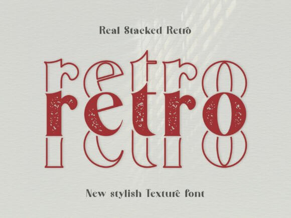
Real Stacked Retro brings instant depth, like you already built a 3D-ish headline without spending an hour nudging shadows. It’s gold for retro font combinations because the stacked look pairs nicely with simple sans captions.
Use Cases That Look Expensive Fast
- Campaign Key Art – hero titles and banners.
- Merch Graphics – layered prints that pop.
- Album Art – bold nameplates.
- Social Headers – series branding.
- Packaging Front Panels – strong product names.
Vintage Sheriff For Old Badge Identity Design
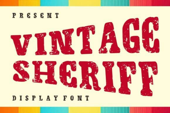
Vintage Sheriff leans into heritage and authority, like a stamp on a crate that crossed the country. Use it for badge logo design work, or whenever you need that official, old-print vibe without faking distress textures.
Where It Makes Sense
- Bar Logos – strong identity on menus.
- BBQ + Grill – labels, signage, promo boards.
- Vintage Markets – booth banners and stamps.
- Craft Brands – heritage-style packaging.
Retro Gamer For Arcade-Inspired Type
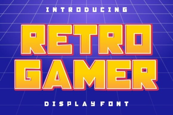
Retro Gamer hits that arcade sweet spot: energetic, chunky, and made for quick recognition. We love it for gaming poster fonts and stream overlays where the headline needs to punch through busy backgrounds.
Where This One Goes Hard
- Stream Graphics – starting soon, alerts, titles.
- Gaming Events – flyers and bracket posters.
- Esports Teams – wordmarks and merch.
- Arcade Bars – menus, signage, promos.
- Retro-Themed Parties – invites and banners.
Quick Wrap-Up And A Tiny Nudge
If you want better retro font ideas, don’t chase “trend” – chase legibility, spacing, and the mood your brand actually sells. Grab a few from this list, test them in a real layout (logo, label, poster), and keep the one that still looks good when you shrink it. If you get stuck, we’ll happily help you shape a custom type direction.